Questions tagged [charts]

Charts are a graphical representation of data, most often in the format of a graph or diagram. Use this tag for questions about using a charting library API.

Charts are a graphical representation of data, using dots, lines, bars, geometric figures or other graphical elements. They can help you visualize vast amounts of data in a way that is easily understood. Similar to the saying "A picture is worth more than 1000 words", one may say "A chart is worth more than 1000 reports" ...

There are many different versions (types) of charts. Here are just a few examples of them:
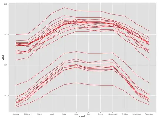
Pie Chart Bar Chart Combined Chart Funnel Chart


Related tags

26456 questions
5
votes
1 answer

How to color the slices of amchart piechart?

How do I color the individual slices of a piechart using the amcharting
Bohrend
  • 1,467
  • 3
  • 17
  • 26
5
votes
2 answers

Google visualization stacked area chart: Add total to tooltip

I'm using the google visualization api to create a stacked area chart. When a user hovers over a point inside the chart, I want it to show the total added sum of the points at that location, as well as the values of those points. The second point, I…
Kippie
  • 3,760
  • 3
  • 23
  • 38
5
votes
1 answer

Matplotlib Pie Chart Labels Alignment

I was trying to create a pie chart in matplotlib and would like to put the labels within wedges. I used the following code to do it: import matplotlib.pyplot as plt fig = plt.figure(1, figsize=(8,8),…
Ken Ma
  • 301
  • 1
  • 5
  • 13
5
votes
3 answers

Plot bar chart with GD::Graph

I have data for each and every student, e.g.: Student Name Score Jack 89 Jill 70 Sandy 40 Now I'm trying to plot these in a bar chart using GD::Graph::Bar, but I see that I…
Le Ray
  • 367
  • 2
  • 12
5
votes
1 answer

Adding a Trendline to Bar Chart in Reporting Services

How do I go about adding a trendline to a bar chart in reporting services 2005?
TheObserver
  • 2,973
  • 7
  • 33
  • 41
5
votes
1 answer

Multi series chart (D3) with missing values

I want to create a multi series line chart with D3 based on this example. My problem is, that some of the values are missing: y x1 x2 x3 1 0.8 0.7 2 0.9 0.7 3 0.9 1.2 0.7 4 1.1 0.7 5 0.8 1.1 2.7 6 0.9 1.2 …
stofl
  • 2,950
  • 6
  • 35
  • 48
5
votes
3 answers

How to set the axis labels of Google Charts to string/text/nominal/category instead of numerical

I want to have text labels instead of numerical on the axis labels of Google Charts.How can I archive this ? The result should look like this (example bubble chart): I found this example somewhere here on stackoverflow, but now i can't find it…
Kenyakorn Ketsombut
  • 2,072
  • 2
  • 26
  • 43
5
votes
1 answer

Highcharts add series dynamically

I want to add some series (I get the series data from a webservice as a 3dim array (and returning it as json) - I dont know the number of series I will get, so I have to load the series data dynamically). In javascript I am building an object:…
spyfx
  • 1,311
  • 4
  • 14
  • 24
5
votes
2 answers

Highcharts Gauge

I'm using highcharts and i'd like to show a big gauge(500x500px). Resizing the gauge was quite easy, but the small block with the value in it doesn't resize. How can I make that small block bigger? Thanks for the help! jsFiddle:…
ivodvb
  • 1,164
  • 2
  • 12
  • 39
5
votes
3 answers

Creating an Infographic In Python

I want to create a simple infographic in python. Matplotlib seems to have a lot of features but nothing that covers off my simple heatmap grid example. The infographic is a simple 5 x 5 grid with numbers inside ranging from 0 to 1. The grid squares…
Matt Alcock
  • 12,399
  • 14
  • 45
  • 61
5
votes
1 answer

Overlapping Y Axis in a Multi y axis Highchart

i am trying to add a multiple yaxis highstock. The plotting works fine but the axis labels are overlapping & overall giving it a clumsy look. here is a snapshot of it! Highchart Multi-Y I have used this example for creating a multi y chart. Can…
petarap
  • 257
  • 1
  • 4
  • 13
5
votes
1 answer

How to dynamically change axis from linear to logarithmic in HighChart

I want to dynamically change axis from linear to logarithmic and vice versa in HighCharts. Please see this fiddle example. yAxis: { //linear type: 'logarithmic', minorTickInterval: 0.1 }, There is a type: String in api For initial…
user503853
5
votes
1 answer

How to show gridlines only on 0 on the yAxis in highcharts?

I have a highcharts graph and everything is going on as the mockup below. But there are a few things I am stuck on. Is there a way to remove all the gridlines from the yAxis except for the one in 0 like the one shown in the picture below with…
saurjk
  • 973
  • 3
  • 13
  • 27
5
votes
2 answers

"Modern UI (Metro) Charts for Windows 8, WPF, Silverlight" for .net 4.0

I'm searching for a good chart-control and found "Modern UI (Metro) Charts for Windows 8, WPF, Silverlight" This control looks really good but I need this for Visual Studio 2010 and 4.0. The original source is written in Visual Studio 2012 und 4.5…
masterchris_99
  • 2,683
  • 7
  • 34
  • 55
5
votes
1 answer

How to have only point in JqPlot rather than line

I am a newbie for JqPlot. Is it possible to plot only points without connecting them. As I don't want it to be a line chart. I just want scattered points on the graph.
Tejas Patel
  • 1,289
  • 13
  • 25
1 2 3
99
100