With newer versions of plotly, all you need is:
df.plot()
As long as you remember to set pandas plotting backend to plotly:
pd.options.plotting.backend = "plotly"
From here you can easily adjust your plot to your liking, for example setting the theme:
df.plot(template='plotly_dark')
Plot with dark theme:
One particularly awesome feature with newer versions of plotly is that you no longer have to worry whether your pandas dataframe is of a wide or long format. Either way, all you need is df.plot(). Check out the details in the snippet below.
Complete code:
# imports
import plotly.express as px
import pandas as pd
import numpy as np

# settings
pd.options.plotting.backend = "plotly"

# sample dataframe of a wide format
np.random.seed(4); cols = list('abc')
X = np.random.randn(50,len(cols))
df=pd.DataFrame(X, columns=cols)
df.iloc[0]=0; df=df.cumsum()

# plotly figure
df.plot(template = 'plotly_dark')
Answer for older versions:
I would highly suggest using iplot() instead if you'd like to use plotly in a Jupyter Notebook for example:
Plot:
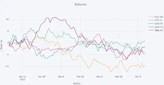
Code:
import plotly
import cufflinks as cf
from plotly.offline import download_plotlyjs, init_notebook_mode, plot, iplot
import pandas as pd
import numpy as np


# setup
init_notebook_mode(connected=True)
np.random.seed(123)
cf.set_config_file(theme='pearl')

# Random data using cufflinks
df1 = cf.datagen.lines()
df2 = cf.datagen.lines()
df3 = cf.datagen.lines()
df = pd.merge(df1, df2, how='left',left_index = True, right_index = True)
df = pd.merge(df, df3, how='left',left_index = True, right_index = True)

fig = df1.iplot(asFigure=True, kind='scatter',xTitle='Dates',yTitle='Returns',title='Returns')
iplot(fig)

