Is it possible to create an outlined(transparent) button with gradient border in flutter? I tried to use LinearGradient in BorderSide style but it's not allowed.
Asked
Active
Viewed 4.2k times
10 Answers
95
I spent about two hours on it :)
how to use:
import 'package:flutter/material.dart';
void main() => runApp(App());
class App extends StatelessWidget {
@override
Widget build(BuildContext context) {
return MaterialApp(
home: Scaffold(
body: SafeArea(
child: Center(
child: Column(
mainAxisSize: MainAxisSize.min,
children: <Widget>[
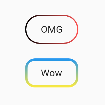
UnicornOutlineButton(
strokeWidth: 2,
radius: 24,
gradient: LinearGradient(colors: [Colors.black, Colors.redAccent]),
child: Text('OMG', style: TextStyle(fontSize: 16)),
onPressed: () {},
),
SizedBox(width: 0, height: 24),
UnicornOutlineButton(
strokeWidth: 4,
radius: 16,
gradient: LinearGradient(
colors: [Colors.blue, Colors.yellow],
begin: Alignment.topCenter,
end: Alignment.bottomCenter,
),
child: Text('Wow', style: TextStyle(fontSize: 16)),
onPressed: () {},
),
],
),
),
),
),
);
}
}
and the class itself:
class UnicornOutlineButton extends StatelessWidget {
  final _GradientPainter _painter;
  final Widget _child;
  final VoidCallback _callback;
  final double _radius;

  UnicornOutlineButton({
    @required double strokeWidth,
    @required double radius,
    @required Gradient gradient,
    @required Widget child,
    @required VoidCallback onPressed,
  })  : this._painter = _GradientPainter(strokeWidth: strokeWidth, radius: radius, gradient: gradient),
        this._child = child,
        this._callback = onPressed,
        this._radius = radius;

  @override
  Widget build(BuildContext context) {
    return CustomPaint(
      painter: _painter,
      child: GestureDetector(
        behavior: HitTestBehavior.translucent,
        onTap: _callback,
        child: InkWell(
          borderRadius: BorderRadius.circular(_radius),
          onTap: _callback,
          child: Container(
            constraints: BoxConstraints(minWidth: 88, minHeight: 48),
            child: Row(
              mainAxisSize: MainAxisSize.min,
              mainAxisAlignment: MainAxisAlignment.center,
              children: <Widget>[
                _child,
              ],
            ),
          ),
        ),
      ),
    );
  }
}

class _GradientPainter extends CustomPainter {
  final Paint _paint = Paint();
  final double radius;
  final double strokeWidth;
  final Gradient gradient;

  _GradientPainter({@required double strokeWidth, @required double radius, @required Gradient gradient})
      : this.strokeWidth = strokeWidth,
        this.radius = radius,
        this.gradient = gradient;

  @override
  void paint(Canvas canvas, Size size) {
    // create outer rectangle equals size
    Rect outerRect = Offset.zero & size;
    var outerRRect = RRect.fromRectAndRadius(outerRect, Radius.circular(radius));

    // create inner rectangle smaller by strokeWidth
    Rect innerRect = Rect.fromLTWH(strokeWidth, strokeWidth, size.width - strokeWidth * 2, size.height - strokeWidth * 2);
    var innerRRect = RRect.fromRectAndRadius(innerRect, Radius.circular(radius - strokeWidth));

    // apply gradient shader
    _paint.shader = gradient.createShader(outerRect);

    // create difference between outer and inner paths and draw it
    Path path1 = Path()..addRRect(outerRRect);
    Path path2 = Path()..addRRect(innerRRect);
    var path = Path.combine(PathOperation.difference, path1, path2);
    canvas.drawPath(path, _paint);
  }

  @override
  bool shouldRepaint(CustomPainter oldDelegate) => oldDelegate != this;
}
-
giving some UnimplementedError. I was in flutter web. – Aneesh Jose Nov 09 '19 at 17:16
-
That should go into the dart library! By the way how do we set the size of the button? – Panduranga Rao Sadhu Nov 15 '19 at 10:04
-
5I've published package https://pub.dev/packages/outline_gradient_button it still doesn't work on web because create shaders and Path operations don't support for now, will wait may be something changed – Jan 06 '20 at 12:32
38
You can achieve this by doing just a simple trick
You have to define two Containers.
First outer container with a gradient background and the second inner container with white background. and as a child of the inner container, you can place anything e.g. TextField, Text, another button, etc.
final kInnerDecoration = BoxDecoration(
  color: Colors.white,
  border: Border.all(color: Colors.white),
  borderRadius: BorderRadius.circular(32),
);

final kGradientBoxDecoration = BoxDecoration(
  gradient: LinearGradient(colors: [Colors.black, Colors.redAccent]),
  border: Border.all(
    color: kHintColor,
  ),
  borderRadius: BorderRadius.circular(32),
);
Now this is your View
  Container(
    child: Padding(
             padding: const EdgeInsets.all(2.0),
             child: Container(
                      child:Text("Button Title with your style"),
                      decoration: kInnerDecoration,
                    ),
           ),
    height: 66.0,
    decoration: kGradientBoxDecoration,
  ),
Done

Yashwardhan Pauranik
- 5,370
- 5
- 42
- 65
Ankit Dubey
- 1,000
- 1
- 8
- 12
-
1This is not just a transparent button, in child you can take any other widget – Ankit Dubey Jan 29 '20 at 10:20
-
Oh now I got your point. Yes It'll not work as transparent button. However i'll recommend it. Because instead of white if you set your screen color as inner Container color, It'll be seemed to be a transparent button. for exmple, if screen background color is blue, set inner Container color as blue. Thank you. – Ankit Dubey Jan 29 '20 at 10:27
-
1And what if there is an image below button? Your answer is wrong, because your button is not transparent, you just match colors. – Oleksandr Sep 28 '20 at 07:29
-
2@Oleksandr It will be weird if any image is appearing inside button. Ofcourse everyone want to see only text of button, not content of screen within button. And You might be correct. this answer might not had fulfilled your requirement. I've just shared my code for which I was struggling. Its totally your call whether to go with this code or not. Thanks for sharing your thoughts. – Ankit Dubey Sep 28 '20 at 07:48
-
hi ANkit, fantastic solution, succinct and performant. I couldn't find the definition of `kHintColor` what did you use for this constant? – valeriana Apr 30 '21 at 02:27
-
1Thanks @valeriana, also I really don't remember which colour it was. You can take any colour as per your need. – Ankit Dubey May 01 '21 at 15:14
6
Use OutlinedButton (Recommended)

Create this class (null-safe code)
class MyOutlinedButton extends StatelessWidget {
  final VoidCallback onPressed;
  final Widget child;
  final ButtonStyle? style;
  final Gradient? gradient;
  final double thickness;

  const MyOutlinedButton({
    Key? key,
    required this.onPressed,
    required this.child,
    this.style,
    this.gradient,
    this.thickness = 2,
  }) : super(key: key);

  @override
  Widget build(BuildContext context) {
    return DecoratedBox(
      decoration: BoxDecoration(gradient: gradient),
      child: Container(
        color: Colors.white,
        margin: EdgeInsets.all(thickness),
        child: OutlinedButton(
          onPressed: onPressed,
          style: style,
          child: child,
        ),
      ),
    );
  }
}
Usage:
MyOutlinedButton(
  onPressed: () {},
  gradient: LinearGradient(colors: [Colors.indigo, Colors.pink]),
  child: Text('OutlinedButton'),
)
CopsOnRoad
- 237,138
- 77
- 654
- 440
2
To change the size, you can insert a Container:
OutlineGradientButton(
  child: Container(
    constraints: BoxConstraints(maxWidth: 300, maxHeight: 50),
    height: 50,
    alignment: Alignment.center,
    child: Text(
      'Text',
      textAlign: TextAlign.center,
      style: TextStyle(
          color: Colors.white, fontSize: 20, fontWeight: FontWeight.w500),
    ),
  ),
  gradient: LinearGradient(
    colors: [Color(0xfff3628b), Color(0xffec3470)],
    begin: Alignment.topCenter,
    end: Alignment.bottomCenter,
  ),
  strokeWidth: 3,
  radius: Radius.circular(25),
),
xew
- 37
- 6
1
Wrap your widget width CustomPaint widget and use this _CustomGradientBorder that extends CustomPainter.
CustomPaint(painter: const _CustomGradientBorder(thickness: 1,
      colors: [Colors.red, Colors.green, Colors.blue, Colors.tealAccent],
      radius: 8), child: //widget here)

class _CustomGradientBorder extends CustomPainter{
final double thickness;
final List<Color> colors;
final double radius;
const _CustomGradientBorder({required this.thickness, required this.colors, required this.radius});

@override
void paint(Canvas canvas, Size size) {
final Path path = Path();
path.moveTo(0, size.height/2);
path.lineTo(0, radius);
path.quadraticBezierTo(0, 0, radius, 0);
path.lineTo(size.width-radius, 0);
path.quadraticBezierTo(size.width, 0, size.width, radius);
path.lineTo(size.width, size.height-radius);
path.quadraticBezierTo(size.width, size.height, size.width-radius, size.height);
path.lineTo(radius, size.height);
path.quadraticBezierTo(0, size.height, 0, size.height-radius);
path.close();
final Paint paint = Paint()
..style = PaintingStyle.stroke
..shader = LinearGradient(colors: colors).createShader(Rect.fromCenter(center: Offset(size.width/2, size.height/2), width: size.width, height: size.height))
..strokeWidth = thickness;
canvas.drawPath(path, paint);
}

@override
bool shouldRepaint(covariant CustomPainter oldDelegate) {
  return true;
}
}
Maurya
- 11
- 2
1
Now there is a easier way provided. Flutter now has a package which does the job perfectly. I am leaving a link to the documentation for further use https://pub.dev/packages/gradient_borders.
Михаил Димитров
- 41
- 1
- 4
1
GradientBorder
class GradientBorder extends Border {
  final Gradient borderGradient;
  final double width;

  const GradientBorder({
    this.width = 0.0,
    required this.borderGradient,
  }) : super();

  @override
  void paint(
    Canvas canvas,
    Rect rect, {
    TextDirection? textDirection,
    BoxShape shape = BoxShape.rectangle,
    BorderRadius? borderRadius,
  }) {
    if (isUniform) {
      switch (shape) {
        case BoxShape.circle:
          assert(
            borderRadius == null,
            'A borderRadius can only be given for rectangular boxes.',
          );
          _paintGradientBorderWithCircle(canvas, rect);
          break;
        case BoxShape.rectangle:
          if (borderRadius != null) {
            _paintGradientBorderWithRadius(canvas, rect, borderRadius);
            return;
          }
          _paintGradientBorderWithRectangle(canvas, rect);
          break;
      }
      return;
    }
  }

  void _paintGradientBorderWithRadius(
      Canvas canvas, Rect rect, BorderRadius borderRadius) {
    final Paint paint = Paint();
    final RRect outer = borderRadius.toRRect(rect);

    paint.shader = borderGradient.createShader(outer.outerRect);

    if (width == 0.0) {
      paint
        ..style = PaintingStyle.stroke
        ..strokeWidth = 0.0;
      canvas.drawRRect(outer, paint);
    } else {
      final RRect inner = outer.deflate(width);
      canvas.drawDRRect(outer, inner, paint);
    }
  }

  void _paintGradientBorderWithCircle(Canvas canvas, Rect rect) {
    final double radius = (rect.shortestSide - width) / 2.0;
    final Paint paint = Paint();
    paint
      ..strokeWidth = width
      ..style = PaintingStyle.stroke
      ..shader = borderGradient
          .createShader(Rect.fromCircle(center: rect.center, radius: radius));

    canvas.drawCircle(rect.center, radius, paint);
  }

  void _paintGradientBorderWithRectangle(Canvas canvas, Rect rect) {
    final Paint paint = Paint();
    paint
      ..strokeWidth = width
      ..shader = borderGradient.createShader(rect)
      ..style = PaintingStyle.stroke;

    canvas.drawRect(rect.deflate(width / 2.0), paint);
  }

  factory GradientBorder.uniform({
    Gradient gradient = const LinearGradient(colors: [Color(0x00000000)]),
    double width = 1.0,
  }) {
    return GradientBorder._fromUniform(gradient, width);
  }

  const GradientBorder._fromUniform(Gradient gradient, this.width)
      : assert(width >= 0.0),
        borderGradient = gradient;
}
Example
class ExamplePage extends StatelessWidget {
  const ExamplePage({Key? key}) : super(key: key);

  @override
  Widget build(BuildContext context) {
    return Scaffold(
      appBar: AppBar(title: const Text('GradientBorder')),
      body: Column(
        mainAxisAlignment: MainAxisAlignment.center,
        crossAxisAlignment: CrossAxisAlignment.stretch,
        children: [
          Container(
            decoration: const BoxDecoration(
              borderRadius: BorderRadius.all(Radius.circular(12)),
              border: GradientBorder(
                borderGradient: LinearGradient(
                  colors: [
                    Colors.red,
                    Colors.green,
                  ],
                  tileMode: TileMode.repeated,
                  begin: Alignment.topLeft,
                  end: Alignment.bottomRight,
                  stops: [0.0, 1.0],
                  transform: GradientRotation(0.0),
                ),
                width: 5,
              ),
            ),
            child: Column(
              children: const [
                SizedBox(height: 20),
                Text('GradientBorder'),
                SizedBox(height: 20),
              ],
            ),
          )
        ],
      ),
    );
  }
}
DiyorbekDev
- 706
- 1
- 5
- 19
-
The only problem with this solution is that if you use an Image.blur filter in the child it will difuse the border. You can solve it with a stack but it brings other problems. But great solution :) Thanks – Fernando Luca De Tena Aug 09 '23 at 11:01
0
You can use a structure like below. You can also use it as a flat button by removing BorderRadius.

InkWell(
      onTap: () {
        print("TAP");
      },
      child: Container(
        height: 85,
        width: 85,
        padding: EdgeInsets.all(6),
        decoration: BoxDecoration(
          borderRadius: BorderRadius.circular(100),
          gradient: LinearGradient(
            colors: [Colors.blue, Colors.black],
            begin: Alignment(-1, -1),
            end: Alignment(2, 2),
          ),
        ),
        child: Center(
          child: ClipRRect(
            borderRadius: BorderRadius.circular(100),
            child: Container(
              decoration: BoxDecoration(
                borderRadius: BorderRadius.circular(100),
                image: DecorationImage(
                  image: Image.network("https://images.unsplash.com/photo-1612151855475-877969f4a6cc?ixlib=rb-1.2.1&ixid=MnwxMjA3fDB8MHxzZWFyY2h8MXx8aGQlMjBpbWFnZXxlbnwwfHwwfHw%3D&w=400&q=80").image,
                  fit: BoxFit.fitHeight,
                ), //By deleting the image here, you can only use it text.
                color: Colors.white,
                border: Border.all(
                  color: Colors.white,
                  width: 4,
                ),
              ),
              child: Center(child: Text("sssss")), //By deleting the text here, you can only use it visually.
              width: 75,
              height: 75,
            ),
          ),
        ),
      ),
    )
Aksoyhlc
- 285
- 1
- 3
- 11
0
class GradientBorderWidget extends StatelessWidget {
  final Widget child;
  const GradientBorderWidget({super.key, required this.child});
  @override
  Widget build(BuildContext context) {
  return Container(
  padding: const EdgeInsets.symmetric(horizontal: 1.5, vertical: 1.5),
  width: double.infinity,
  decoration: BoxDecoration(
      borderRadius: BorderRadius.circular(15),
      gradient: const LinearGradient(
          colors: [color1, color2, color3],
          begin: Alignment.centerLeft,
          end: Alignment.centerRight)),
    alignment: Alignment.center,
    child: ClipRRect(borderRadius: BorderRadius.circular(15), child:
    child),
    );
    }
    }
Zeeshan Ali
- 17
- 4
-1
I tried many ways to do that, but all of them had their limitations, then I found a package that worked how I expected: https://pub.dev/packages/outline_gradient_button
Rodion Mostovoi
- 1,205
- 12
- 16
-
3It's package from user from accepted answer. He linked it in comment. – Oleksandr Jun 17 '21 at 09:46