0

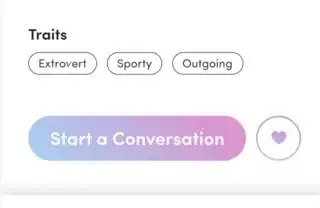
here is the example out put i want

enter image description here

here is what i tried

const CircleAvatar(
                      maxRadius: 40,
                      backgroundColor: AppColor.pink,
                      child: CircleAvatar(
                        maxRadius: 38,
                        backgroundColor: Colors.white,
                        child: Icon(
                          CupertinoIcons.heart_fill,
                          size: 50,
                          color: AppColor.pink,
                        ),
                      ),
                    )

but this is just normal color, there is no option to set gradient color in CircleAvatar, i looked over all solution, but i couldn't find a proper solution yet, thanks for your time
mishalhaneef
  • 672
  • 8
  • 29

2 Answers2

1

Try this code:

Container(
              width: 80,
              height: 80,
              padding: EdgeInsets.all(2),
              decoration: BoxDecoration(
                shape: BoxShape.circle,
                gradient: LinearGradient(
                  colors: [
                    Colors.red,
                    Colors.blue,
                  ],
                  begin: Alignment.topLeft,
                  end: Alignment.bottomRight,
                ),

              ),
              child: CircleAvatar(
                radius: 40,
                backgroundColor: Colors.white,
                child: ShaderMask(
                  shaderCallback: (bounds) => LinearGradient(
                    colors: [Colors.pink, Colors.purple],
                    begin: Alignment.topLeft,
                    end: Alignment.bottomRight,
                    stops: [0.0, 1.0],
                  ).createShader(bounds),
                  child: Icon(
                    CupertinoIcons.heart_fill,
                    size: 32,
                    color: Colors.white,
                  ),
                ),
              ),
            )

Output:

output

Wrap the CircleAvatar in a Container with a gradient property to create the gradient border effect, and wrap the Icon with a ShaderMask and set its shaderCallback property to a LinearGradient to apply the gradient effect to the icon.

I Hope this help!

Sania Developer
  • 130
  • 1
  • 9
0

You can create a class and use it as you like see below example for your understanding Create a separate file for this class Note that this will give you gradient colors for icons

class GradientIcon extends StatelessWidget {
  GradientIcon(
    this.icon,
    this.size,
    this.gradient,
  );

  final IconData icon;
  final double size;
  final Gradient gradient;

  @override
  Widget build(BuildContext context) {
    return ShaderMask(
      child: SizedBox(
        width: size * 1.2,
        height: size * 1.2,
        child: Icon(
          icon,
          size: size,
          color: Colors.white,
        ),
      ),
      shaderCallback: (Rect bounds) {
        final Rect rect = Rect.fromLTRB(0, 0, size, size);
        return gradient.createShader(rect);
      },
    );
  }
}

Then use it in you widget tree like

class IconSample extends StatelessWidget {
  @override
  Widget build(BuildContext context) {
    return GradientIcon(
      Icons.add_alert,
      50.0,
      LinearGradient(
        colors: <Color>[
          Colors.red,
          Colors.yellow,
          Colors.blue,
        ],
        begin: Alignment.topLeft,
        end: Alignment.bottomRight,
      ),
    );
  }
}
Rahul Pandey
  • 520
  • 3
  • 15