8

I have a boolean matrix:

mm <- structure(c(TRUE, TRUE, TRUE, FALSE, TRUE, FALSE, TRUE, FALSE, 
                  FALSE, FALSE, TRUE, TRUE, TRUE, TRUE, TRUE, FALSE, FALSE, TRUE, 
                  FALSE, FALSE, FALSE, TRUE, TRUE, TRUE, TRUE, FALSE, FALSE, FALSE, 
                  FALSE, FALSE, TRUE, TRUE, TRUE, TRUE, TRUE, FALSE, FALSE, FALSE, 
                  FALSE, FALSE, TRUE, TRUE, TRUE, TRUE, TRUE, FALSE, FALSE, FALSE, 
                  FALSE, FALSE, FALSE, FALSE, FALSE, FALSE, FALSE, TRUE, TRUE, 
                  TRUE, TRUE, TRUE, FALSE, FALSE, FALSE, FALSE, FALSE, TRUE, TRUE, 
                  TRUE, TRUE, FALSE, TRUE, FALSE, FALSE, FALSE, FALSE, TRUE, TRUE, 
                  TRUE, TRUE, TRUE, FALSE, FALSE, FALSE, FALSE, FALSE, TRUE, TRUE, 
                  TRUE, TRUE, TRUE, FALSE, FALSE, FALSE, FALSE, FALSE, TRUE, TRUE, 
                  TRUE, TRUE, TRUE), .Dim = c(10L, 10L), .Dimnames = list(NULL, 
                                                                          c("n1", "n2", "n3", "n4", "n5", "n1.1", "n2.1", "n3.1", "n4.1", 
                                                                            "n5.1")))

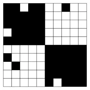
For this matrix, I'd like to make a plot similar to this one:

crossword-like plot

(the picture was taken from a similar question for Matlab: How can I display a 2D binary matrix as a black & white plot?)

Maybe I'm missing something obvious, but I don't see an easy way how to do that in R. So far, my best attempt is based on barplot:

m1 <- matrix(TRUE,ncol=10,nrow=10)
barplot(m1,col=mm)

but it makes all rows have the same colors.

Any ideas are welcome

Community
  • 1
  • 1
Marat Talipov
  • 13,064
  • 5
  • 34
  • 53

4 Answers4

6

You can do this using ggplot2's geom_tile and reshape2's melt:

library(ggplot2)
library(reshape2)

melted <- melt(mm)
ggplot(melted, aes(x = Var2, y = Var1, fill = value)) + geom_tile() +
    scale_fill_manual(values = c("white", "black"))

To make it a bit neater, you could remove the legend and the gray edges with some adjustments to the theme:

ggplot(melted, aes(x = Var2, y = Var1, fill = value)) + geom_tile() +
    scale_fill_manual(values = c("white", "black")) +
    theme_bw() +
    theme(legend.position = "none")

Final output:

enter image description here

David Robinson
  • 77,383
  • 16
  • 167
  • 187
6

Here are a few more approaches to round out the graphics options.

  1. base graphics with rect:

    plot.new()
    par(mar=rep(0, 4))
    plot.window(xlim=c(0, ncol(mm)), ylim=c(0, nrow(mm)), asp=1)
    o <- cbind(c(row(mm)), c(col(mm))) - 1
    rect(o[, 1], o[, 2], o[, 1] + 1, o[, 2] + 1, col=t(mm)[, ncol(mm):1])
    

    enter image description here

  2. lattice::levelplot and latticeExtra:

    library(latticeExtra)
    levelplot(t(mm)[, ncol(mm):1], asp=1, scales='sliced', 
              col.regions=c('white', 'black'), margin=FALSE, colorkey=FALSE) + 
      layer(panel.grid(h=nrow(mm)-1, v=ncol(mm)-1, col=1))
    

    enter image description here

  3. rasterVis::levelplot, raster, and latticeExtra:

    library(rasterVis)
    library(latticeExtra)
    levelplot(raster(mm), col.regions=c('white', 'black'), 
              margin=FALSE, colorkey=FALSE) + 
      layer(panel.grid(h=nrow(mm)-1, v=ncol(mm)-1, col=1))
    

    enter image description here

  4. sp::spplot, raster, and latticeExtra:

    library(raster)
    library(latticeExtra)
    spplot(raster(mm), colorkey=FALSE, col.regions=c('white', 'black')) +
      layer(panel.grid(h=nrow(mm)-1, v=ncol(mm)-1, col=1))
    

    enter image description here

  5. raster

    It can be a bit fiddly to set the graphics device's dimensions such that raster doesn't plot additional (partial) cells outside the intended x and y limits. When using this approach, if the goal is to export to e.g. png, I plot to windows/x11/quartz first and resize the window until the plotted area is as I'd intended, then query the device dimensions with dev.size() and use these values to determine the dimension ratio for plotting to png.

    plot(raster(mm), legend=FALSE, col=c('white', 'black'))
    abline(h=seq(0, 1, len=nrow(mm) + 1), 
           v=seq(0, 1, len=ncol(mm) + 1))
    

    enter image description here

jbaums
  • 27,115
  • 5
  • 79
  • 119
5

Here's an approach that uses qheat a wrapper for ggplot2 from the qdap package:

library(qdap)
qheat(t(data.frame(mm)), by.column=NULL, high="black", text.color =NA,
    grid="grey20") + guides(fill=FALSE)

enter image description here

Tyler Rinker
  • 108,132
  • 65
  • 322
  • 519
4

Here's an approach using plot from the graphics package:

plot(rep(1:10, each = 10), rep(-(1:10), 10), axes = FALSE, ann = FALSE,
     pch = ifelse(mm, 0, 15), cex = 6, asp = 1, xpd = NA)

enter image description here

rawr
  • 20,481
  • 4
  • 44
  • 78
  • Interesting use of `pch`, but note that `cex` will have to be adjusted according to the size of the plotting device. – jbaums Jan 20 '15 at 22:47