12

I'm graphing some data (two lines) and I'd like to change the line style for the portions of the lines where the difference between them is statistically significant. So, in the below image (now a link b/c anti-spam policies don't allow me to post an image) I'd like the lines to look different (i.e. dashed perhaps) up until they start converging at about 35 on the x axis.

line plot

Is there a way to do this easily? I have the values for the x axis where the differences are significant, I'm just not clear how to change line styles at certain x-axis locations.

Sceeerutinizer
  • 125
  • 1
  • 6
  • 3
    What about making two plots per curve? One with the first set of points (before the values start converging) and then another one with the second set. Just set the plots to have same style (color, marker, etc), except for the line style! :) – Ricardo Cárdenes Feb 14 '12 at 22:17
  • Thanks, I'll try this. I have a few other plots where the lines diverge again later on cycling into and out of significance. This'll mean I'll have a bunch of plot commands, but hopefully I'll be able to sort it out. – Sceeerutinizer Feb 14 '12 at 22:20
  • @RicardoCardenes- I suggest you put your comment as an answer so it can be upvoted/accepted. It is the right way to do it :-) – David Robinson Feb 14 '12 at 22:48
  • You can automate it a great deal. See my answer. – Ricardo Cárdenes Feb 14 '12 at 23:00
  • @DavidRobinson: I know, I know, I didn't got +2k for just commenting ;). It's just that sometimes I don't feel like my comment is worth an answer :) – Ricardo Cárdenes Feb 14 '12 at 23:01
  • Haha by "it's the right way to do it" I meant that your answer was right and should be the official answer, not that posting as answer is the right way to do it. (And if we're going to get competitive, your +2k is just short of my +2k :-) – David Robinson Feb 14 '12 at 23:35

2 Answers2

16

Edit: I'd had this open and left, so I didn't notice @Ricardo's answer. Because matplotlib will convert things to numpy arrays regardless, there are more efficient ways to do it.

As an example:

Just plot two different lines, one with a dashed linestyle and another with a solid linestyle.

E.g.

import numpy as np
import matplotlib.pyplot as plt

x = np.linspace(0, 10, 100)
y1 = 2 * x
y2 = 3 * x

xthresh = 4.5
diff = np.abs(y1 - y2)
below = diff < xthresh
above = diff >= xthresh

# Plot lines below threshold as dotted...
plt.plot(x[below], y1[below], 'b--')
plt.plot(x[below], y2[below], 'g--')

# Plot lines above threshold as solid...
plt.plot(x[above], y1[above], 'b-')
plt.plot(x[above], y2[above], 'g-')

plt.show()
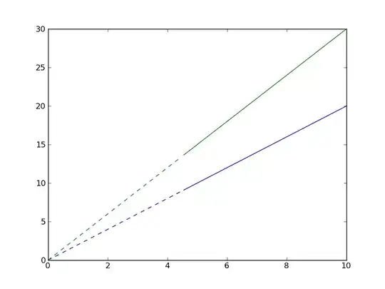
enter image description here

For the case where they're cyclic, use masked arrays:

import numpy as np
import matplotlib.pyplot as plt

x = np.linspace(0, 10, 100)
y1 = 2 * np.cos(x)
y2 = 3 * np.sin(x)

xthresh = 2.0
diff = np.abs(y1 - y2)
below = diff < xthresh
above = diff >= xthresh

# Plot lines below threshold as dotted...
plt.plot(np.ma.masked_where(below, x), np.ma.masked_where(below, y1), 'b--')
plt.plot(np.ma.masked_where(below, x), np.ma.masked_where(below, y2), 'g--')

# Plot lines above threshold as solid...
plt.plot(np.ma.masked_where(above, x), np.ma.masked_where(above, y1), 'b-')
plt.plot(np.ma.masked_where(above, x), np.ma.masked_where(above, y2), 'g-')

plt.show()

enter image description here

Joe Kington
  • 275,208
  • 71
  • 604
  • 463
  • Was thinking on something like that, but somehow decided to do it the complex way :D. Very good :) – Ricardo Cárdenes Feb 14 '12 at 23:38
  • Glad I just refreshed this. Was just considering using a masked array. Very helpful. Thanks to all for the insight. – Sceeerutinizer Feb 14 '12 at 23:46
  • http://stackoverflow.com/questions/27082282/changing-line-style-for-certain-range-of-values-using-matplotlib – Ohm Nov 22 '14 at 20:39
  • Hello, could you clarify what is the line `plt.plot(x[below], y1[below], 'b--')` does? – Ohm Nov 25 '14 at 10:55
  • 1
    @Ohm - It's using numpy's boolean indexing (`below` is a boolean array, e.g. `[True, True, False, False, True]`) to select only the regions of `x` and `y` where `diff < xthresh`. For example, if `x = np.arange(10)`, and we did `print x[x < 5]`, we'd get `[0, 1, 2, 3, 4]`. However, this assumes we have a line with lots of samples. If you have `x = array([0, 1])` and you did `x[x < 0.5]`, you'd just get `0`, not `[0, 0.499999]`. It's just selecting the discrete points where the given condition is true, not interpolating. – Joe Kington Nov 25 '14 at 18:24
  • @JoeKington - Is it possible to do the same trick for contour maps? I tried to use this using this line - 'lt.contour(X[stable],Y[stable], f1[stable], levels = [0],colors = ('r'),linewidths = 4,extend='both')', but it gives TypeError: Input z must be a 2D array – Ohm Nov 30 '14 at 13:24
  • 1
    @Ohm - Yes, but you need to use masked arrays instead. Here's a quick example: https://gist.github.com/joferkington/3ca60b0b05b7310f09e8 – Joe Kington Dec 02 '14 at 02:01
3

Let's say that your data is on NumPy arrays dataset1 and dataset2 and you've defined threshold as your significance

def group(data):
    """Assumes that len(data) > 0"""
    prev = 0
    index = 1
    value = data[0]

    while (index < len(data)):
        if data[index] != value:
            yield (value, prev, index)

            value = not value
            prev = index
        index += 1

    yield (value, prev, index)

diff = np.abs(dataset1 - dataset2)
for significant, start, end in group(diff < threshold):
   # Plot data from dataset1[start:end] and dataset2[start:end]
   # Use the value in "significant" (True/False) to figure out
   # The style
Ricardo Cárdenes
  • 9,004
  • 1
  • 21
  • 34