5

I've following data:

data

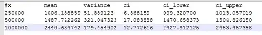
I want to plot a graph shows for all x the mean connected with lines (linespoint) and also showing all the confidence interval [ci_lower, ci_upper]. I managed to do that using 2 plots.

set xrange [0:1100000]
set yrange [0:5000]
plot \
'2011-06-16_1n_result.txt' using 1:7 title '1 node' with lines, \
    '2011-06-16_1n_result.txt' using 1:7:10:11 notitle with errorbars

However it doesn't look nice with two colors and I have the feeling that there should be a way to do that with a single plot.

What's the solution code to that?

Best, Will

Will
  • 2,858
  • 6
  • 33
  • 50

1 Answers1

12

I think you are looking for the yerrorlines. Maybe the following example can help you:

Example

Data.dat:

x,   mean,  min,   max
1,   0.40,  0.29,  0.44
2,   0.44,  0.22,  0.65
3,   0.26,  0.06,  0.50
4,   0.30,  0.08,  0.67
5,   0.53,  0.03,  0.88
6,   0.43,  0.08,  0.97
7,   0.37,  0.02,  0.91
8,   0.53,  0.39,  0.60
9,   0.51,  0.22,  0.86
10,  0.55,  0.31,  0.80

GnuplotFile:

plot [0:11] "Data.dat" using 1:2:3:4 with yerrorlines
Community
  • 1
  • 1
Woltan
  • 13,723
  • 15
  • 78
  • 104