59

I am trying to change my labelText color when focused. I can change the text color but not when focused.

I have tried all the hint text colors and label text colors, but nothing helps.

Container(
  padding: EdgeInsets.fromLTRB(15, 10, 15, 0),
  child: TextFormField(
    cursorColor: Colors.lightGreen,
    keyboardType: TextInputType.phone,
    decoration: InputDecoration(
      labelText: 'Phone Number',
      hintText: 'Enter a Phone Number',
      focusedBorder: OutlineInputBorder(
        borderSide: BorderSide(
          color: Colors.lightGreen
        )
      ),
      border: OutlineInputBorder(
        borderSide: BorderSide()
      ),
    )
  ),
),

Here are images of what is happening:

enter image description here

enter image description here

Philippe Fanaro
  • 6,148
  • 6
  • 38
  • 76
Bnd10706
  • 1,933
  • 5
  • 24
  • 39
  • 1
    Are you trying to change the color of the labelText or hintText in general or are you asking to have it be one color when not in focus and another when in focus? – Adrian Murray Jun 02 '19 at 02:39
  • 2
    I am looking to change the color of the labelText once its in focus. If you see from my pictures, the label text is grey when not selected (which i want) and then when i do select it I want it to go Black(it goes to blue) – Bnd10706 Jun 02 '19 at 02:42

17 Answers17

74

You'd need to have a way determine its focus state and then create a conditional for its color based off of that. This is where a focusNode would be helpful. Construct a new FocusNode off the widget creation, use that as the focusNode property in the TextFormField. Then in color property of the TextStyle property of the TextFormField you could add something like:

FocusNode myFocusNode = new FocusNode();

...

  return TextFormField(
    focusNode: myFocusNode,
    decoration: InputDecoration(
      labelText: 'test',
      labelStyle: TextStyle(
        color: myFocusNode.hasFocus ? Colors.blue : Colors.black
      )
    ),
  );

EDIT : Just a quick note, you'll probably need to make sure this is in a StatefulWidget and then add a listener to the focusNode you created and call setState on any events on that focusNode. Otherwise you wont see any changes.

Philippe Fanaro
  • 6,148
  • 6
  • 38
  • 76
Adrian Murray
  • 2,170
  • 1
  • 13
  • 15
  • this did not work. I added a focus node like you said and followed your example. The labelStyle remained the same color weather in focus or not. – Bnd10706 Jun 02 '19 at 02:51
  • humm.. are you saying call set set on the labelText? – Bnd10706 Jun 02 '19 at 02:56
  • 8
    You don't setState on a property, you call it on an event which that calls a rebuild of the entire widget/class. You're calling setState on the focus event. This would be done by adding a listener in the initState for example. Like : myFocusNode.addListener((){ setState((){}); }) don't forget to dispose of your listeners to prevent memory leaks. – Adrian Murray Jun 02 '19 at 02:59
  • perfect, that did it. Thank you! – Bnd10706 Jun 02 '19 at 03:08
  • This is my first time using a listener (sorry im a beginner, where do I dispose of the listener at? – Bnd10706 Jun 02 '19 at 03:13
  • you override the dispose() method just like you do the initState(). You would need to make the (){} function it's own variable and then call it in both the addListener and removeListener methods of the focusNode you created. This is likely something best read up on in depth rather than my quick explanation. – Adrian Murray Jun 02 '19 at 03:15
  • I will, I appreciate it! – Bnd10706 Jun 02 '19 at 03:18
  • Ok, i found an issue.... I have 6 different forms, and when i add the focus node to the forms, they call go into focus. I dont need to do 6 different focusnodes do it? – Bnd10706 Jun 02 '19 at 03:21
  • 1
    yes, each focus node is meant for each field. That's how you determine where you have focus or where to set focus if you wish to move the user's focus programmatically. An option you may want to consider is to make your own class that wraps all of this color-change-on-focus/unfocus functionality into one place. Then use that class as your way to make text fields. This would actually be a bit more efficient since then you'd only call a rebuild of each textfield on focus change events instead of the whole form/page. – Adrian Murray Jun 02 '19 at 03:31
  • This method is working for changing the color of the text field when focused, but the color does not revert to the original one when blurred. Any ideas? Thanks! – rob_ Jun 08 '20 at 09:17
  • Use the theme, you only have to do it once for all input fields. floatingLabelStyle: TextStyle(color: Colors.blue), – wamae Sep 17 '21 at 06:51
  • This is a good start, although I think a theme-based solution is more sustainable e.g. keeps your code DRY. e.g. inputDecorationTheme: InputDecorationTheme( floatingLabelStyle: TextStyle(color: Colors.blue), ), – wamae Oct 04 '21 at 10:29
  • if you don't want to use focus nodes you can achieve the same effect by setting the primarySwatch:Colors.blue in ThemeData – mister_cool_beans May 02 '22 at 09:05
32

Use themes, this would only have to be done once in a central place:

inputDecorationTheme: InputDecorationTheme(
      floatingLabelStyle: TextStyle(color: Colors.blue),
),
wamae
  • 660
  • 9
  • 21
26

The Summary

You might want to check out Flutter Cookbook's Focus and text fields recipe.

Essentially, we have to:

  1. Create a FocusNode property.
  2. Add initialization and disposal to it.
  3. Add it to the TextFormField.
  4. Add a focus request on every tap on the TextFormField.

1. Create a FocusNode property

class CustomTextFormFieldState extends State<CustomTextFormField> {
  FocusNode _focusNode;
  ...

2. Add initialization and disposal to it

@override
void initState() {
  super.initState();
  _focusNode = FocusNode();
}

@override
void dispose() {
  _focusNode.dispose();
  super.dispose();
}

3. Add it to the TextFormField

@override
Widget build(BuildContext context) {
  return TextFormField(
    focusNode: _focusNode,
    ...

4. Add a focus request on every tap on the TextFormField

Don't forget to use setState:

void _requestFocus(){
  setState(() {
    FocusScope.of(context).requestFocus(_focusNode);
  });
}

Add the method to the TextFormField's onTap property:

@override
Widget build(BuildContext context) {
  return TextFormField(
    focusNode: _focusNode,
    onTap: _requestFocus,
    ...
Philippe Fanaro
  • 6,148
  • 6
  • 38
  • 76
19

https://api.flutter.dev/flutter/material/InputDecoration/labelStyle.html

labelStyle: MaterialStateTextStyle.resolveWith((Set<MaterialState> states) {
          final Color color = states.contains(MaterialState.focused)
              ? Colors.pink
              : Colors.orange;
          return TextStyle(color: color);
        }),
agent linlux
  • 191
  • 1
  • 4
12

A quick solution is changing the primarySwatch from the theme of the Widget MaterialApp. The only disadvantage is that a Material Color is required.

on focus textfield image

enter image description here

Classy-Bear
  • 881
  • 11
  • 19
10

I solve this problem with a Focus widget. First I defined a Color-Variable for each Field:

final _lowColor = Colors.amber[50];   // use your own colors
final _highColor = Colors.amber[200];

Color _field1Color = _lowColor;
Color _field2Color = _lowColor;
...

Then I wrapped each TextFormField with a Focus Widget and change the fieldColor:

child: Focus(
  onFocusChange: (hasFocus) {
    setState(() => _field1Color = hasFocus ? _highColor : _lowColor);
  },
  child: TextFormField(
    ...
      color: _field1Color,
    ...
    ),
  ), 
),
oibees
  • 129
  • 1
  • 3
9

for active/click

floatingLabelStyle: TextStyle(color: Colors.yellow),

for inactive

labelStyle: TextStyle(color: Colors.black),

below is complete example

TextField(
         decoration: InputDecoration(
            hintText: 'Verify Password',
            focusColor: appColor,
            labelText: "Verify Password",
            labelStyle: TextStyle(color: Colors.black),
            floatingLabelStyle: TextStyle(color: appColor),
            floatingLabelBehavior: FloatingLabelBehavior.always
         ),
         cursorColor: appColor,
)
Mudassar Ashraf
  • 734
  • 7
  • 8
8

Here is a quick method without using stateful widget

 return Theme( // 1) wrap with theme widget
   data: Theme.of(context).copyWith(primaryColor: //2) color you want here)
   child: TextFormField(
     focusNode: myFocusNode,
     decoration: InputDecoration(
    labelText: 'test',      
    ),
   ),
  );
David Machara
  • 559
  • 9
  • 13
  • The Text of the unfocused label is "hintColor: ". But it doesn't work, if you use a TextStyle color property in the hintText property of the InputDecoration. I can't tell why not... – th_lo Mar 18 '21 at 11:21
  • 1
    This is hands down the easier way to make it work. Thanks. – DavidMM Jun 04 '21 at 16:26
  • I'm assuming that this needs to apply through the application. Would it be better to do the above or do it at a theme level? – wamae May 30 '22 at 13:14
4

Update

As mentioned by Guilherme in the comment, the later version of Flutter uses different logic to get the color

Color _getActiveColor(ThemeData themeData) {
  if (isFocused) {
    return themeData.colorScheme.primary;
  }
  return themeData.hintColor;
}

Source

You will now need to set it from the colorScheme instead

ThemeData.dark().copyWith(
  colorScheme: ColorScheme.dark(
    primary: activeColor,
  ),
)

Original answer

After digging the source code for the InputDecorator used to determine the label color, here's what I found.

TextStyle _getFloatingLabelStyle(ThemeData themeData) {
  final Color color = decoration.errorText != null
    ? decoration.errorStyle?.color ?? themeData.errorColor
    : _getActiveColor(themeData);
  final TextStyle style = themeData.textTheme.subtitle1.merge(widget.baseStyle);
  return style
    .copyWith(color: decoration.enabled ? color : themeData.disabledColor)
    .merge(decoration.labelStyle);
}

Color _getActiveColor(ThemeData themeData) {
  if (isFocused) {
    switch (themeData.brightness) {
      case Brightness.dark:
        return themeData.accentColor;
      case Brightness.light:
        return themeData.primaryColor;
    }
  }
  return themeData.hintColor;
}

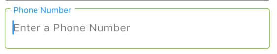
In short, to change the label color, set the primaryColor light theme or accentColor for dark theme.

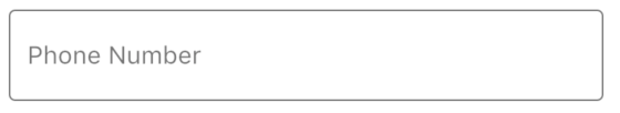
Another tip: To change the label color while it's not focused, set hintColor.

ThemeData.dark().copyWith(
  primaryColor: Colors.red,
  accentColor: Colors.white,
  hintColor: Colors.pink,
)
CopsOnRoad
  • 237,138
  • 77
  • 654
  • 440
Yaobin Then
  • 2,662
  • 1
  • 34
  • 54
  • It seems things have changed in the latest flutter version. Now instead of using "primaryColor" and "accentColor" we need to change "colorScheme": ``ThemeData.dark().copyWith(colorScheme: ColorScheme.dark(primary: activeColor),"`` https://github.com/flutter/flutter/blob/b22742018b3edf16c6cadd7b76d9db5e7f9064b5/packages/flutter/lib/src/material/input_decorator.dart#L2030 – Gui Silva May 20 '21 at 18:54
  • Thanks! Updated the answer to reflect this – Yaobin Then May 21 '21 at 02:42
  • thanks ,after long time ,this is good answer – Mohammed Alanany Nov 16 '21 at 04:25
3

One more clean way to do it with styles (you can add styles to the main theme and use for dark \ light modes)

TextFormField(
  decoration: InputDecoration(
    labelText: "some label",
    labelStyle: const TextStyle(color: Colors.grey),
    floatingLabelStyle: const TextStyle(color: Colors.blueAccent),
  ),),

enter image description here

awaik
  • 10,143
  • 2
  • 44
  • 50
1

you can also use labelStyle when the text field is in focus and if the text field is erroneous (caused by not following the validation)

labelText: 'Password',
     labelStyle: TextStyle(
        color: Colors.black54,
          ),
//when error has occured
     errorStyle: TextStyle(
       color: Colors.black,
         ),
Masudha Meher
  • 93
  • 1
  • 1
  • 7
1

I solved the problem using a StatefulWidget and Focus widget. I use StatefulWidget because you need to use setState to notify the color change when focus on input

enter image description here

class InputEmail extends StatefulWidget {
  @override
  _InputEmailState createState() => _InputEmailState();
}

class _InputEmailState extends State<InputEmail> {
  Color _colorText = Colors.black54;

  @override
  Widget build(BuildContext context) {
    const _defaultColor = Colors.black54;
    const _focusColor = Colors.purple;

    return Container(
      padding: EdgeInsets.symmetric(vertical: 15),
      child: Focus(
        onFocusChange: (hasFocus) {
          // When you focus on input email, you need to notify the color change into the widget.
          setState(() => _colorText = hasFocus ? _focusColor : _defaultColor);
        },
        child: TextField(
          // Validate input Email
          keyboardType: TextInputType.emailAddress,
          
          decoration: InputDecoration(
            hintText: 'example@domain.com',
            labelText: 'Email',
            labelStyle: TextStyle(color: _colorText),
            
            // Default Color underline
            enabledBorder: UnderlineInputBorder(
              borderSide: BorderSide(color: Colors.black26),
            ),

            // Focus Color underline
            focusedBorder: UnderlineInputBorder(
              borderSide: BorderSide(color: Colors.purple),
            ),
            icon: Icon(
              Icons.mail,
              color: Colors.deepPurpleAccent,
            ),
          ),
        ),
      ),
    );
  }
}

Gleny
  • 155
  • 1
  • 5
0

If You want to change the primary color. Just simply define add the primaryColor of the Widget MaterialApp

const appPrimaryColor = Color(0xFF746DF7);
ThemeData theme() {
  return ThemeData(
    scaffoldBackgroundColor: Colors.white,
    fontFamily: "Inter",
    appBarTheme: appBarTheme(),
    textTheme: textTheme(),
    inputDecorationTheme: inputDecorationTheme(),
    visualDensity: VisualDensity.adaptivePlatformDensity,
    primaryColor: appPrimaryColor // <------ HERE
  );
}

MaterialApp(
   title: 'Flutter Demo',
   theme: theme(), // <------ HERE
   home: SplashScreen(),
   routes: routes,
)

enter image description here

Phat Tran
  • 3,404
  • 1
  • 19
  • 22
0

The Material 3 way using ColorScheme for text color and InputDecorationTheme for border color:

var focusColor = Colors.blue;
var nonFocusColor = Colors.grey;

MaterialApp(
  theme: ThemeData(
    colorScheme: ColorScheme.fromSeed(
      primary: focusColor,
      onSurfaceVariant: nonFocusColor,
      // other required props ...
    ),
    inputDecorationTheme: const InputDecorationTheme(
      focusedBorder: OutlineInputBorder(
        borderSide: BorderSide(color: focusColor),
      ),
      enabledBorder: OutlineInputBorder(
        borderSide: BorderSide(color: nonFocusColor),
      ),
    ),
    useMaterial3: true,
  ),
);
galki
  • 8,149
  • 7
  • 50
  • 62
-1

You can wrap the textfield with Theme and set the primary color to whatever you want the label color to be

-1

There is a 'lableStyle' in 'decoration', just like:

labelText: 'Description',
labelStyle: TextStyle(
  color: Colors.lightBlueAccent,
)),
Dharman
  • 30,962
  • 25
  • 85
  • 135
Javen
  • 7
  • 2
-1

There is a floatingLabelStyle parameter in the InputDecoration, you can use it like this:

decoration: InputDecoration(
    labelText: "label",
    hintText: "hint",
    labelStyle: GoogleFonts.roboto(
      color: color.labelColor,
    ),
    floatingLabelStyle: GoogleFonts.roboto(
      color: color.defaultGreen,
    ),),
E_net4
  • 27,810
  • 13
  • 101
  • 139
Hassan Ansari
  • 318
  • 1
  • 3
  • 11