3

I've been trying to get a Bootstrap 4 layout as shown below:

enter image description here

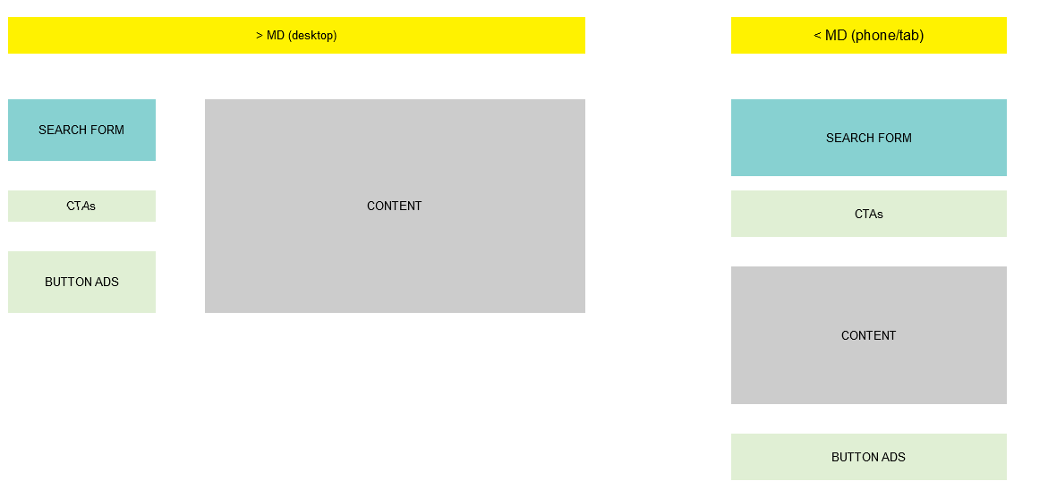
On large devices I need the Search Form, CTAs and Button ads to go in a vertical column 4 wide while the Content will occupy all the space on the right (with variable content and being able grow downwards as required).

For small devices, I want Search Form, CTAs, Content and Button ads to display in that order, taking 100% of screen width.

I'll use the grid ordering classes to alter the normal flow. But for now, I'm stuck and can't the desired layout for large devices. The code I've tried is shown below, but the Content is always below the other items instead of beside it.

This question seems to address this, but the push/pull classes are now gone?

My code (2 tries)

<div class="row align-items-start">

  <div class="col-md-4">
    <div style="height:50px;width:100%;background-color: red;"></div>
  </div> 

  <div class="w-100"></div>

  <div class="col-md-4">
    <div style="height:50px;width:100%;background-color: blue;"></div>
  </div> 

  <div class="w-100"></div>

  <div class="col-md-4">
    <div style="height:50px;width:100%;background-color: green;"></div>
  </div> 

  <div class="w-100"></div>

  <div  class="col-md-8 offset-md-4">
    <div style="height:50px;width:100%;background-color: yellow;"></div>
  </div> 

</div> 


<div class="row ">

  <div class="col-md-4">
    <div style="height:50px;width:100%;background-color: red;"></div>
  </div> 

  <div class="col-md-4">
    <div style="height:50px;width:100%;background-color: blue;"></div>
  </div> 

  <div class="col-md-4">
    <div style="height:50px;width:100%;background-color: green;"></div>
  </div> 

  <div style='float:right;' class="col-md-8 offset-md-4">
    <div style="height:50px;width:100%;background-color: yellow;"></div>
  </div> 

</div> 

KevInSol
  • 2,560
  • 4
  • 32
  • 46
  • I am just learning so don't pay much attention to what I say but, I don't think it is healthy to use `float:right` on cols, maybe you should try offsets or simply making them not 12-col width and applying some `mr-auto` or `ml-auto` – ajax333221 Jul 06 '18 at 16:49
  • Good point - just tried it but did not work for me – KevInSol Jul 06 '18 at 17:09

3 Answers3

5

You need to disable the flexbox (d-md-block) and use floats on the columns at larger screen widths. Then use flexbox order-* for smaller/mobile screen widths.

<div class="container-fluid">
    <div class="row d-md-block">
        <div class="col-md-4 float-left">
            <div style="height:50px;width:100%;background-color: red;">A</div>
        </div>
        <div class="col-md-8 float-right order-1">
            <div style="height:150px;width:100%;background-color: green;">C</div>
        </div>
        <div class="col-md-4 float-left order-0">
            <div style="height:50px;width:100%;background-color: blue;">B</div>
        </div>
        <div class="col-md-4 float-left order-last">
            <div style="height:50px;width:100%;background-color: yellow;">D</div>
        </div>
    </div>
</div>

https://codeply.com/go/jfARR4GYE4


Related:

Bootstrap with different order on mobile version
https://codeply.com/go/mKykCsBFDX

A-B-C-D A-C-B-D

Carol Skelly
  • 351,302
  • 90
  • 710
  • 624
  • 1
    Just seeing this after the weekend - perfect and same with your other answer and explanation. When I put it into the rest of the page the footer content was messed up appearing between the columns. Wrapping your code in a clearfix class solved that. Many thanks! – KevInSol Jul 09 '18 at 12:05
1

You can do it like this

.top{
    background-color: yellow;
    height: 50px;
}

.left-side{
    width: 100%;
}

.first{
    background-color: aqua;
}
.second{
    background-color: green;
}

.third{
    background-color: aquamarine;
}


.content{
    height: 300px;
    background-color: grey;
    width: 100%;
   
}

.show-on-small{
    display: none;
}

@media only screen and (max-width: 768px) {
    
     .show-on-small{
        display: block;
    }

    .hide-on-small{
        display: none;
    }
}
<!DOCTYPE html>
<html lang="en">
<head>
    <meta charset="UTF-8">
    <meta name="viewport" content="width=device-width, initial-scale=1.0">
    <meta http-equiv="X-UA-Compatible" content="ie=edge">
    <title>Document</title>
    
    <link rel="stylesheet" href="https://stackpath.bootstrapcdn.com/bootstrap/4.1.1/css/bootstrap.min.css">
    <link rel="stylesheet" href="sty.css">
</head>
<body>

<div class="container-fluid"> 

    <div class="row">
        <div class="col-12 top">
            MD Desktop
        </div>
    </div>

    <div class="row">
 
        <div class="col-md-4">
            <div class="left-side first">SEARCH FORM</div>
            <div class="left-side second">CTAs</div>
            <div class="left-side third hide-on-small">BUTTON ADS</div>
        </div>
        
        <div class="col-md-8">
            <div class="content">CONTENT</div>
        </div>
        
        <div class="col-md-4 show-on-small">
                <div class="left-side third">BUTTON ADS</div>
        </div>
          
    </div>
</div>
    
</body>
</html>
borbesaur
  • 681
  • 4
  • 10
  • Thank you for such a detailed response. I see you have the button ads in twice - I was really hoping to avoid doing that. I did think of a similar solution (with nested grids). If no other solutions comes I'll have to do something like that. But functionally wise, this is exactly what I want. – KevInSol Jul 06 '18 at 17:06
  • No problem. I was hoping to figure out a way to do it without using a media query but couldn't find a default bootstrap behavior that worked. – borbesaur Jul 06 '18 at 17:56
-1

You can use the order property of flexbox to order in the way you want. You can use media queries to achieve different ordering in different viewports. Refer to https://developer.mozilla.org/en-US/docs/Web/CSS/CSS_Flexible_Box_Layout/Ordering_Flex_Items for more details.

Adi.P
  • 370
  • 1
  • 12
  • It's not the ordering I'm having a problem with, I can't get the layout on the left working. – KevInSol Jul 06 '18 at 16:07
  • For something like this, flex boxes make it complicated. You can use grid structure to do so. Refer https://gridbyexample.com/examples/example7/ – Adi.P Jul 06 '18 at 16:16