5

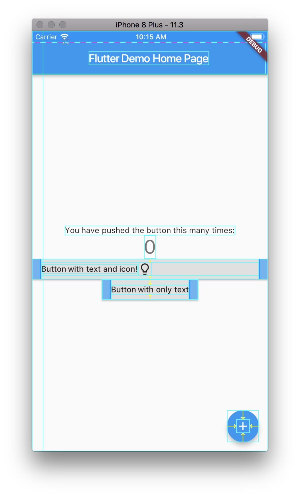
I am trying to create a Flutter app that has a button with a text and icon as label, the icon being placed right of the text. The approach described in this post yields an odd looking button that seems expanded to the width of the app, see this image (link as I am not allowed to attach images):

Button becomes wide when adding a Row widget as child

It is not clear to me which layout widgets to use to tweak the text+image button to be formatted as the plain text button.

The code for producing the above example:

Widget build(BuildContext context) {
    return new Scaffold(
      appBar: new AppBar(
        title: new Text(widget.title),
      ),
      body: new Center(
        child: new Column(
          mainAxisAlignment: MainAxisAlignment.center,
          children: <Widget>[
            new Text(
              'You have pushed the button this many times:',
            ),
            new Text(
              '$_counter',
              style: Theme.of(context).textTheme.display1,
            ),
            new RaisedButton(
              onPressed: _incrementCounter,
              child: new Row(
                children: <Widget>[
                  new Text("Button with text and icon!"),
                  new Icon(Icons.lightbulb_outline)
                ],
              ),
            ),
            new RaisedButton(
              onPressed: _incrementCounter,
              child: new Text("Button with only text")
              ),
          ],
        ),
      ),
      floatingActionButton: new FloatingActionButton(
        onPressed: _incrementCounter,
        tooltip: 'Increment',
        child: new Icon(Icons.add),
      ),
    );
  }
}
Ae Yppek
  • 85
  • 1
  • 1
  • 4

3 Answers3

9

Row property mainAxisSize: MainAxisSize.min does the trick here.

@override
  Widget build(BuildContext context) {
    return new Scaffold(
      appBar: new AppBar(
        title: new Text('Home'),
      ),
      body: new Center(
        child: new Column(
          mainAxisAlignment: MainAxisAlignment.center,
          children: <Widget>[
            new RaisedButton(
              onPressed: () {},
              child: new Row(
                mainAxisAlignment: MainAxisAlignment.center,
                mainAxisSize: MainAxisSize.min,
                children: <Widget>[
                  new Text('Button with text and icon!'),
                  new Icon(Icons.lightbulb_outline),
                ],
              ),
            ),
            new RaisedButton(
              onPressed: () {},
              child: new Text('Button with only text'),
            )
          ],
        ),
      ),
    );
  }
Vinoth Kumar
  • 12,637
  • 5
  • 32
  • 38
7

You can simply use this RaisedButton.icon

Simple Usage:

RaisedButton.icon(
   onPressed: () {},
   elevation: 2.0,
   shape: new RoundedRectangleBorder(
      borderRadius: new BorderRadius.circular(5.0),
   ),
   color: const Color(0xFFFFB822),
   icon: Icon(Icons.add_shopping_cart),
   label: Text("Add to Cart",
             style: TextStyle(
             fontWeight: FontWeight.w900,
    ),
  ),
)
Rasheed
  • 991
  • 1
  • 12
  • 18
0

Very Simple and Easy...

ElevatedButton(
                style: ElevatedButton.styleFrom(
                    primary: Colors.green, elevation: 2),
                onPressed: () {},
                child: Row(
                  children: [
                    Icon(Icons.edit_outlined),
                    SizedBox(
                      width: 10.0,
                    ),
                    Text('Edit'),
                  ],
                ),
              ),

enter image description here

you can change your icon or text color, whatever you want to. Hope this'll help you.

Raghib Arshi
  • 717
  • 8
  • 12