how to have a button with text and icon for the flutter?
I wanted to have a button which looks like icon with a text that is able to put at the bottom of the screen
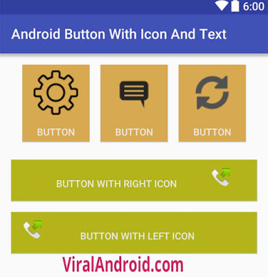
For example, the icon is like at here: android-button-with-icon-and-text

how to have a button with text and icon for the flutter?
I wanted to have a button which looks like icon with a text that is able to put at the bottom of the screen
For example, the icon is like at here: android-button-with-icon-and-text
EDIT 1: With Flutter 1.20 release Flutter Team did breaking changes introducing new buttons. So the below mentioned button types are deprecated. Use TextButton instead of FlatButton and ElevatedButton instead of RaisedButton.
TextButton.icon(onPressed: null, icon: null, label: null);
ElevatedButton.icon(onPressed: null, icon: null, label: null);
See breaking changes for buttons and their themes here
Note: FlatButton and RaisedButton is DEPRECATED
You can simply use named constructors for creating different types of buttons with icons. For instance
FlatButton.icon(onPressed: null, icon: null, label: null);
RaisedButton.icon(onPressed: null, icon: null, label: null);
But if you have specfic requirements then you can always create custom button with different layouts or simply wrap a widget in GestureDetector.
Screenshot:

SizedBox.fromSize(
  size: Size(56, 56), // button width and height
  child: ClipOval(
    child: Material(
      color: Colors.orange, // button color
      child: InkWell(
        splashColor: Colors.green, // splash color
        onTap: () {}, // button pressed
        child: Column(
          mainAxisAlignment: MainAxisAlignment.center,
          children: <Widget>[
            Icon(Icons.call), // icon
            Text("Call"), // text
          ],
        ),
      ),
    ),
  ),
)
You can achieve that by using a FlatButton that contains a Column (for showing a text below the icon) or a Row (for text next to the icon), and then having an Icon Widget and a Text widget as children.
Here's an example:
class MyPage extends StatelessWidget {

  @override
  Widget build(BuildContext context) =>
      Scaffold(
        appBar: AppBar(
          title: Text("Hello world"),
        ),
        body: Center(
          child: Column(
            mainAxisAlignment: MainAxisAlignment.center,
            children: <Widget>[
              FlatButton(
                onPressed: () => {},
                color: Colors.orange,
                padding: EdgeInsets.all(10.0),
                child: Column( // Replace with a Row for horizontal icon + text
                  children: <Widget>[
                    Icon(Icons.add),
                    Text("Add")
                  ],
                ),
              ),
            ],
          ),
        ),
        floatingActionButton: FloatingActionButton(
          onPressed: () => {},
          tooltip: 'Increment',
          child: Icon(Icons.add),
        ),
      );
}
This will produce the following:
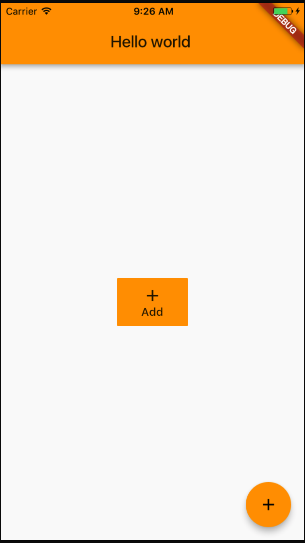
Use Column or Row in a Button child, Row for horizontal button, Column for vertical, and dont forget to contain it with the size you need:
Container(
  width: 120.0,
  height: 30.0,
  child: RaisedButton(
    color: Color(0XFFFF0000),
    child: Row(
      children: <Widget>[
        Text('Play this song', style: TextStyle(color: Colors.white),),
        Icon(Icons.play_arrow, color: Colors.white,),
      ],
    ),
  ),
),
If you need a button like this:
You can use RaisedButton and use the child property to do this. You need to add a Row and inside row you can add a Text widget and an Icon Widget to achieve this. If you want to use png image, you can use similar widget to achieve this.
RaisedButton(
    onPressed: () {},
    color: Theme.of(context).accentColor,
    child: Padding(
      padding: EdgeInsets.fromLTRB(
          SizeConfig.safeBlockHorizontal * 5,
          0,
          SizeConfig.safeBlockHorizontal * 5,
          0),
      child: Row(
        mainAxisAlignment: MainAxisAlignment.spaceBetween,
        children: <Widget>[
          Text(
            'Continue',
            style: TextStyle(
              fontSize: 20,
              fontWeight: FontWeight.w700,
              color: Colors.white,
            ),
          ),
          Icon(
            Icons.arrow_forward,
            color: Colors.white,
          )
        ],
      ),
    ),
  ),
The way i usually do it is by embedding a Row inside the Raised button:
class Sendbutton extends StatelessWidget {
      @override
      Widget build(BuildContext context) {
        return RaisedButton(
          onPressed: () {},
          color: Colors.black,
          textColor: Colors.white,
          child: Row(
            children: <Widget>[
              Text('Send'),
              Icon(Icons.send)
            ],
          ),

        );
      }
    }
The FlatButton, RaisedButton and OutlineButton widgets have been replaced by TextButton, ElevatedButton, and OutlinedButton respectively.
Just put this code below as Button. Also the accepted answer is updated in September, 2021.
TextButton.icon(
    style: TextButton.styleFrom(
      textStyle: TextStyle(color: Colors.blue),
      backgroundColor: Colors.white,
      shape:RoundedRectangleBorder(
        borderRadius: BorderRadius.circular(24.0),
      ),
    ),
    onPressed: () => {},
    icon: Icon(Icons.send_rounded,),
    label: Text('Contact me',),
  ),

You can do something like,
RaisedButton.icon( elevation: 4.0,
                    icon: Image.asset('images/image_upload.png' ,width: 20,height: 20,) ,
                      color: Theme.of(context).primaryColor,
                    onPressed: getImage,
                    label: Text("Add Team Image",style: TextStyle(
                        color: Colors.white, fontSize: 16.0))
                  ),
I hope this will help out. I am using flutter 2.10.1

ElevatedButton.icon(onPressed: null, icon: null, label: null);
How to use ElevatedButton.icon
ElevatedButton.icon(
        icon: const Icon(
          Icons.add_circle,
          color: Colors.white,
        ),
        onPressed: onPressed,
        label: Text(
          "Schedule",
          style: const TextStyle(
              fontSize: 16,
              color: Colors.white),
        ),
        style: ElevatedButton.styleFrom(
          primary: Color.fromARGB(255, 3, 133, 194),
          fixedSize: const Size(208, 43),
        ),
      )
You can read the documentation here: https://api.flutter.dev/flutter/material/ElevatedButton/ElevatedButton.icon.html
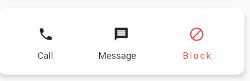
Congrats to the previous answers... But I realised if the icons are in a row (say three icons as represented in the image above), you need to play around with columns and rows.
Here is the code
 Column(
        crossAxisAlignment: CrossAxisAlignment.start,
            children: <Widget>[
              Row(
                mainAxisAlignment: MainAxisAlignment.spaceAround,
                children: [
                  FlatButton(
                      onPressed: () {},
                      child: Icon(
                        Icons.call,
                      )),
                  FlatButton(
                      onPressed: () {},
                      child: Icon(
                        Icons.message,
                      )),
                  FlatButton(
                      onPressed: () {},
                      child: Icon(
                        Icons.block,
                        color: Colors.red,
                      )),
                ],
              ),
              Row(
                mainAxisAlignment: MainAxisAlignment.spaceAround,
                children: <Widget>[
                  Text(
                    '   Call',
                  ),
                  Text(
                    'Message',
                  ),
                  Text(
                    'Block',
                    style: TextStyle(letterSpacing: 2.0, color: Colors.red),
                  ),
                ],
              ),
            ],
          ),
In the Newest Version of Flutter, I think you can use Just IconButton Widget like this :
@override
Widget build(BuildContext context) {
  return Column(
    mainAxisSize: MainAxisSize.min,
    children: <Widget>[
      IconButton(
        icon: const Icon(Icons.volume_up),
        onPressed: () {},
      ),
      Text('Volume')
    ],
  );
}
Hope this helps out, learn more about it from this documentation.
If You need the text to be centered, and the image to be besides it, like this:
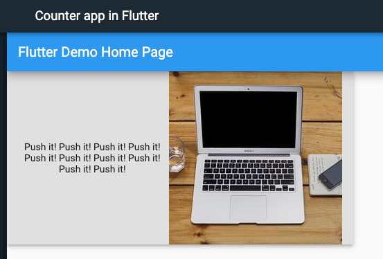
Then You can achieve it with this widget tree:
RaisedButton(
  onPressed: () {},
  child: Row(
    mainAxisAlignment: MainAxisAlignment.spaceBetween,
    children: <Widget>[
      Expanded(child: Text(
        'Push it! '*10,
        textAlign: TextAlign.center,
      ),),
      Image.network(
        'https://picsum.photos/250?image=9',
      ),
    ],
  ),
),
Flutter 2.4:
The best recommended way is using ShapeDecoration
Here is a example using an Inkwell (simulating a button, but you can use a button instead and get same result).
InkWell(
      onTap: (){},
      child: Container(
               width: 50,
               height: 50,
               decoration: ShapeDecoration(
                             shape: CircleBorder(), //here we set the circular figure
                             color: Colors.red
                           ),
                         child: Center(
                              child: Icon(
                                     Icons.email,
                                     size: 30,
                                      color: Colors.white,
                                      )
                            ),
                        )
)
These are the posibles shapes in ShapeDecoration:
RoundedRectangleBorder(),
BeveledRectangleBorder(),
ContinuousRectangleBorder(),
CircleBorder(),
link example of result: https://images.vexels.com/media/users/3/140138/isolated/preview/88e50689fa3280c748d000aaf0bad480-icono-de-ronda-de-correo-electronico-1.png
       TextButton(
            style: TextButton.styleFrom(
                shape: RoundedRectangleBorder(
                    borderRadius: BorderRadius.circular(18.0),
                    side: BorderSide(color: Colors.blue)),
                primary: Colors.black,

                //backgroundColor: Colors.grey,
                onSurface: Colors.grey,
                minimumSize:
                    Size(MediaQuery.of(context).size.width - 20, 40)),
            onPressed: () => null,
            child: Row(
              mainAxisAlignment: MainAxisAlignment.start,
              children: [
                Align(
                  alignment: Alignment.centerLeft,
                  child: new Text("b )",
                      textAlign: TextAlign.start,
                      style: TextStyle(
                        fontSize: 14,
                      )),
                ),
                Image.network(
                    'https://blabala7710263543.jpg'),
              ],
            )),
ElevatedButton.icon(
  icon: const Icon(
    Icons.add_circle,
    color: Colors.green,
  ),
  onPressed: onPressed,
  label: Text(
    "Button",
    style: const TextStyle(
        fontSize: 16,
        color: Colors.green),
  ),
  style: ElevatedButton.styleFrom(
    primary: Color.fromARGB(255, 45, 186, 239),
    fixedSize: const Size(210, 45),
  ),
)
as of flutter 3.3.10 you can achieve this button using Container, Column and InkWell
Like:
InkWell(
              onTap: () {/*DO SOMETHING*/},
              child: Container(
                  height: 100,//PREF HEIGHT
                  width: 100, //PREF WIDTH
                  alignment: Alignment.center,
                  color: Colors.orange, //YOUR BUTTON COLOR
                  child: Column(
                      mainAxisAlignment: MainAxisAlignment.center,
                      children: const [Icon(Icons.add, size:18 /*PREF ICON SIZE*/),SizedBox(height:25), Text('MY BUTTON')]))),
Just use Row and Column combination to achieve the result.
Resizable custom button widget with an icon.

menu_button.dart
import 'package:flutter/material.dart';

class MenuButton extends StatelessWidget {
  final String text;
  final void Function()? onPressed;
  final double width;
  final double height;
  final IconData iconData;
  const MenuButton(
      {required this.text,
      this.onPressed,
      this.width = 200,
      this.height = 60,
      super.key,
      required this.iconData});
  @override
  Widget build(BuildContext context) {
    return SizedBox(
      width: width,
      height: height,
      child: OutlinedButton(
          onPressed: onPressed,
          child: Row(
            mainAxisAlignment: MainAxisAlignment.center,
            children: [
            Icon(iconData),
            SizedBox(
              width: 10,
            ),
            Text(text),
          ])),
    );
  }
}
Call like this:
 ...
MenuButton(
            text: 'О ПРИЛОЖЕНИИ',
            onPressed: () => context.push("/menu/about_app"),
            width: 280,
            iconData: Icons.info_outlined),
 ...