I have a simple CSS related question. How do I obtain the right end blur/fade as shown in the image?

I have a simple CSS related question. How do I obtain the right end blur/fade as shown in the image?
Let's make this:
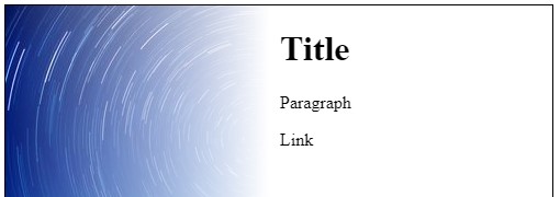
Browser Compatibility: IE 9 + for box-shadow.
Place appropriate box-shadow inset in the div
The div is given left padding to line it's text up with the white part of the background (the box-sizing: border-box essentially absorbs the padding into the width)
div {
  background: url(https://i.stack.imgur.com/AF4np.jpg) no-repeat;
  height: 500px;
  width: 500px;
  border: solid 1px #000;
  padding-left: 300px;
  box-sizing: border-box;
  box-shadow: inset -350px 0 100px 0 #FFF;
}
<div>
<h1>Title</h1>
<p>Paragraph</p>
<a>Link</a>
</div>Browser Compatibility: IE 9 + for multiple background images / IE 10 + for CSS linear gradients (IE 9 can be supported with an IE gradient filter or a partially transparent .png)
The container div is given a linear-gradient background followed by the image background (separated by a comma)
The div is given left padding to line it's text up with the white part of the background (the box-sizing: border-box essentially absorbs the padding into the width)
div {
  background: linear-gradient(to right, rgba(255, 255, 255, 0) 0, rgba(255, 255, 255, 1) 240px, rgba(255, 255, 255, 1) 290px), url(https://i.stack.imgur.com/AF4np.jpg) no-repeat;
  height: 500px;
  width: 500px;
  border: solid 1px #000;
  padding-left: 250px;
  box-sizing: border-box;
}
<div>
<h1>Title</h1>
<p>Paragraph</p>
<a>Link</a>
</div>
Use a CSS gradient that goes from completely transparent to white and position it over the RHS of the image.
background: linear-gradient(to right, rgba(255,255,255,0) 0%,rgba(255,255,255,1) 100%);
Check which vendor prefixes apply to your target platforms.