0

Pardon me if my question is too simple or silly, I have just started working on R. I have searched and tried many times but I am unable to have multiple labels. This is what my code looks like:

datato<-read.table("forS.txt",header=TRUE)
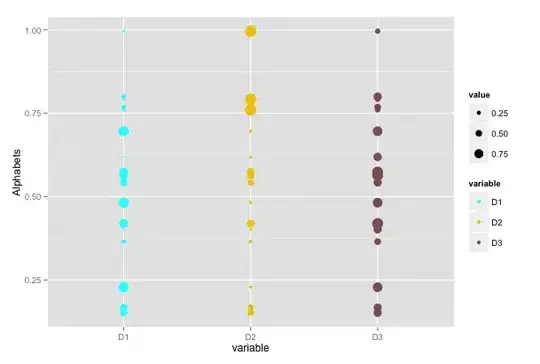
g<-ggplot(datato)

g+
geom_point(aes(x=Point1,y=Alphabets,size=D1),fill="cyan",shape=21)+
geom_point(aes(x=Point2,y=Alphabets,size=D2),fill="gold2",shape=21)+
geom_point(aes(x=Point3,y=Alphabets,size=D3),fill="lightpink4",shape=21)+
scale_size(range = c(0, 20),name="") + theme(axis.text.x = element_text(size =    15,face="bold"),axis.text.y = element_text(size = 15,face="bold"))+   
xlab("Numbers") + ylab("Alphabets Freq")+ggtitle("Bubble Chart")+
scale_x_continuous(limits = c(1, 15))+
scale_shape_manual(values=1:3, labels = c("DDD", "EEE", "FFF"))

I am plotting D1 against, alphabets and so with D2 and D3. I get a nice bubble plot as I need. But in the end, I get label for lightpink4 on the right hand size, which is by default and overrides the previous labels. But I want to show cyan is for D1, gold2 for D2 and lightpink4 for D3 on the right hand side. I cannot figure out, how to use: scale_shape_manual

Please help me understand this.

 Alphabets  D1  D2  D3  Point1  Point2  Point3
A   0.094   0.073   0.11    1   2   3


B   0.019   0.08    0.09    1   2   3

C   0.086   0.059   0.05    1   2   3

D   0.03    0.021   0.09    1   2   3
Death Metal
  • 830
  • 3
  • 9
  • 26

1 Answers1

1
  • reshape your data into a long format. That much more useful with ggplot2
  • you want colour instead of fill
  • you want scale_colour_manual instead of scale_shape_manual

This should work:

library(ggplot2)
library(reshape2)

dataset <- data.frame(
  Alphabets = runif(18), 
  D1 = runif(6), 
  D2 = runif(6), 
  D3 = runif(6)
)

molten <- melt(
  dataset, 
  id.vars = "Alphabets", 
  measure.vars = c("D1", "D2", "D3")
)


ggplot(molten, aes(x = variable, y = Alphabets, size = value, colour = variable)) +
  geom_point() +
  scale_colour_manual(values = c("D1" = "cyan", "D2" = "gold2", "D3" = "lightpink4"))

plot

Community
  • 1
  • 1
Thierry
  • 18,049
  • 5
  • 48
  • 66
  • Thank you for the help. I saw many posts for `melt`, but didn't understand much from it. What is this (below): this doing?? `dataset <- data.frame( Alphabets = runif(18), D1 = runif(6), D2 = runif(6), D3 = runif(6) )` – Death Metal Mar 24 '14 at 00:22
  • That is just generating some sample data since you didn't provide any. – rawr Mar 24 '14 at 00:49
  • @rawr Hi.. I was having trouble putting sample data on top, I had put the sample data at last. Alphabets, etc.. Sorry for the confusion. – Death Metal Mar 24 '14 at 00:54
  • @Thierry This works like a charm. I see, instead of iterating geom_point(aes(x=Point1,y=Alphabets,size=D1),fill="cyan",shape=21)+ You simply used one command geom_point and it worked on all the bubbles.. How is it so? – Death Metal Mar 24 '14 at 01:57