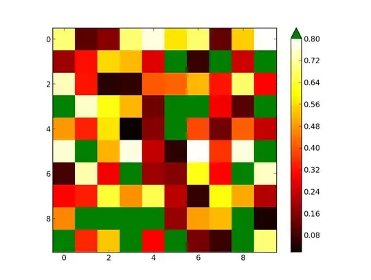
I am generating a heat map with data that has a fixed outlier number and I need to show these outliers as a colour out of the colour palette of the cmap I use which is "hot". With the use of cmap.set_bad('green') and np.ma.masked_values(data, outlier), I get a plot which looks right but the color bar is not getting synced with the data properly even if I use cmap.set_over('green'). Here is the code I have been trying:
plt.xlim(0,35)
plt.ylim(0,35)
img=plt.imshow(data, interpolation='none',norm=norm, cmap=cmap,vmax=outlier)

cb_ax=fig.add_axes([0.85, 0.1, 0.03, 0.8])

cb=mpl.colorbar.ColorbarBase(cb_ax,cmap=cmap,norm=norm,extend='both',spacing='uniform')
cmap.set_over('green')
cmap.set_under('green')
Here is the data (outlier is 1.69 obviously):
Data;A;B;C;D;E;F;G;H;I;J;K
A;1.2;0;0;0;0;1.69;0;0;1.69;1.69;0
B;0;0;0;0;0;1.69;0;0;1.69;1.69;0
C;0;0;0;0;0;1.69;0;0.45;1.69;1.69;0.92
D;1;0;-0.7;-1.2;0;1.69;0;0;1.69;1.69;0
E;0;0;0;0;0;1.69;0;0;1.69;1.69;0
F;1.69;1.69;1.69;1.69;1.69;1.69;1.69;1.69;1.69;1.69;1.69
G;0;0;0;0;0;1.69;0;0;1.69;1.69;0
H;0;0;0;0;0;1.69;0;0;1.69;1.69;0
I;1.69;1.69;1.69;1.69;1.69;1.69;1.69;1.69;1.69;1.69;1.69
J;1.69;1.69;1.69;1.69;1.69;1.69;1.69;1.69;1.69;1.69;1.69
K;0;0;0;0;0;1.69;0;0;1.69;1.69;0
Appreciate any help