0

I'd like to generate a colorbar for values stored in a list

def map_values_to_color(data: List, cmap: str, integer=False):
   
    norm = matplotlib.colors.Normalize(vmin=min(data), vmax=max(data), clip=True)
    mapper = cm.ScalarMappable(norm=norm, cmap=cmap)

    if integer:
        color = [[r, g, b] for r, g, b, a in mapper.to_rgba(data, bytes=True)]
    else:
        color = [[r, g, b] for r, g, b, a in mapper.to_rgba(data)]

    colorlist = [(val, color) for val, color in zip(data, color)]

    return colorlist
    
if __name__ == '__main__':


    vals = [100, .80, .10, .79, .70, .60, .75, .78, .65, .90] 

    colorlist = map_values_to_color(data=vals, cmap='bwr_r', integer=True)

Any suggestions on how to generate just the colorbar will be really helpful.

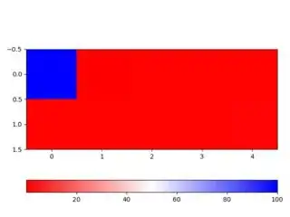
EDIT: Output obtained from the below code:

enter image description here

EDIT2: The below answer might be useful for lists without outliers. However, my data has outliers and I am still looking for suggestions/ inputs on how to visualize the data with outliers efficiently using a colorbar i.e some sort of a discrete colorbar.
Natasha
  • 1,111
  • 5
  • 28
  • 66

1 Answers1

1

As they told you, you need a 2-d array to use imshow, but you need a 1-row, N-columns array to represent the inherently mono-dimensionality of a list.

Further, we can apply a little bit of cosmetics to the ticks to simplify the plot (I removed the y ticks because you do not really have an y axis) and to make easier to identify the outliers (I specified a denser set of x ticks — beware that for a really long list this must be adapted in some way).

Last but not least, you have a strict definition of outliers and want a colormap describing in detail the correct range and evidencing the outliers, with this regard I have adapted an answer by Joe Kington, in which we modify the colormap to show contrasting colors for the outliers and specify, at the level of imshow, which is the range outside of which we have outliers.

Here it is my script (note the extended slicing syntax that makes a 1-d array a 2-d one, the use of vmin and vmax, the use of `extend='both' and how we set the contrasting colors for the outliers)

import numpy as np
import matplotlib.pyplot as plt

vals = [100, .80, .10, .79, .70, -80, .75, .78, .65, .90]
arr = np.array(vals)[None, :] # arr.shape ⇒ (1, 10)
###   #######################
im = plt.imshow(arr, vmin=0, vmax=1, cmap='bwr')                
cbar = plt.colorbar(im, extend='both', orientation='horizontal')
cbar.cmap.set_under('yellow') , cbar.cmap.set_over('green')
plt.xticks(range(len(vals))), plt.yticks(())
plt.show

The script produces

enter image description here

gboffi
  • 22,939
  • 8
  • 54
  • 85
  • Thanks for the response . But I still see the same problem after adding `plt.colorbar()`. The values that are less than 1 are assigned a single color. I'd like to view the values < 1 with distinct color mapping. – Natasha Sep 06 '20 at 06:41