What is the easiest way to put checkbox content (text) on the left side of the checkbox itself?
Asked
Active
Viewed 7.6k times
8 Answers
112
A solution that maximizes "easiness" and "correctness" is to make a RightToLeft checkbox with LeftToRight content:
<CheckBox FlowDirection="RightToLeft">
    <TextBlock FlowDirection="LeftToRight" Text="CheckBox Content:" />
</CheckBox>
Or if you'd like a style:
<Style TargetType="CheckBox">
    <Setter Property="FlowDirection" Value="RightToLeft" />
    <Setter Property="ContentTemplate">
        <Setter.Value>
            <DataTemplate>
                <ContentControl FlowDirection="LeftToRight" Content="{Binding}" />
            </DataTemplate>
        </Setter.Value>
    </Setter>
</Style>
nmclean
- 7,564
- 2
- 28
- 37
-
25For whatever reason, this flips the checkmark glyph, too (*note:* .NET 4.5), which renders this solution useless. Best bet would be to edit a copy of the original style and customize the template to handle this. – erodewald Apr 27 '15 at 13:42
-
1Since some people might not be aware of how to get a copy of the default `CheckBox` style, I decided to throw my implementation (which leverages attached properties) up on [a gist](https://gist.github.com/gen3ric/be2aa4a6d2d82739b835) which includes the **full** `CheckBox` style with some minor modifications to the `ControlTemplate.Triggers`. – erodewald Apr 27 '15 at 14:31
-
1@nmclean in your solution missing flip the checkmark glyph. @Erode, you can easily flip the glyph as @Lance suggested setting `FlowDirection` for `Path` ([Lance Solution](http://stackoverflow.com/a/31649285/2122718)) – marbel82 Jul 06 '16 at 08:14
-
1Not only is the check mark flipped, but so are any question marks "?" flipped to the start of the sentence. @Lance provides a complete solution based on the above by adding extra FlowDirection hints ([Link to Solution from Lance below](https://stackoverflow.com/questions/17465867/text-on-the-left-side-of-checkbox-in-wpf/31649285#31649285)) and for the more inquisitive punker76 provides a complete custom control. – Lucien Murray-Pitts Jul 16 '20 at 22:28
-
To resolving the flip of the checkmark glyph see: https://stackoverflow.com/questions/24217199/checkbox-tick-mirrored-when-changing-flowdirection – Hosein Aqajani Aug 03 '20 at 08:12
34
In code:
System.Windows.Controls.CheckBox checkBox = new System.Windows.Controls.CheckBox();
checkBox.Content = ":CheckBox Enabled";
checkBox.FlowDirection = System.Windows.FlowDirection.RightToLeft;
In XAML:
<CheckBox FlowDirection="RightToLeft" Content=":CheckBox Enabled" />
EDIT
User punker76 helped me notice that colon ":" has to be places infront of the text to be displayed correctly, at the end ("CheckBox Enabled:"), probably caused by an affect flow direction has on text element. Nice catch.
Till Helge
- 9,253
- 2
- 40
- 56
Ivan Peric
- 4,263
- 3
- 23
- 32
-
4There is a problem with this: your tick-mark gets flipped horizontally, at least when implemented as a stroke array. This happens because all components which make up the CheckBox inherit the FlowDirection property. The solution is explained here: [link](http://stackoverflow.com/questions/20911471/wpf-button-icon-gets-mirrored-why/20912496#20912496) – 2.718 Feb 20 '14 at 03:32
-
@punker76 The same issue causes the ":ABC" to be displayed as "ABC:". Setting the ContentPresenter's FlowDirection to LeftToRight makes the text display as expected for left to right scripts. – 2.718 Feb 20 '14 at 03:55
27
I spent two hours for it, but i found the best decision
<Style x:Key="TextAlignLeft" TargetType="CheckBox">
    <Style.Resources>
        <Style TargetType="Path">
            <Setter Property="FlowDirection" Value="LeftToRight" />
        </Style>
        <Style TargetType="TextBlock">
            <Setter Property="FlowDirection" Value="LeftToRight" />
        </Style>
    </Style.Resources>

    <Setter Property="FlowDirection" Value="RightToLeft" />
</Style>
JumpingJezza
- 5,498
- 11
- 67
- 106
Lance
- 764
- 1
- 7
- 18
-
1I tested this in windows 10 Visual Studio 2017 and works well, the tick direction is correct too. – Sorush Mar 20 '19 at 14:22
26
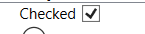
I know it's been a while and I'm late. But after going through several complicated answers and searching a lot on the internet I finally found the simplest way to achieve this without distorting the tick from here.
<CheckBox Content="Checked" FlowDirection="RightToLeft">
    <CheckBox.Resources>
        <Style TargetType="{x:Type Path}">
            <Setter Property="FlowDirection" Value="LeftToRight" />
        </Style>
    </CheckBox.Resources>
</CheckBox>
Result:
17
Another way is to make a new custom style
<ResourceDictionary xmlns="http://schemas.microsoft.com/winfx/2006/xaml/presentation"
                    xmlns:Microsoft_Windows_Themes="clr-namespace:Microsoft.Windows.Themes;assembly=PresentationFramework.Aero"
                    xmlns:x="http://schemas.microsoft.com/winfx/2006/xaml">
  <SolidColorBrush Color="#F4F4F4"
                   x:Key="CheckBoxFillNormal" />
  <SolidColorBrush Color="#8E8F8F"
                   x:Key="CheckBoxStroke" />
  <Style x:Key="EmptyCheckBoxFocusVisual">
    <Setter Property="Control.Template">
      <Setter.Value>
        <ControlTemplate>
          <Rectangle Margin="1"
                     SnapsToDevicePixels="true"
                     Stroke="{DynamicResource {x:Static SystemColors.ControlTextBrushKey}}"
                     StrokeDashArray="1 2"
                     StrokeThickness="1" />
        </ControlTemplate>
      </Setter.Value>
    </Setter>
  </Style>
  <Style x:Key="CheckRadioFocusVisual">
    <Setter Property="Control.Template">
      <Setter.Value>
        <ControlTemplate>
          <Rectangle Margin="14,0,0,0"
                     SnapsToDevicePixels="true"
                     Stroke="{DynamicResource {x:Static SystemColors.ControlTextBrushKey}}"
                     StrokeDashArray="1 2"
                     StrokeThickness="1" />
        </ControlTemplate>
      </Setter.Value>
    </Setter>
  </Style>
  <Style TargetType="{x:Type CheckBox}"
         x:Key="ContentLeftCheckBoxStyle">
    <Setter Property="Foreground"
            Value="{DynamicResource {x:Static SystemColors.ControlTextBrushKey}}" />
    <Setter Property="Background"
            Value="{StaticResource CheckBoxFillNormal}" />
    <Setter Property="BorderBrush"
            Value="{StaticResource CheckBoxStroke}" />
    <Setter Property="BorderThickness"
            Value="1" />
    <Setter Property="FocusVisualStyle"
            Value="{StaticResource EmptyCheckBoxFocusVisual}" />
    <Setter Property="VerticalContentAlignment"
            Value="Center" />
    <Setter Property="Template">
      <Setter.Value>
        <ControlTemplate TargetType="{x:Type CheckBox}">
          <StackPanel Orientation="Horizontal">
            <ContentPresenter HorizontalAlignment="{TemplateBinding HorizontalContentAlignment}"
                              Margin="{TemplateBinding Padding}"
                              RecognizesAccessKey="True"
                              SnapsToDevicePixels="{TemplateBinding SnapsToDevicePixels}"
                              VerticalAlignment="{TemplateBinding VerticalContentAlignment}" />
            <BulletDecorator Background="Transparent"
                             SnapsToDevicePixels="true"
                             VerticalAlignment="{TemplateBinding VerticalContentAlignment}">
              <BulletDecorator.Bullet>
                <Microsoft_Windows_Themes:BulletChrome Background="{TemplateBinding Background}"
                                                       BorderBrush="{TemplateBinding BorderBrush}"
                                                       IsChecked="{TemplateBinding IsChecked}"
                                                       RenderMouseOver="{TemplateBinding IsMouseOver}"
                                                       RenderPressed="{TemplateBinding IsPressed}" />
              </BulletDecorator.Bullet>
            </BulletDecorator>
          </StackPanel>
          <ControlTemplate.Triggers>
            <Trigger Property="HasContent"
                     Value="true">
              <Setter Property="FocusVisualStyle"
                      Value="{StaticResource CheckRadioFocusVisual}" />
              <Setter Property="Padding"
                      Value="0,0,4,0" />
            </Trigger>
            <Trigger Property="IsEnabled"
                     Value="false">
              <Setter Property="Foreground"
                      Value="{DynamicResource {x:Static SystemColors.GrayTextBrushKey}}" />
            </Trigger>
          </ControlTemplate.Triggers>
        </ControlTemplate>
      </Setter.Value>
    </Setter>
  </Style>
</ResourceDictionary>
usage:
<CheckBox Style="{StaticResource ContentLeftCheckBoxStyle}" Content="CheckBox:" />
hope that helps!
punker76
- 14,326
- 5
- 58
- 96
-
3I guess we were all aware of that answer and we know it is the right way to solve this problem, but "the easiest" way is to just change flow direction. :) – Ivan Peric Jul 04 '13 at 10:31
-
1
-
12This answer should really be marked as correct. It does all the right things and has no problems with flipped checkmarks and reversed text. The answer which advocates the use of FlowDirection, does not work consistently for character order and non-symmetrical checkmarks. – 2.718 Feb 27 '14 at 04:45
-
There may be a problem: "The type 'Microsoft_Windows_Themes:BulletChrome' was not found. Verify that you are not missing an assembly reference and that all referenced assemblies have been built." See: https://stackoverflow.com/questions/2304779/wpf-microsoft-windows-themes-not-found . – Ivan P. May 19 '21 at 11:59
15
Another workaround, to avoid the subtle problems discussed above with flow direction and the large amount of code when defining an entirely new CheckBox style, is to just use a WrapPanel containing a Label (with the desired CheckBox content string) and a CheckBox (with no content string).
<WrapPanel>
    <Label Content="Checkbox content"/>
    <CheckBox VerticalAlignment="Center" Margin="5,0,0,0"/>
</WrapPanel>
Bill Foster
- 151
- 1
- 2
-
5This is simple and easy but you lose the ability to also to click the text to check the box that some of these other solutions afford you. – windowsgm Mar 14 '18 at 16:35
5
easiest way is to use a stack panel:
            <StackPanel Orientation="Horizontal">
                <TextBlock Text="Some Text"/>
                <CheckBox  />
            </StackPanel>
John
- 1,714
- 21
- 41
-
3i guess this is ok if you don't mind losing the ability to check/uncheck when clicking on the text – failedprogramming Mar 20 '15 at 05:43
-
3
0
You can edit the checkbox template and over there can place the textblock ahead of the rectangle
Arushi Agrawal
- 619
- 3
- 10