4

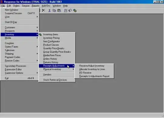
Can anyone please tell me what I need to do with the code below to display a trendline over my barchart. Thanks!

I am using the JqPlot plugin. Here's the code to date...

<!DOCTYPE html PUBLIC "-//W3C//DTD XHTML 1.0 Transitional//EN" "http://www.w3.org/TR/xhtml1/DTD/xhtml1-transitional.dtd">
<html xmlns="http://www.w3.org/1999/xhtml">

<head>
    <script language="javascript" type="text/javascript" src="excanvas.min.js"></script>
    <script language="javascript" type="text/javascript" src="jquery-1.3.2.min.js"></script>
    <script language="javascript" type="text/javascript" src="jquery.jqplot.min.js"></script>
    <script language="javascript" type="text/javascript" src="jqplot.categoryAxisRenderer.min.js"></script>
    <script language="javascript" type="text/javascript" src="jqplot.barRenderer.min.js"></script>


    <link rel="stylesheet" type="text/css" href="jquery.jqplot.css" />

    <script type="text/javascript">
        var planned = [70000,90000,120000,100000,];
        var actual = [80000,80000,150000,120000];
        var xAxis = ['Jan', 'Feb', 'Mar', 'Apr'];
        $(function() {  
            $.jqplot('chartDiv', [planned, actual], BarChart());
        });


        function BarChart()
        {
            var optionsObj = {
                title: 'Departmental Savings',
                axes: {
                     xaxis: {
                        renderer: $.jqplot.CategoryAxisRenderer,
                        ticks: xAxis,                       
                    },
                    yaxis: {
                        tickOptions: { showMark: false, formatString: "%d" },                       
                    },
                },

            grid: {
                    borderColor: "#fff",
                    background: "#FFF",
                    drawGridlines: false,
                    shadow: false
                }, 

                series: [
                    {label:'Planned'},
                    {label: 'Actual'}
                    ],

                legend: {
                    show: true,
                    location: 'sw',
                    xoffset: -70,
                    yoffset: -22,
                    },

                seriesDefaults:{
                    shadow: false,
                    renderer:$.jqplot.BarRenderer,
                    rendererOptions:{
                       barPadding: 0,
                       barMargin: 10,
                       barWidth: 25,
                   }

                },  
            };
            return optionsObj;
        }


    </script>

</head>

<body>

<div>
     <div id="chartDiv" />
    </div>
</div>
</body>
</html>

As you can see I have a bit of work still to do! The top image is where I am currently, The bottom one is what it will hopefully look like when i'm done!

The fluff around the edges is simple CSS stuff!

enter image description here

decbrad
  • 191
  • 5
  • 15
  • what does your trend line represent? From your example plot it looks like the mid point of Planned? – Mark Mar 19 '12 at 22:43

1 Answers1

4

Here's an example where the "trend-line" is the mean of the planned and actual, plotted as a line over the bar graph:

enter image description here

All I did was add a third series with the trend data. In the series options I set the "renderer" to bar for the two bar series, leaving the third to be the default line. Fiddle here (you have to cache the JS files since jqplot does not allow hotlinking).

    var planned = [70000,90000,120000,100000,];
    var actual = [80000,80000,150000,120000];
    var trend = [75000, 85000, 140000, 110000];
    var xAxis = ['Jan', 'Feb', 'Mar', 'Apr'];

    $(function() {  
        $.jqplot('chart1', [planned, actual, trend], BarChart());
    });


    function BarChart()
    {
        var optionsObj = {
            title: 'Departmental Savings',
            axes: {
                 xaxis: {
                    renderer: $.jqplot.CategoryAxisRenderer,
                    ticks: xAxis,                       
                },
                yaxis: {
                    tickOptions: { showMark: false, formatString: "%d" },                       
                },
            },

            grid: {
                borderColor: "#fff",
                background: "#FFF",
                drawGridlines: false,
                shadow: false
            }, 

            series: [
                {label:'Planned',renderer:$.jqplot.BarRenderer},
                {label: 'Actual',renderer:$.jqplot.BarRenderer},
                {label: 'Mean of Planned and Actual'}
                ],

            legend: {
                show: true,
                location: 'nw'
                },

            seriesDefaults:{
                shadow: false,

                rendererOptions:{
                   barPadding: 0,
                   barMargin: 10,
                   barWidth: 25,
               }

            },  
        };
        return optionsObj;
    }
Mark
  • 106,305
  • 20
  • 172
  • 230
  • Hi Mark, fantastic! Thanks for the guidance! Managed to get it looking more or less the same as the screenshot... cheers! – decbrad Mar 21 '12 at 03:13
  • Hi again Mark! Maybe you can help! I am trying to limit the number of point labels that display in the grid! Maybe you know how? thanks for all you help! http://stackoverflow.com/questions/9807451/jqplot-limiting-point-labels-displayed-to-just-1-series – decbrad Mar 21 '12 at 15:16