0

I'd like to create a function X which applies another function Y to several variables.

Function Y

DplotV <- function (id,x){
    D <- as.data.frame(cbind(id,x))
    x1 <- as.data.frame(D[order(x),])
    dotchart(x1$x,labels=id,pch=16)
}

DplotV(mydata$id,mydata$blood)

This basically sorts the id and the variable x by the variable x and creates a dotplot. I've also created some code which names the chart and saves it by taking the x variable name, which I've not included here. In the full function I also have other parameters such as color etc... so writing the function for each variable becomes a repetitive and long task.

When working on a big dataset it would be ideal to plot several variables by the same id variable.

Is there a way to apply the function above to each variable in the dataset (but always using the same id variable?)

Ideally I'd like a function (e.g. DplotData) which applies DplotV to all the variables in the dataset (except the id var if possible), so that I can just write DplotData(mydata$id,mydata) and the function will loop through all the dataset variables (blood and weight in this case).

joran
  • 169,992
  • 32
  • 429
  • 468
maycobra
  • 417
  • 7
  • 15
  • 1
    You're reinventing the wheel here. `dotchart` does what you describe already, provided you organize your data correctly. See the examples in `?dotchart`. The other option is faceting using **ggplot2** or **lattice**. – joran Mar 12 '12 at 18:11
  • http://stackoverflow.com/questions/9666151/r-pass-variable-name-to-plotting-function-title-in-r for loop does exactly what's needed – Marco M Mar 13 '12 at 17:46
  • Thank [you](http://stackoverflow.com/questions/9666151/r-pass-variable-name-to-plotting-function-title-in-r) – maycobra Mar 20 '12 at 16:02

2 Answers2

2

Using the examples from ?dotchart, if you organize your data similarly to VADeaths:

VADeaths
      Rural Male Rural Female Urban Male Urban Female
50-54       11.7          8.7       15.4          8.4
55-59       18.1         11.7       24.3         13.6
60-64       26.9         20.3       37.0         19.3
65-69       41.0         30.9       54.6         35.1
70-74       66.0         54.3       71.1         50.0

where each column is a variable, and the rownames are ids, then simply calling dotchart(VADeaths) results in a grouped dotchart:

enter image description here

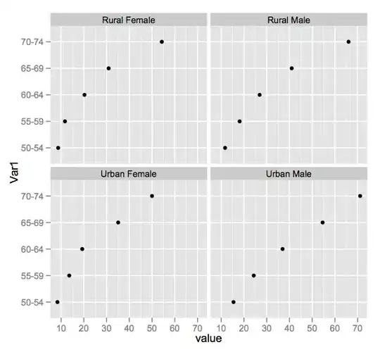
Alternatively, you could use faceting, by melting your data into a long format and then using ggplot:

require(plyr)
require(ggplot2)
ggplot(melt(VADeaths),aes(y = Var1,x = value)) + 
    facet_wrap(~Var2) + 
    geom_point()

enter image description here

joran
  • 169,992
  • 32
  • 429
  • 468
  • Dear Joran,thanks for your help. I forgot to mention that I had already tried these but unfortunately I have too many id values for these to be of manageable size. These are good for data exploration, but if you have 30 id categories the plots will be too big and the id labels too small. If you're working with individual plots on the other hand it's much easier to customise the shape and make it fit into a report. – maycobra Mar 12 '12 at 18:50
0

Bottom of this post

Pass variable name to plotting function title

integrating for loop in the plot chart does exactly what's needed.

Community
  • 1
  • 1
Marco M
  • 623
  • 1
  • 8
  • 15