29

The Problem:

enter image description here


The Question

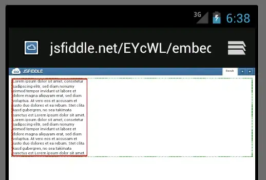
The paragraph will fill the complete width of the page in

  • Firefox
  • Firefox Mobile (tested with 4.0.3 on SGS2)
  • Chrome
  • Chrome Mobile Beta (tested with 4.0.3 on SGS2)
  • Internet Explorer
  • Internet Explorer Mobile (testes with Windows Phone Emulator)
  • Opera Mobile (tested with 4.0.3 on SGS2)
  • Android native browser (tested with 4.0.3 on SGS2 and Android emulator)

What do I have to do so it does the same in the default Android browser?


I tried:

Please note that this example is reduced to show the problem which I have on a much larger page. So I would like the solution to be as little disruptive as possible. For example, setting all paragraphs on my site to float seems like a bad idea.

width

Increasing the value of the width property on the p CSS class has no effect.
Relative values: 100% and 1000% have no effect. Values <100% have an effect (paragraph becomes thinner).
Absolute values: 1000px doesn't expand the width, low values decrease it though.

float

When setting float : right; on the paragraph, it will display as desired:
enter image description here

CSS Reset

When I insert these CSS Reset styles, the width of the paragraph is unaffected.

position

When setting position to absolute on the paragraph, it will display as desired. But I'm unsure if that would be safe to generally have enabled.


The Source:

<!DOCTYPE html
     PUBLIC "-//W3C//DTD XHTML 1.0 Transitional//EN"
     "http://www.w3.org/TR/xhtml1/DTD/xhtml1-transitional.dtd">
<html xmlns="http://www.w3.org/1999/xhtml">
  <head>
    <title>Android Browser Issue</title>
    <meta http-equiv="Content-Type" content="text/html; charset=utf-8" />
    <style>
      body {
        border : 3px dotted green;
        margin : 0;
        padding: 0;
      }
      p {
        border : 3px solid red;
        margin : 0;
        padding: 0; 
      }
    </style>
  </head>
  <body>
    <p>Lorem ipsum dolor sit amet, consetetur sadipscing elitr, sed diam nonumy eirmod tempor invidunt ut labore et dolore magna aliquyam erat, sed diam voluptua. At vero eos et accusam et justo duo dolores et ea rebum. Stet clita kasd gubergren, no sea takimata sanctus est Lorem ipsum dolor sit amet. Lorem ipsum dolor sit amet, consetetur sadipscing elitr, sed diam nonumy eirmod tempor invidunt ut labore et dolore magna aliquyam erat, sed diam voluptua. At vero eos et accusam et justo duo dolores et ea rebum. Stet clita kasd gubergren, no sea takimata sanctus est Lorem ipsum dolor sit amet.</p>
  </body>
</html>

You can see it here: http://jsfiddle.net/EYcWL/embedded/result/ or go there directly: enter image description here

Community
  • 1
  • 1
Oliver Salzburg
  • 21,652
  • 20
  • 93
  • 138

8 Answers8

12

I've found a solution to this issue that actually works!! This is actually a setting in the android browser "Auto-Fit Pages". Turning that off will resolve this issue with certainty.

Mike

mcottingham
  • 1,926
  • 2
  • 18
  • 28
9

This is not a bug, you don't need a fix in ECMAScript to solve this.

You have to think about the tree in which your content resides.

window
 \- html
   \- body
     \- p
       \- content

So, your content's width is determined by the CSS attributes on the p element. So, as you will want the text to be as width as your browser's window is we can try to put its width to 100%; thus:

p { width: 100%; display: block; margin: 0px; padding: 0px; }

However, you will experience that this isn't working as you thought. This is however not a bug, but simply a misunderstanding of the standard. Let't have a look at what the standard has to tell us about setting a percentual width on an element, see the width property in the visual formatting model details:

<percentage>
Specifies a percentage width. The percentage is calculated with respect to the width of the generated box's containing block. If the containing block's width depends on this element's width, then the resulting layout is undefined in CSS 2.1.

Emphasis mine, this text says that it is calculated with respect to the width of the containing block. Looking back at our tree, p is contained within body. So, what's the width of our containing block?

We haven't defined that width yet, so it is taking on some value determined by the browser.

The solution here is to define the width of the body as well, which translates to adding 6 characters:

html, body, p { width: 100%; display: block; margin: 0px; padding: 0px; }

So, now your html's width is 100% of your window's width, body's width is 100% of your html and your p's width is 100% of your body. this should get all the width's right.

The bottom line is to think about your DOM tree and check out the CSS standard...

Tamara Wijsman
  • 12,198
  • 8
  • 53
  • 82
  • Doesnt seem to solve the issue for me? http://dl.dropbox.com/u/6562060/Screen%20Shot%202012-04-14%20at%2012.50.49.png – Neo Apr 14 '12 at 11:51
  • @Anti-Girl: Your `

    ` seems to be the problem in this case, while the other two work correctly. Try stuff like `min-width: 100%` as well as `display: block` to get it to understand `width: 100%`. It worked for Oliver.

    – Tamara Wijsman Apr 14 '12 at 12:10
  • @Anti-Girl: He has accepted my answer and told me on chat that it worked. I'm looking into your case now... – Tamara Wijsman Apr 14 '12 at 12:15
  • oh ok, thanks- i thought he got overwhelmed by the detailed response :) – Neo Apr 14 '12 at 12:19
  • Tthe answer in fact does not work.. if you enter in his changes the page still does not display the text across the entire screen in Android 4 (just make a webpage with the code above you dont need to test your own)... I have yet to find a solution but others looking don't your head too much when you find the accepted solution does not work – Richard Sinden Oct 03 '12 at 21:45
  • @RichardSinden: I know him (he's mod on SU and often on chat) so I can get the state of my answer unaccepted if needs to be, but I would suggest you to start a new question instead (and feel free to link it). It might indeed be that a different version of the browser results in different behavior; who knows this is the case, we can't tell for sure. Luckily he mentioned the version in the OP post, so I think it would work on Android native browser (tested with 4.0.3 on SGS2 and Android emulator)... – Tamara Wijsman Oct 04 '12 at 11:10
  • This solution does not resolve a similar issue I was having on the Android 4.0.4 browser. CSS to the spec doesn't work there. However, adding an empty background image (as suggested below) does work. – Will Peavy Dec 24 '12 at 01:44
  • Adding the width, display, margin, and padding to the html and body completely fixed a similar problem I was having. Thank you! – jake_feyereisen Feb 05 '14 at 18:56
6

This is not a CSS issue,

body, p { width: 100%; }

Doesnt seem to work, please see this screenshot.

However if you apply a background to the paragraph, it does then span fully.

This seems like a hack but I cant find any other solution.

 background: url('');

Not sure if that will display a missing image x icon on some browsers,
alternatively you could use an empty png.

Tamara Wijsman
  • 12,198
  • 8
  • 53
  • 82
Neo
  • 1,027
  • 3
  • 12
  • 30
  • 1
    `margin` and `padding` force `p` to be a block element, this is why I suggested `display: block` as a solution to your problem, don't use dirty hacks like setting the background... – Tamara Wijsman Apr 14 '12 at 12:19
  • 1
    Make sure to include `html` as well, and your `style` tag is missing an attribute. We actually solved this issue on chat first after which I posted the solution here, so excuse me for the incompleteness. Actually, it seems that the Android browser bugs are different now compared to how they were then. To completely fix this setting a height too is required, in any case. If you still have this problem, [please ask a new question](http://stackoverflow.com/questions/ask). – Tamara Wijsman Apr 14 '12 at 12:36
  • thanks for the follow up, height does fix it but only if its a specific pixel value, so its not the correct solution unfortunately ! thanks for the help – Neo Apr 14 '12 at 12:42
  • @Anti-Gil: Well, this actually makes sense: In order for the element to take on a certain width it needs an element around it in which it can flow, `body` is invalid for that matter so try wrapping it in a `div`. If you don't specify an element around it you need your element to function as a `block`, but to become a `block` you don't only need `width` but also the `height`. So, this might be solved by surrounding it in a div. – Tamara Wijsman Apr 14 '12 at 12:51
  • Nope, doesn't work either; seems that browser doesn't support full width paragraphs unless you specify a height. It was working back then, but now seems broken again. **Background, however, seems to introduces some kind of recalculation; wonder *what* it recalculates though, doesn't seem to be `block` upon trying.** *Interesting...* – Tamara Wijsman Apr 14 '12 at 12:58
  • Thanks. I had an issue similar to the OP, and this solved my problem. – Will Peavy Dec 24 '12 at 01:41
6

After hitting this problem, Combining meta viewport and media queries provided the simplest solution. Just adding <meta name="viewport" content="width=device-width" /> to the source HTML provided in the question fixed the display in the Android browser (using an Android 4.2 virtual device). Quoting the above link:

Normally the layout viewport takes a width that the vendor has decided is optimal for viewing desktop sites.

By setting the meta viewport to device-width you’re sure that your site’s width is optimised for the device it’s being viewed on.

Community
  • 1
  • 1
Go Dan
  • 15,194
  • 6
  • 41
  • 65
3

It's a bug; you have to force the height declaration to obtain the desired effect; I've made this fiddle.

So, I suggest you to use .height() metod in jQuery or other js framework to calculate the real height of the <p> and to add an inline style at fly. It's quite unobtrusive.

I hope I was helpful.

bobighorus
  • 1,152
  • 4
  • 17
  • 35
  • You don't want to be calculating what your browser should be doing for you, check out my answer to see where the problem lied. It would only be a bug if the CSS standard explained that the body should by default be 100% width, but I'm too bothered to check that out... – Tamara Wijsman Mar 04 '12 at 23:17
1

For android and small screens on default navigator, the paragraph is taken the device-width as p->max-width.

In my case I've solved with viewport and some javascript:

//NOTE: Take android boolean var from user-agent in request
var screenWidth=window.screen.width;
if (screenWidth<600 && android) {
    var node = document.createElement('meta');
    node.name="viewport";
    node.content="initial-scale=0.1, maximum-scale=3";
    $("head").append(node);
}

This is working for all my pages with some media queries for different dpi & device width height.

surfealokesea
  • 4,971
  • 4
  • 28
  • 38
0

I don't tink this is a bug: my Android 4 changes the width of p if I move from portrait to landscape and if I double-click to zoom, it fits exactly the screen.

Keep in mind that the viewport for mobiles often shows roughly 1000px (may be 1024) in width, while the screen is smaller; when you say 100% the browser may use the screen width, not the viewport width. This allow you to dblclick to text automatically fit the paragraph to the screen without reflowing. Probably this behaviour is restricted to the P tag and this may be considerated consistent to the semantic of p.

FxIII
  • 408
  • 5
  • 12
-1

The other simple way to fix that bug:

p {
    background-image: url(../img/blank.png);
    background-repeat: repeat;
}

blank.png is transparent 1x1px image.