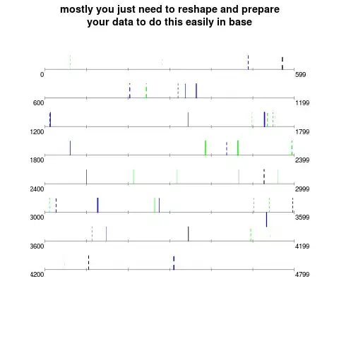
I'll do this in base graphics, though I'm sure others could do the same or better in lattice or ggplot2. I think the main thing you need to do to easily make that kind of plot with your data is reshape and rethink what format the data need to be in to be amenable to plotting. I would have done this using your data if 1) it were in long format and 2) the variables on which you base color, line type, width, etc were available as extra columns. If you had your data like that, then you could reduce it to include only the amino acids for which line segments need to be drawn. I've simulated a dataset similar to yours. You should be able to modify this code to fit your case:
First the dataset:
    set.seed(1)
    # make data.frame just with info for the lines you'll actually draw
    # your data was mostly zeros, no need for those lines
    position <- sort(sample(1:4563,45,replace = FALSE))
    # but the x position needs to be shaved down!
    # modulars are the real x positions on the plot:
    xpos <- position%%600
    # line direction appeared in your example but not in your text
    posorneg <- sample(c(-1,1),45,replace = TRUE,prob=c(.05,.95))
    # oxidant concentration for line width- just rescale the oxidant concentration
    # values you have to fall between say .5 and 3, or whatever is nice and visible
    oxconc   <- (.5+runif(45))^2
    # oxidant type determines line type- you mention 2
    # just assign these types to lines types (integers in R)
    oxitype  <- sample(c(1,2),45,replace = TRUE)
    # let's say there's another dimension you want to map color to
    # in your example png, but not in your description.
    color <- sample(c("green","black","blue"),45,replace=TRUE)

    # and finally, which level does each segment need to belong to?
    # you have 8 line levels in your example png. This works, might take
    # some staring though:
    level <- 0
    for (i in 0:7){
    level[position %in% ((i*600):(i*600+599))] <- 8-i
    }

    # now stick into data.drame:
    AminoData <-data.frame(position = position, xpos = xpos, posorneg = posorneg,
         oxconc = oxconc, oxitype = oxitype, level = level, color = color)
OK, so imagine you can reduce your data to something this simple. Your main tool in plotting (in base) will be segments(). It is vectorized, so there's no need for looping or fanciness:
    # now we draw the base plot:
    par(mar=c(3,3,3,3))
    plot(NULL, type = "n", axes = FALSE, xlab = "", ylab = "",
         ylim =  c(0,9), xlim = c(-10,609))
    # horizontal segments:
    segments(0,1:8,599,1:8,gray(.5))
    # some ticks: (also not pretty)
    segments(rep(c((0:5)*100,599),8), rep(1:8,each=7)-.05, rep(c((0:5)*100,599),8),
       rep(1:8,each=7)+.05, col=gray(.5))
    # label endpoints:
    text(rep(10,8)+.2,1:8-.2,(7:0)*600,pos=2,cex=.8)
    text(rep(589,8)+.2,1:8-.2,(7:0)*600+599,pos=4,cex=.8)
    # now the amino line segments, remember segments() is vectorized
    segments(AminoData$xpos, AminoData$level, AminoData$xpos,
       AminoData$level + .5 * AminoData$posorneg, lty = AminoData$oxitype,
       lwd = AminoData$oxconc, col = as.character(AminoData$color))
    title("mostly you just need to reshape and prepare\nyour data to do this easily in base")
This might be too artisanal for the tastes of some, but it's the way I go about special plotting.