2

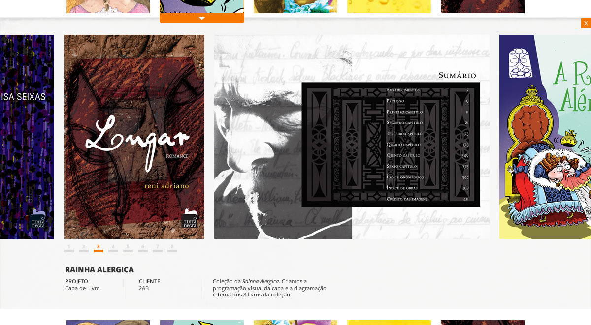
https://i.stack.imgur.com/FZyiq.jpg I've designed this layout and it works fine in my mind, but when i try to make this with CSS things get a little strange.

I have a div with 960px of width and this div is the main content wrapper. I want this gallery div to ignore the width and have 100% of the browser resolution (or another width). Any idea how to do this?

<div id="conteudo" > 
    <div class="exploded-wrapper" id="your_post_here_<?php the_ID(); ?>">
        <div class="exploded" id="your_post_here_<?php the_ID(); ?>">
            <a href="javascript:jQuery('.exploded-wrapper').hide();jQuery('.exploded').hide();" class="close"></a>
            <div class="detalhes">
                <div class="desc_wrapper">
                    <div class="desc">
                        <h2>
                            <?php the_title(); ?>
                        </h2>
                        <?php echo the_excerpt(); ?>
                        <div class="desc_pag">
                   <!--a href="#">1</a>
                            <a href="#">2</a>
                            <a href="#">3</a-->
                        </div>
                    </div>
                </div>                    
                <div class="galeria">
                    <?php the_content('Read the rest of this entry &raquo;'); ?>
            <script type="text/javascript">
    jQuery(document).ready(function() {

        // Using default configuration
        //$("#galeria").carouFredSel();

        // Using custom configuration
        jQuery("#galeria").carouFredSel({
            //items             : 2,
            circular            : true,
            direction           : "left",
            infinite            : true,
            scroll : {
                items           : 1,
                easing          : "swing",                          
                pauseOnHover    : true,
                mousewheel      : true
            }                   
        }); 
    });

    </script>
                </div>
            </div>
        </div>
    </div>
    </div>

for the CSS please use firebug and inspect http://ccrdesign.com/portifolio/

animuson
  • 53,861
  • 28
  • 137
  • 147
  • 2
    Use position: absolute; to take it out of the document flow, along wiht width100% should make t full browser window width. – Kyle Jan 30 '12 at 06:52
  • 1
    Had a quick look, and although I didn't find the solution offhand, I did notice that you are re-using element ID's. An ID must be unique; you should switch the re-used ones to be classes instead, and adjust any scripts accordingly. – Greg Pettit Jan 30 '12 at 06:54
  • @KyleSevenoaks What is the "it" you are referring to, though? Also a width of 100% will only make it as wide as its parent, not the browser window (unless the parent is also that wide or the document IS the parent). I would look at the link provided, see if you can get it working, and provide it as an actual answer rather than a comment... grab some upvotes and an accepted answer if you solve it! – Greg Pettit Jan 30 '12 at 06:57
  • @Greg, I was just making some suggestions. I do know how SO works :D maybe I'll take a closer look... :) Thiago: The link you provided, the CSS is not linked properly or something, it is not styled. – Kyle Jan 30 '12 at 06:59
  • Why would you want a div of 960px wide, when you already know that you're going to ignore the 960px? Or did you mean that you want the fixed-width div to have a scrollbar? – Mr Lister Jan 30 '12 at 07:18
  • i'm using the 960px grid for the thumbnails. I want to ignore this 960px when i open the content. that's why i need to ignore it! – Thiago Correia Carneiro Jan 30 '12 at 07:30
  • Also i'm going to check the ID's and Classes! – Thiago Correia Carneiro Jan 30 '12 at 07:31

1 Answers1

0

One, you can use javascript/jquery to manually set the width of the expanded div to the page width, but this is very hackish and I wouldn't recommend it.

What I WOULD recommend is that you reconsider your html structure. Instead of using one content wrapper at 960px width, have your wrapper be 100% width with alternating rows of photos and "empty" 100% divs that you can easily expand. So, abstracted:

<div class="wrapper" style="width:100%;">
    <div class="row1" style="width:960px;left:50%;margin-left:-480px;height:100px;">
        <div class="gallery photo1">
            <!-- row of photo content -->
        </div>
    </div>
    <div class="row2" ... ...">
    </div>
    ..etc..
</div>

Your javascript can append a div under the clicked div and set the style to whatever you want, and since the parent div will be 100% width, you can achieve the effect you want. These will stack nicely : ).

Oliver
  • 2,182
  • 5
  • 24
  • 31