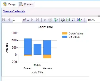
In Excel, you can create up-down bars, where the bar appears 'above' or 'below' some other value, with +ve and -ve being different colours
see here for an example: http://peltiertech.com/Excel/ChartsHowTo/StockChartsAndLineChartTricks.html
Is it possible to do this in SSRS, the closest I've seen is candlestick charts
I can use Dundas Chart for Reporting Services if that's any use