73

I have an unordered list full or anchors. I have a CSS :Hover event that adds borders to it but all the anchors to the left slightly adjust when i hover because it is adding 1px to the width and auto adjusting. how do i make sure the positioning is absolute?

div a:visited, #homeheader a{
    text-decoration:none;
    color:black;
    margin-right:5px;
}
div a:hover{
    background-color:#D0DDF2;
    border-radius:5px;
    border:1px solid #102447;
}

div li{
    padding:0;
    margin:0px 10px;
    display:inline;
    font-size:1em;
}
<div>
    <ul>
        <li><a href ="#">this</a></li>
        <li><a href ="#">that</a></li>
        <li><a href="#">this again</a></li>
        <li><a href="#">that again</a></li>
    </ul>
</div>

I made a JS Fiddle demo here.

TylerH
  • 20,799
  • 66
  • 75
  • 101
user1082764
  • 1,973
  • 9
  • 26
  • 40
  • 3
    Borders count for sizing calculations, so if you add a 1px border, you have to shrink the height/width by 1px to compensate. – Marc B Dec 24 '11 at 17:03

14 Answers14

118

You can add a transparent border to the non-hover state to avoid the "jumpiness" when the border appears:

http://jsfiddle.net/TEUhM/3/

#homeheader a:visited, #homeheader a{
    border:1px solid transparent;
}
KyleMit
  • 30,350
  • 66
  • 462
  • 664
Wesley Murch
  • 101,186
  • 37
  • 194
  • 228
  • I came across this by accident and was surprised that no one had included background-clip: padding-box; with the border: 1px solid transparent; css. Seems a must for me to include both entries when addressing this issue. – Borgboy Sep 08 '16 at 17:52
  • FYI: (In case anyone is facing the same issue,) adding a transparent background behaved differently on my bootstrap nav pills (where the active nav pill has a different font color and background color). Using rgba worked for me: `border: 1px solid rgba(0, 0, 0, 0);` where the last 0 is for transparency. – Anupam Feb 14 '17 at 12:33
  • this will add extra space. what if I don't want that extra space? – Hope Jan 06 '21 at 07:27
  • 1
    @Hope https://stackoverflow.com/questions/8971004/how-to-render-a-border-to-div-without-occupying-any-extra-space-in-html – Wesley Murch Jan 08 '21 at 16:43
21

You can also use outline, which won't affect the width i.e. so no "jump" effect. However,support for a rounded outline may be limited.

TylerH
  • 20,799
  • 66
  • 75
  • 101
moey
  • 10,587
  • 25
  • 68
  • 112
12

You could use a box shadow, rather than a border for this sort of functionality.

This works because your shadow doesn't 'take size in the DOM', and so won't affect the positioning, unlike that of a border.

Try using a declaration like

box-shadow:0 0 1px 1px #102447;

instead of your

border:1px solid #102447;

on your hover state.

Below is a quick demo of this in action:

DEMO

#homeheader a:visited,
#homeheader a {
  text-decoration: none;
  color: black;
  margin-right: 5px;
}
#homeheader a:hover {
  background-color: #D0DDF2;
  border-radius: 5px;
  box-shadow: 0 0 1px #102447;
}
#homeheader li {
  padding: 0;
  margin: 0px 10px;
  display: inline;
  font-size: 1em;
}
<div id="homecontainer">
  <div id="homeheader">
    <ul>
      <li><a href="#">this</a>
      </li>
      <li><a href="#">that</a>
      </li>
      <li><a href="#">this again</a>
      </li>
      <li><a href="#">that again</a>
      </li>
    </ul>
  </div>
</div>
jbutler483
  • 24,074
  • 9
  • 92
  • 145
7

Add a margin of 1px and remove that margin on hover, so it is replaced by the border.

http://jsfiddle.net/TEUhM/4/

GolezTrol
  • 114,394
  • 18
  • 182
  • 210
6

After taking a long time pressure i found a cool solution. Hope that it will help others.

on the add the folloing code :

HTML

<div class="border-test">
  <h2> title </h2>
  <p> Technology founders churn rate niche market </p>
</div>

CSS

.border-test {
  outline: 1px solid red;
  border: 5px solid transparent;
}
.border-test:hover {
  outline: 0px solid transparent;
  border: 5px solid red;
}

Check live : Live Demo

Hope it will help.

Siful Islam
  • 1,906
  • 3
  • 21
  • 31
5

No one has mentioned it here, but the best and simplest solution to this in my opinion is to use "box shadow" instead of borders. The magic is on the "inset" value which allows it be like a boarder.

box-shadow: inset 0 -3px 0 0 red;

You can offset the X or Y to change top/bottom and use -negative value for opposite sides.

.button {
  width: 200px;
  height: 50px;
  padding: auto;
  background-color: grey;
  text-align: center;
}

.button:hover {
  box-shadow: inset 0 -3px 0 0 red;
  background-color: lightgrey;
}
<div class="button"> Button </div>
Jquestions
  • 1,650
  • 1
  • 23
  • 30
4

You can use box-shadow which does not change your box-size, unlike border.

Here is a little tutorial.

emilie zawadzki
  • 2,035
  • 1
  • 18
  • 25
3

Just add the following code into your css file

#homeheader a {
    border:1px solid transparent;
}
s.n
  • 693
  • 1
  • 9
  • 18
2

The CSS "box-sizing" attribute fixed this problem for me. If you give your element

.class-name {
    box-sizing: border-box; 
}

Then the width of the border is added to the inside of the box when the browser calculates its width. This way when you turn the border style on and off, the size of the element doesn't change (which is what causes the jittering you observed).

This is a new technology, but the support for border-box is pretty consistent. Here is a demo!

Ziggy
  • 21,845
  • 28
  • 75
  • 104
2

The easiest method I found was using 'outline' instead of 'border'.

#home:hover{
outline:1px solid white;
}

instead of

#home:hover{
border:1px solid white;
}

Works the best!

https://www.kirupa.com/html5/display_an_outline_instead_of_a_border_hover.htm

1

Add a negative margin on hover to compensate:

#homeheader a:hover{
    border: 1px solid #102447;
    margin: -1px;
}

updated fiddle

In the fiddle the margin: -1px; is a little more complex because there was a margin-right getting overridden, but it's still just a matter of subtracting the newly-occupied space.

mccc
  • 2,354
  • 1
  • 20
  • 22
0

I too was facing the same problem. The fix mentioned by Wesley Murch works! i.e. adding a transparent border around the element to be hovered.

I had a ul on which :hover was added to every li. Every time, I hovered on each list item, the elements contained inside li too moved.

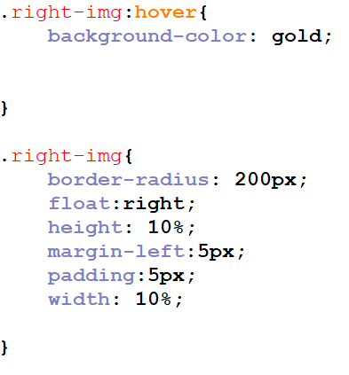
Here is the relevant code:

html

<ul>           
    <li class="connectionsListItem" id="connectionsListItem-0">     
        <div class="listItemContentDiv" id="listItemContentDiv-0">
            <span class="connectionIconSpan"></span>
            <div class="connectListAnchorDiv">
            <a href="../test/1.html" class="homeConnectionListanchor" id="leftTabConnectionListAnchor-0">Test1</a>
            </div>
        </div>
    </li>
</ul>

css

.listItemContentDiv
{
    display: inline-block;
    padding: 8px;
    right: 0;
    text-align: left;
    text-decoration: none;
    text-indent: 0;
}

.connectionIconSpan
{
    background-image: url("../images/connection4.png");
    background-position: 100% 50%;
    background-repeat: no-repeat;
    cursor: pointer;
    padding-right: 0;
    background-color: transparent;
    border: medium none;
    clear: both;
    float: left;
    height: 32px;
    width: 32px;
}

.connectListAnchorDiv
{
    float: right; 
    margin-top: 4px;
}

The hover defn on each list item:

.connectionsListItem:hover
{
    background-color: #F0F0F0;
    background-image: linear-gradient(#E7E7E7, #E7E7E7 38%, #D7D7D7);
    box-shadow: none;
    text-shadow: none;
    border-radius: 10px 10px 10px 10px;
    border-color: #AAAAAA;
    border-style: solid;

}

The above code used to make the containing elements shift, whenever I hovered over connectionsListItem. The fix was this added to the css as:

.connectionsListItem
{
    border:1px solid transparent;
}
Binita Bharati
  • 5,239
  • 1
  • 43
  • 24
0

Use :before to create the border, that way it won't modify the actual content and gives you more freedom. Check it out here: http://codepen.io/jorgenrique/pen/JGqOMb

<div class='border'>Border</div>
<div class='before'>Before</div>
div{
  width:300px;
  height:100px;
  text-align:center;
  margin:1rem;
  position:relative;
  display:flex;
  justify-content:center;
  align-items: center;
  background-color:#eee;
}
.border{
  border-left:10px solid deepPink;
}
.before{
  &:before{
    content:"";
    position:absolute;
    background-color:deepPink;
    width:10px;
    height:100%;
    left:0;
    top:0;
  }
  &:hover{
    background-color:#ccc;
    &:before{
      width:0px;
      transition:0.2s;  
    }
  }
}
0

Be careful if you also use padding. In my case, I had a 5px padding inside the hover defn. It should be moved inside the actual class of the element you want to hover over.

Code snippet

MariusMihai92
  • 19
  • 1
  • 6