When you say
compare each section to a subset of Unicode
this is not really clear, because there is more than one way to do this. I would bring the comparing down to the level of pixel. In a gray image, every pixel has a gray-value. Assume you want to replace every pixel by an appropriate character, how has this character to match the pixel? If you look at a character from really far, you'll see only a gray spot. If you replace now a pixel with a character, you should choose the character with the most similar gray-value to that pixel.
In a monospaced font, every character uses the same amount of space. If you take now this rectangle of space, draw a character on it, you can calculate the mean gray-value. This mean gray-value is not more than how much area of the rectangle is white compared to the whole rectangle. A space has a gray-value of 1. And maybe a dollar-sign is one of the most black characters you'll find.
So here is what I would do:
- Take a set of characters, no matter whether you use only ascii or uni-code. Calculate for every character the amount of white. It should be obvious, that this could be different for different fonts, but you have to use a monospaced one.
- You have now a list which maps every character to a gray-value. You should now rescale the gray-values to your target gray-value interval. When you have an 8-bit image, then your brightest character (space) should correspond to a value of 255 and your darkest should correstpond to gray-level 0.
- Now, rescale your input image, so that it is not too big, because even with a very small font, you'll maybe not getting 2000 characters on one line.
- Replace every pixel with the character whose gray-level is nearest to its own graylevel
In Mathematica this is only a few lines of code. In python it's maybe a bit longer, but it should be ok too.
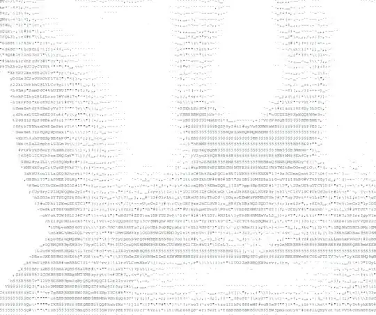
Using this way, you get pretty amazing results when you look at the text from far away and when you get closer, you see that it all consists of characters.


Update
When you want to create an image of the same size as the original, then the approach is not very different but even here you have, as Mark already pointed out, to create a raster image of every letter you are using.
I don't really see a faster way of comparing your image-tiles with a letter to decide which one is the most appropriate.
Maybe one hint: If your using this approach, the letters will be visible in your image, because when you have e.g. a 12pt font, each letter will have at least an image-size of about 10x15. When you now convert an image of 1000x1500, which is not so small, you use only 100x100 letters.
Therefore, it might be worth a thought to not use the image itself but the image gradients. This may give better images, because then a letter is choosen, which follows the edges quite good.
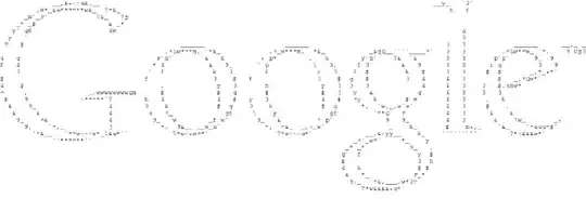
Using only the gradients, the google logo doesn't look so bad
