4

I would like to plot a geographical map with n numbers of squares according to the frequency of a disease within a county. Like this one here: enter image description here

But I couldn't figure out how to do this with R or qGIS. Thanks for y'all help.

Dominik
  • 2,753
  • 7
  • 28
  • 32
  • That's kind of a weird one, are you sure the cells aren't just a very sparse grid where the colour is blue since the value is present versus absent? It's not really that you want to draw n cells at a given point, is it? Sample data and more details about your data would help, but if you just want a plot "like this" then a really basic starting point is m <- matrix(sample(c(0, 1), 50 * 30, replace = TRUE, prob = c(0.95, 0.05)), 50, 30); image(m, col = c("white", "blue")) – mdsumner Dec 01 '11 at 12:07
  • Each block represents a reported number of incidents, the location shows where that amount took place. – Paul Hiemstra Dec 01 '11 at 12:21
  • The problem with either blocks or bubbles is one of the viewer's qualitative reaction. That is: does the area or the diameter scale linearly with the underlying values? A number of people (including Tufte of course) have written about this. – Carl Witthoft Dec 01 '11 at 12:53
  • Also, these blocks are going to overlap if you're not lucky. If Hamburg had as many cases as Berlin it would smush its neighbours. – Spacedman Dec 01 '11 at 12:57
  • I think the area should scale with the values. The comparative size of the bubbles is governed by the area. I think that was the critique on charts where for example only the height of a block was linked to the value. – Paul Hiemstra Dec 01 '11 at 12:59
  • @mdsummer Paul is right. The Squares represent the number of cases in a district. The map is published by the RKI (Robert-Koch Institute) a well known epidemiological institute in Germany. I should build something that looks similar to the RKI one, but with Brandenburg (a federal state of Germany) – Dominik Dec 02 '11 at 13:12
  • @PaulHiemstra The Problem with the scaling is, that it is not so easy to see the number of cases... – Dominik Dec 02 '11 at 13:13

2 Answers2

7

First write a little function called 'stackbox' that plots (using "rect") the squares for the stack in the right place.

Here's the first line of that function:

stackbox <- function(x,y,n,size,maxheight=5){
  • where 'size' is the height and width of the boxes, and 'maxheight' lets you have a stack that is 5 high or 10 high or whatever.

Then call that function for every county that has cases.

Where exactly were you stuck in the process?

Here's the function in full:

stackbox <- function(x,y,n,size,maxheight=5,...){
  stackheight = seq(0,n,by=maxheight)
  stackheight=diff(unique(c(stackheight,n)))

  for(col in 1:length(stackheight)){
    xl=rep(x+(col-1)*size,stackheight[col]) - (length(stackheight)/2)*size
    yb=y+size*((1:stackheight[col])-1) - (max(stackheight)/2)*size
    xr=xl+size
    yt=yb+size
    rect(xl,yb,xr,yt,...)
  }
}

Example:

plot(1:10)
for(i in 1:10){
 stackbox(i,i,i,3,size=.1,col="red",border="white")
}

To do this on a map, you need the sp and maptools packages, and a shapefile or other geospatial data source that has your data in it:

africa=readShapeSpatial(file.path(mapLib,"africa.shp"))
plot(africa,border="gray")
coords=coordinates(africa)
for(i in 1:nrow(africa)){
  if(cases[i]>0){
    stackbox(coords[i,1],coords[i,2],africa$cases[i],1,border="#606060",col="#0083FE")
  }
}

Map using stacked boxes

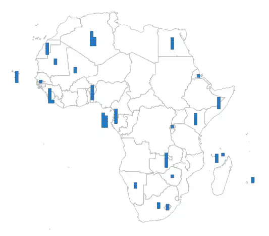
I've picked colours that look a bit like your original. Note that the boxes are in plot coordinates, so I had to make them 0.1 of a degree. You may wish to transform your map to a euclidean projection (using spTransform from package:gdal) and then they'll be in those units and properly square.

Doing nice text labels like in your original would be tricky though...

Spacedman
  • 92,590
  • 12
  • 140
  • 224
  • Thank you for your answer. This is quite awesome. I have all data as a shp file, so I can do that. In qGIS it is not so difficult to plot the names, and I think it should be doable with R as well. The requiered information is in the shp file... – Dominik Dec 02 '11 at 11:10
  • what is the mabLib entry in your readShapeSpatial command?!? – Dominik Dec 02 '11 at 11:12
  • Thats just the folder where I keep my map files. mapLib="/data/maps" for me, maybe mapLib="C:\\maps\\" for you? The file.path function joins the path to the shapefile name. – Spacedman Dec 02 '11 at 11:53
5

As an alternative I would suggest a bubble plot, which is quite easy to make using ggplot2 using the point geometry. An example form the help pages (http://had.co.nz/ggplot2/geom_point.html):

p <- ggplot(mtcars, aes(wt, mpg)) 
p + geom_point(aes(size = qsec)) 

which leads to:

ggplot bubble plot

The size of the bubble represents the amount measured. The example does not use geographical coordinates, but they can be used easily. The ggplot2 package also supports adding spatial polygons as an additional layer, e.g. using geom_path. The help file of coord_map shows a few examples using map data. See also the fortify function to transform a SpatialPolygons object to a data.frame (which is needed for ggplot2).

Paul Hiemstra
  • 59,984
  • 12
  • 142
  • 149
  • someone sufficiently ambitious could write a geom_stackbox() with mappings x, y, size, colour ... – Ben Bolker Dec 01 '11 at 14:41
  • I personally like the version of Paul more; and this is how I usually do that. However, I need to plot the data in the shown example... :-/ Does someone have an idea how to do the example Spacedman with ggplot? – Dominik Dec 02 '11 at 11:06
  • @Dominik, as Ben already stated, someone needs to write a new geometry for this to work in ggplot. – Paul Hiemstra Dec 02 '11 at 11:20
  • I see. So it is not that easy. To bad, using just one polt function would be a bit more consistent... – Dominik Dec 02 '11 at 13:14