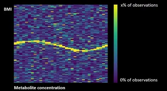
I am studying the relationship between the concentration of a metabolite (hypocretin) and a continuous outcome variable (BMI). I want to create a frequency heat map in which different concentrations of the metabolite are presented on the X-axis and the frequency of different BMI values on the Y-axis. I have found an unrelated picture on the Internet that I modified in photoshop to represent what I would like to create.

I want to get a heatmap with the following attributes:
Smoothed graph
The heat map shows the proportion of values in their respective columns, which means that the frequency of each column adds up to 1, instead of the frequency of values in all columns combined.
When I visualize the heat map with our data using ggplot2 this results in the following heat map (corresponding to code1 below).
#code1

BMI_HEATMAP<- df3 %>%
  ggplot(., aes(x = Hypocretin.level, y = BMI, height = 1,width=1)) +
    geom_density_2d_filled()+
  labs(title =
         "Heat Map of the Effect of Hypocretin.Level on Body Mass Index",
       subtitle =
         "Where BMI ranges between 0 and 60 with 18.5 - 24.9 being considered healthy (UK National Health Service, 2020)",
       x="Hypocretin Level/pg/mL(1:0-40;2:40-110;3:110-200;4:200+)",
       y="Body Mass Index (BMI)")+
  scale_x_continuous(breaks = c(1,2,3,4,5,6,7,8,9,10,11,12,13,14,15,16,17,18)) +
  scale_y_continuous(breaks = c(10,20,30,40,50,60)) +
  mytheme1
BMI_HEATMAP
heat map with smoothing but not normalized per metabolite concentration:

Unfortunately for some of the neurometabolite concentrations I have a lot of data points available (1 and 18) but for the other concentrations (2-17) I have much less data points available. I am however mainly interested in these (sparse) intermediate values and would therefore like to normalize the frequencies per metabolite concentration (in such a way that each concentration [or column] adds to 100% frequency) to better visualize a possible trend.
I then used the following ggplot2 code that normalizes the frequency per metabolite concentration (code2).
#code2

  BMI_dot_plot2 <- df3 %>%
       ggplot(.,aes(x = Hypocretin.level, y = BMI, fill = freq, height = 1,width=1))+
       labs(title =
                             "Heat Map of the Effect of Hypocretin.Level on Body Mass Index",
                      subtitle =
                            "Where BMI ranges between 0 and 60 with 18.5 - 24.9 being considered healthy (UK National Health Service, 2020)",
                      x="Hypocretin Level/pg/mL(1:0-40;2:40-110;3:110-200;4:200+)",
                      y="Body Mass Index (BMI)",
                      fill = " Freq")+
       geom_tile(colour="white", size=0) +
    scale_x_continuous(breaks = c(1,2,3,4,5,6,7,8,9,10,11,12,13,14,15,16,17,18)) +
    scale_y_continuous(breaks = c(15,20,30,40,50)) +
       scale_fill_viridis()+
       mytheme1
  BMI_dot_plot2
heat map with normalization per metabolite concentration but no smoothing:

This code however does not have smoothing included, which makes the graph difficult to interpret.
What code should I use to have the frequencies normalized per neurometabolite concentration to 100% frequency (like in code2) but also have the data smoothed that it looks like the heat map in the first picture of code 1?