I'm experimenting with 1D time-series data and trying to reproduce the following approach via animation over my own data in GoogleColab notebook.
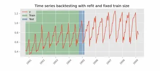
It's about reproducing the animation of STS transformation (implemented by series_to_supervised() function with Lookback steps to past time n_in=9) equal to Backtesting with refit and fixed training size (rolling origin) animation approach introduced skforecast package. It's more about train and test selection over actual time-series data y. Visualize fixed train size and refit and predict next step(s).
import numpy as np
import pandas as pd
import matplotlib.pyplot as plt
from matplotlib.patches import Rectangle
from matplotlib.animation import FuncAnimation
from IPython.display import HTML
print(pd.__version__)


# Generate univariate (1D) time-series data into pandas DataFrame
import numpy as np
np.random.seed(123) # for reproducibility and get reproducible results

df = pd.DataFrame({
    "TS_24hrs": np.arange(0, 274),
    "count"   : np.abs(np.sin(2 * np.pi * np.arange(0, 274) / 7) + np.random.normal(0, 100.1, size=274)) # generate sesonality
})
#df = pd.read_csv('/content/U2996_24hrs_.csv', header=0, index_col=0).values
print(f"The raw data {df.shape}")
#print(f"The raw data columns {df.columns}")


# visulize data
import matplotlib.pyplot as plt
fig, ax = plt.subplots( figsize=(10,4))

# plot data
df['count'].plot(label=f'data or y', c='red' )
#df['count'].plot(label=f'data',  linestyle='--')
plt.xticks([0, 50, 100, 150, 200, 250, df['TS_24hrs'].iloc[-1]], visible=True, rotation="horizontal")

plt.legend(bbox_to_anchor=(1.04, 1), loc="upper left")
plt.title('Plot of data')
plt.ylabel('count', fontsize=15)
plt.xlabel('Timestamp [24hrs]', fontsize=15)
plt.grid()
plt.show()

# slecet train/test data using series_to_supervised (STS)
from pandas import DataFrame, concat
def series_to_supervised( data, n_in, n_out=1, dropnan=True):
    """
    Frame a time series as a supervised learning dataset.
    Arguments:
        data: Sequence of observations as a list or NumPy array.
        n_in: Number of lag observations as input (X).
        n_out: Number of observations as output (y).
        dropnan: Boolean whether or not to drop rows with NaN values.
    Returns:
        Pandas DataFrame of series framed for supervised learning.
    """
    n_vars = 1 if type(data) is list else data.shape[1]
    df = pd.DataFrame(data)
    cols = list()
    # input sequence (t-n, ... t-1)
    for i in range(n_in, 0, -1):
        cols.append(df.shift(i))
    # forecast sequence (t, t+1, ... t+n)
    for i in range(0, n_out):
        cols.append(df.shift(-i))
    # put it all together
    agg = concat(cols, axis=1)
    # drop rows with NaN values
    if dropnan:
        agg.dropna(inplace=True)
    return agg.values


values=series_to_supervised(df, n_in=9)
data_x,data_y =values[:, :-1], values[:, -1]

print(data_x.shape)
print(data_y.shape)


# define animation function
import matplotlib.pyplot as plt
import pandas as pd
from matplotlib.animation import FuncAnimation

fig, ax = plt.subplots(nrows=1, ncols=1, figsize=(40, 8))
plt.subplots_adjust(bottom=0.25)
plt.xticks(fontsize=12)
ax.set_xticks(range(0, len(data_y), 9))
ax.set_yticks(range(0, 2500, 200))

data_y = pd.Series(data_y)
data_y.plot(color='r', linestyle='-', label="y")
ax.set_title('Time Series')
ax.set_xlabel('Time')
ax.set_ylabel('Value')
ax.legend(loc="upper left")
ax.grid(True, which='both', linestyle='-', linewidth=3)
ax.set_facecolor('gainsboro')

ax.spines['bottom'].set_position('zero')
ax.spines['left'].set_position('zero')
ax.spines['right'].set_color('none')
ax.spines['top'].set_color('none')

nested_list = list(trainX_tss)
lines = [ax.plot([], [], color='g', linestyle='-')[0] for _ in range(len(trainX_tss))]

def init():
    for line in lines:
        line.set_data([], [])
    return lines

def update(frame):
    for i, line in enumerate(lines):
        data = pd.Series(nested_list[i], index=range(frame + i, frame + i + 9))
        line.set_data([], [])
        line.set_data(data.index, data)
    return lines


# define animation setup
anim = FuncAnimation(fig, update,
                    frames=len(nested_list) - 9,
                    init_func=init,
                    interval=500,
                    blit=True,
                    repeat=False)


# Save animation (.gif))
anim.save('BrowniamMotion.gif', writer = "pillow", fps=10 )

# visulize animation in GoogleColab Notebook
# suppress final output
plt.close(0)
HTML(anim.to_html5_video())
Multi-Step or Sequence Forecasting A different type of forecasting problem is using past observations to forecast a sequence of future observations. This may be called sequence forecasting or multi-step forecasting.
So far, I could reach this output which is so ugly and incorrect.


