1

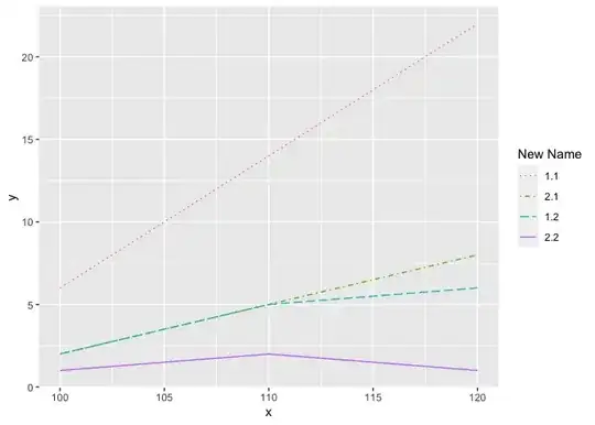
I am unable to figure out how to edit the legend title for plots involving different line types and colors representing the interaction of factors and their levels.

The sample script below produces the desired plot for two factors each with two levels: four different line types each in a different color.

The legend elements show the correct line type x color combinations, but the legend is titled interaction(f1.f2). I am unable to figure out how to retitle the legend as f1.f2.

library(ggplot2)

# Example data frame
x <- x <- rep(seq(100, 120, 10), each = 4)
f1 <- rep(1:2, each = 2, times = 3) # Factor 1 w/ 2 levels
f2 <- rep(1:2, each = 1, times = 6) # Factor 2 w/ 2 levels
y <- c(6, 2, 2, 1, 14, 5, 5, 2, 22, 6, 8, 1)
df <- data.frame(x, f1, f2, y)

# Plot different line types and colors for each combination of two factors with
#   two levels each.

p <- ggplot(df, aes(x = x,
                    y = y)) +
    geom_line(aes(color = interaction(f1, f2),
                  linetype = interaction(f1, f2))) +
    scale_linetype_manual(values = c("dotted",
                                     "dotdash",
                                     "longdash",
                                     "solid"))

p
Herb
  • 21
  • 2

1 Answers1

1

You have made a 'combined' legend for the two scales (linetype and colour) so to change the legend name you need to change the name parameter for both scales, e.g.

library(ggplot2)

# Example data frame
x <- x <- rep(seq(100, 120, 10), each = 4)
f1 <- rep(1:2, each = 2, times = 3) # Factor 1 w/ 2 levels
f2 <- rep(1:2, each = 1, times = 6) # Factor 2 w/ 2 levels
y <- c(6, 2, 2, 1, 14, 5, 5, 2, 22, 6, 8, 1)
df <- data.frame(x, f1, f2, y)

# Plot different line types and colors for each combination of two factors with
#   two levels each.

p <- ggplot(df, aes(x = x,
                    y = y)) +
  geom_line(aes(color = interaction(f1, f2),
                linetype = interaction(f1, f2))) +
  scale_linetype_manual(name = "New Name",
                        values = c("dotted",
                                   "dotdash",
                                   "longdash",
                                   "solid")) +
  scale_color_hue(name = "New Name")

p

Created on 2023-07-26 with reprex v2.0.2

Does that make sense?


Also, if your actual use-case is more complicated than this example, creating the 'interaction' before plotting might simplify things, e.g.

library(tidyverse)

# Example data frame
x <- x <- rep(seq(100, 120, 10), each = 4)
f1 <- rep(1:2, each = 2, times = 3) # Factor 1 w/ 2 levels
f2 <- rep(1:2, each = 1, times = 6) # Factor 2 w/ 2 levels
y <- c(6, 2, 2, 1, 14, 5, 5, 2, 22, 6, 8, 1)
df <- data.frame(x, f1, f2, y)

df %>%
  unite(col = "New Name", c(f1, f2), 
        sep = ".", remove = FALSE) %>%
  ggplot(aes(x = x,
                 y = y)) +
  geom_line(aes(color = `New Name`,
                linetype = `New Name`))

Created on 2023-07-26 with reprex v2.0.2

jared_mamrot
  • 22,354
  • 4
  • 21
  • 46