0
library(tidyverse)  
library(ggplot2)

set.seed(3)

age_f <- factor(c("young","old"))   
age_f <-sample(age_f, replace= T, size = 800)

awareness_rating<-sample(c(1:4), replace= T, size = 800)
risk_rating <-sample(c(1:4), replace= T, size = 800)
like_rating <-sample(c(1:4), replace= T, size = 800)

df <- data.frame(age_f, awareness_rating, risk_rating, like_rating)


df<- df %>% mutate(
       across(.cols= -(c(1,2)),
         .fns = ~ifelse(rbinom(n(), 1, 0.02), NA, .x))
       )  
df <-df %>% mutate(across(c(2:4), ~factor(.x, levels = c(1,2,3,4), 
     labels = c("not at all", "a little", "somewhat", "a lot"))))

what I like to do is creating the same plot with a specific format for multiple variables in the dataset using map function. So the code for creating the plot is this:

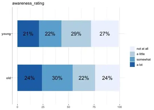
df %>% filter(!is.na(awareness_rating)) %>% group_by(age_f, awareness_rating) %>% 
 summarize(Count = n()) %>% mutate(pct = round(prop.table(Count)*100,0), res= str_c(pct, "%")) %>% 
 ggplot(aes(x=age_f, y=pct, fill=awareness_rating)) +
 geom_col(width = 0.6)+ theme_bw() + theme (axis.title.x = element_blank(),
                                            axis.text.y = element_text(size = 25, face= "bold"),
                                            axis.title.y = element_blank(),
                                            legend.text = element_text(size = 25),
                                            legend.title = element_blank(), 
                                            axis.line.y.left = element_line(color = 'gray'),
                                            panel.border   = element_blank())+    
 geom_text(aes(label = res), position = position_stack(vjust = .5), size= 10) + coord_flip() +  
 scale_fill_brewer()

which creates this plot

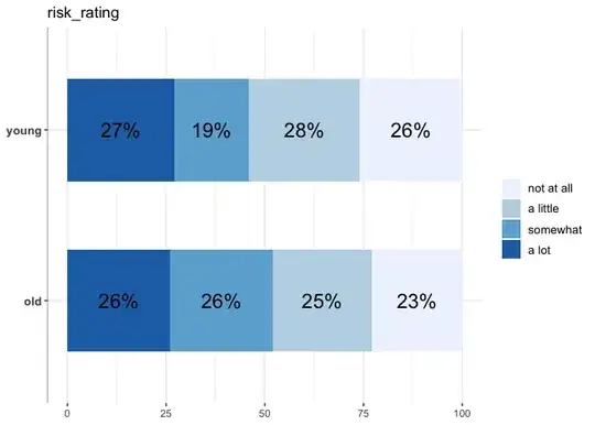
I want to create the plot for risk_rating and like_rating as well.

My attempt was to create function and mapping it around the three columns.

p1func<- function(df){
  
  df %>% filter(!is.na(.x)) %>% group_by(age_f, .x) %>% 
    summarize(Count = n()) %>% mutate(pct = round(prop.table(Count)*100,0), res= str_c(pct, "%")) %>% 
    ggplot(aes(x=age_f, y=pct, fill=.x)) +
    geom_col(width = 0.6)+ theme_bw() + theme (axis.title.x = element_blank(),
                                               axis.text.y = element_text(size = 25, face= "bold"),
                                               axis.title.y = element_blank(),
                                               legend.text = element_text(size = 25),
                                               legend.title = element_blank(), 
                                               axis.line.y.left = element_line(color = 'gray'),
                                               panel.border   = element_blank())+    
    geom_text(aes(label = res), position = position_stack(vjust = .5), size= 10) + coord_flip() +  
    scale_fill_brewer()
}


df %>%  map_at (c(2:4), ~p1func)

However, it does not create any plots.

What am I doing wrong here? How can I achieve my goal with out copying and pasting the same code multiple times? This is not too cumbersome for 3 variables in this mock example, but I need to do that much more times in my actual data.

Your help would be really appreciated.

ffew
  • 15
  • 4

1 Answers1

1

Here is a working approach which uses map to loop over the names of the columns to plot. Additionally I fixed your plotting function which now takes one argument x (aka the name of the column to plot) and uses !!sym(x) to "unquote" the column name.

Note: Unfortunately your example code did not work with the provided data, e.g. df wasn't defined, so I made a best guess to fix that.

library(ggplot2)
library(purrr)
library(stringr)

p1func <- function(x) {
  df %>%
    filter(!is.na(!!sym(x))) %>%
    group_by(age_f, !!sym(x)) %>%
    summarize(Count = n()) %>%
    mutate(
      pct = round(prop.table(Count) * 100, 0),
      res = str_c(pct, "%")
    ) %>%
    ggplot(aes(x = pct, y = age_f, fill = !!sym(x))) +
    geom_col(width = 0.6) +
    geom_text(aes(label = res),
      position = position_stack(vjust = .5), size = 6
    ) +
    scale_fill_brewer() +
    theme_bw() +
    theme(
      axis.text.y = element_text(size = 10, face = "bold"),
      legend.text = element_text(size = 10),
      axis.line.y.left = element_line(color = "gray"),
      panel.border = element_blank()
    ) +
    labs(
      x = NULL, y = NULL, fill = NULL,
      title = x
    )
}

map(names(df)[2:4], p1func)

#> [[1]]

#> 
#> [[2]]

#> 
#> [[3]]

DATA

library(tidyverse)

set.seed(3)

age_f <- factor(c("young", "old"))
age_f <- sample(age_f, replace = T, size = 800)

awareness_rating <- sample(c(1:4), replace = T, size = 800)
risk_rating <- sample(c(1:4), replace = T, size = 800)
like_rating <- sample(c(1:4), replace = T, size = 800)

df <- data.frame(age_f, awareness_rating, risk_rating, like_rating)

df <- df %>% mutate(
  across(
    .cols = -1,
    .fns = ~ ifelse(rbinom(n(), 1, 0.02), NA, .x)
  )
)

df <- df %>% mutate(across(c(2:4), ~ factor(.x,
  levels = c(1, 2, 3, 4),
  labels = c("not at all", "a little", "somewhat", "a lot")
)))
stefan
  • 90,330
  • 6
  • 25
  • 51
  • Thank you so much!! And yes, sorry I missed the line where I defined the df. I edited my original post. – ffew Jul 19 '23 at 22:32
  • Sorry but I woud like to understand why it has to be "!!sym(x)" . Why .x or x cannot pass names(df[2:4)) and uncolumned? Could you please explain? – ffew Jul 19 '23 at 22:35
  • Hm. Not sure where to start as there are several issues with your code. First. Run `foo <- df %>% map_at(c(2:4), ~p1func)`. Then check `foo` and you will see that this created a list with three elements where each element is your function `pfunc1`. Second. I think you have a misconception about how `.x` and the `map` family works. You can't use`.x` inside the function you want to apply, i.e. inside `p1func`. `.x` It's just a special symbol to use the the shorthand `~ f(.x)` instead of the more verbose `function(x) f(x)`. – stefan Jul 19 '23 at 23:31
  • 1
    ... In short: That's why I have re-factored your function to take as an argument the column name. However, to tell the `dplyr` verbs or `ggplot2` that the character `x` is a column of your dataset `df` we have to "unquote" it, which could be achieved via `!!sym()` or the `.data` pro-noun. See e.g. https://stackoverflow.com/questions/57136322/what-does-the-operator-mean-in-r-particularly-in-the-context-symx for more on `!!sym(x)` – stefan Jul 19 '23 at 23:38