I'm trying to plot a graph from the data frame below which has a column called "Week" where the year and week of the year are combined. I would like to use this column as my x-axis but when I plot the graph, the order is not correct.
library (ggplot2)
library(ggthemes)
library(scales)
library(dplyr)

Week <- c("2023w1", "2023w2", "2023w3", "2023w4", "2023w5", "2023w6", "2023w7", "2023w8",
          "2023w9", "2023w10", "2023w11", "2023w12", "2023w13", "2023w14", "2023w15","2023w16",
          "2023w17", "2023w18", "2023w19", "2023w20",
          "2022w1", "2022w2", "2022w3", "2022w4", "2022w5", "2022w6", "2022w7", "2022w8",
          "2022w9", "2022w10", "2022w11", "2022w12", "2022w13", "2022w14", "2022w15","2022w16",
          "2022w17", "2022w18", "2022w19", "2022w20")

Quantity <- c("45","46", "47","48", "49","50","51","52",
              "55","48", "45","49", "62","71","83","50",
              "45","46", "47", "57", "45","46", "47","48", "49","50","51","52",
              "55","48", "45","49", "62","71","83","50",
              "45","46", "47", "57")

df <- data.frame(Week, Quantity)
I tried to plot the graph using
windows()
plot <- ggplot(df) +
  geom_bar(aes(x=Week, y=Quantity), stat="identity", fill="pink",
           colour="pink")+
  theme(axis.text.x = element_text(angle = 90, vjust = 0.5, hjust=1))
plot
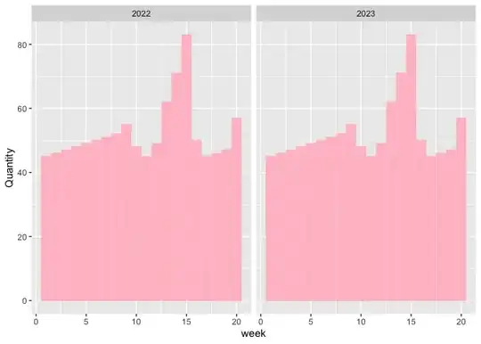
and got the following graph. As you see the order of the numbers is incorrect:

I would like the numbers to be in numerical order. eg: 2023w1, 2023w2, 2023w3....2023w9, 2023w10,2023w11, 2023w12 and so forth. Is there a way to do this?