0

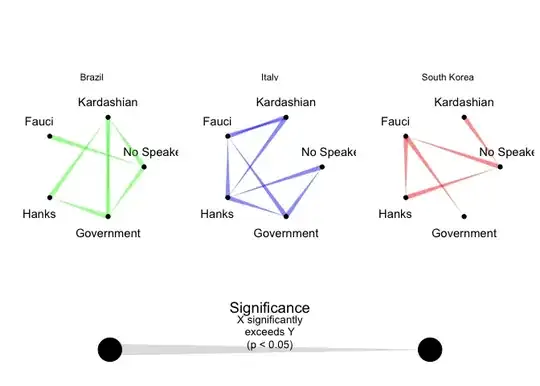
This is the data I'm using also I'm attaching the sample figure down below.

df <- data.frame( 
  "PersonName1" = c("F","H","H","H","K","K","K","K","N","N","G","N","N","N","K","G","K"), 
  "PersonName2" = c("G","G", "F","N","N","F","H","G","G","F","H","F","H","F","F","F","H"), 
  "P" = c(0.5, 0.5, 0.5, 0.5, 0.5, 0.5, 0.5, 0.5, 0.5, 0, 0,0.5,0,0.5,0.5,0.5,0.5), 
  "Country" = c("UK","UK","UK","UK","UK","UK","UK","UK","UK","UK","UK","Rwanda","Rwanda","Vietnam","Vietnam","Vietnam","Vietnam")) 

enter image description here

This is the code I'm using it generates only one figure also I'm using a customised legend as well. I want to get a plot like this. Is there any function in ggraph inorder to implement this?

install.packages('ragg')
install.packages('ggraph')
library(ggraph)
library(tidygraph)
install.packages("cowplot")
library(cowplot)
library(gridExtra)

df <- data.frame( 
  "PersonName1" = c("No Speaker","No Speaker"), 
  "PersonName2" = c("Fauci","Hanks"), 
  "P" = c(0.5, 0) ) 

df %>%
  as_tbl_graph() %>%
  activate(edges) %>%
  tidygraph::filter(P > 0) %>%
  activate(nodes) %>%
  ggraph(layout = 'circle') +
  geom_node_text(aes(label = name), size = 8, 
                 nudge_x = c(0.2, 0, -0.2, -0.2, 0), 
                 nudge_y = c(0.3, 0.3, 0.3, -0.3, -0.3),
                 check_overlap = TRUE) + 
  geom_edge_link2(aes(width = after_stat(index)), color = "red",
                  alpha = 0.5) +
  geom_node_point(size = 20)  +
  scale_edge_width(range = c(0, 15), guide = 'none') +
  coord_cartesian(xlim = c(-1.5, 1.5), ylim = c(-1.5, 1.5)) +
  theme_void() ->p_gp


### legend
data.frame(lg1 = "Y", lg2 = "X" , P = 0.5) %>% 
  as_tbl_graph() %>%
  activate(edges) %>%
  tidygraph::filter(P > 0) %>%
  activate(nodes) %>%
  ggraph(layout = 'circle') +
  geom_node_text(aes(label = name), size = 4,
                 nudge_y = c(-0.15, -0.15, -0.15, -0.15, -0.15)) +
  geom_edge_link2(aes(width = after_stat(index)), color = "grey",
                  alpha = 0.5) +
  geom_node_point(size = 10) +
  scale_edge_width(range = c(0, 5), guide = 'none') +
  coord_cartesian(xlim = c(-1.5, 1.5), ylim = c(-1.5, 1.5)) +
  theme_void() -> p_lg

ggdraw(p_lg) +
  draw_label("Significance", y = 0.66, size = 14) +
  draw_label("X significantly", y = 0.62, size = 10) +
  draw_label("exceeds Y", y = 0.58, size = 10) +
  draw_label("(p < 0.05)",  y = 0.54, size = 10) -> p_lg

### grid
grid.arrange(p_gp, p_lg,
             ncol=2, nrow=1, widths=c(9/10,1/10))
M--
  • 25,431
  • 8
  • 61
  • 93
People
  • 63
  • 5
  • Have a look at [facet_edges](https://ggraph.data-imaginist.com/reference/facet_edges.html) – stefan Jul 13 '23 at 23:37
  • Related: https://stackoverflow.com/questions/76608489/customized-legend-fo-ggraph – M-- Jul 31 '23 at 20:40

1 Answers1

1
library(ggraph)
library(tidygraph)
library(patchwork)
library(cowplot)

Let’s create some data that can create the graphs in your example. The edge data contains a column type that associates each edge with one of the three countries.

node_names <-
  c("Hanks", "Kardashian", "Fauci", "Government", "No Speaker")
types <- c("Brazil", "South Korea", "Italy")
n <- 500

df <-
  data.frame(
    from = sample(node_names, n, replace = TRUE),
    to = sample(node_names, n, replace = TRUE),
    P = abs(rnorm(n)),
    type = sample(types, n, replace = TRUE)
  ) |>
  distinct(from, to, .keep_all = TRUE)

Now we use ggraph::facet_edges() to create three separate plots/facets.

p_gp <-
  df %>%
  as_tbl_graph() %>%
  activate(edges) %>%
  tidygraph::filter(P > 0) %>%
  activate(nodes) %>%
  ggraph(layout = 'circle') +
  geom_node_text(
    aes(label = name),
    nudge_x = c(0.2, 0,-0.2,-0.2, 0),
    nudge_y = c(0.3, 0.3, 0.3,-0.3,-0.3),
    check_overlap = TRUE
  ) +
  geom_edge_link2(aes(width = after_stat(index), color = type), ,
                  alpha = 0.5) +
  geom_node_point()  +
  scale_edge_width(range = c(0, 2), guide = 'none') +
  scale_edge_color_manual(values = c("green", "blue", "red"), guide = "none") +
  coord_cartesian(xlim = c(-1.5, 1.5), ylim = c(-1.5, 1.5)) +
  facet_edges( ~ type) +
  theme_void() +
  theme(aspect.ratio = 1) # this makes sure that the facets are always square.


### legend
p_lg <-
  data.frame(lg1 = "Y", lg2 = "X" , P = 0.5) %>%
  as_tbl_graph() %>%
  activate(edges) %>%
  tidygraph::filter(P > 0) %>%
  activate(nodes) %>%
  ggraph(layout = 'circle') +
  geom_node_text(
    aes(label = name),
    size = 4,
    nudge_y = c(-0.15,-0.15,-0.15,-0.15,-0.15)
  ) +
  geom_edge_link2(aes(width = after_stat(index)),
                  color = "grey",
                  alpha = 0.5) +
  geom_node_point(size = 10) +
  scale_edge_width(range = c(0, 5), guide = 'none') +
  coord_cartesian(xlim = c(-1.5, 1.5), ylim = c(-1.5, 1.5)) +
  theme_void()

p_lg <-
  ggdraw(p_lg) +
  draw_label("Significance", y = 1.2, size = 14) +
  draw_label("X significantly", y = 1, size = 10) +
  draw_label("exceeds Y", y = .8, size = 10) +
  draw_label("(p < 0.05)",  y = .6, size = 10)
#> Warning in y + params$y: longer object length is not a multiple of shorter
#> object length
#> Warning: Using the `size` aesthetic in this geom was deprecated in ggplot2 3.4.0.
#> ℹ Please use `linewidth` in the `default_aes` field and elsewhere instead.
#> This warning is displayed once every 8 hours.
#> Call `lifecycle::last_lifecycle_warnings()` to see where this warning was
#> generated.

To add in the custom legend we can use the patchwork package.

p_gp / p_lg +
  plot_layout(heights = c(5, 1))

Till
  • 3,845
  • 1
  • 11
  • 18
  • the figures that generated are wrong. It's not correct ones according to the dataframe I have given but I have got the idea on how to proceed. Thanks – People Jul 20 '23 at 12:59