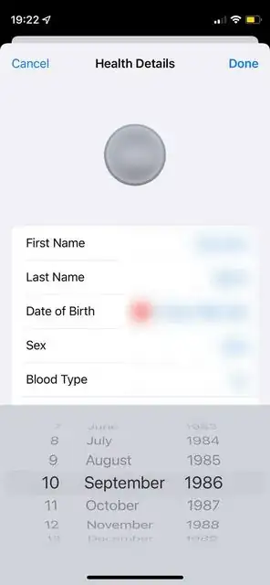
As @jnpdx pointed out in a comment to the question, it turns out that the DatePicker on the Health app is written with UIKit and has no equivalent in SwiftUI. So I had to make a bespoke component for that using UIViewRepresentable.
This is what I concocted:
import SwiftUI

class MuteTextField: UITextField {
    override func canPerformAction(_ action: Selector, withSender sender: Any?) -> Bool {
        false
    }

    override func selectionRects(for range: UITextRange) -> [UITextSelectionRect] {
        []
    }

    override func caretRect(for position: UITextPosition) -> CGRect {
        .null
    }
}

struct DatePickerField: UIViewRepresentable {
    @Binding var selectedDate: Date?
    @Binding var isDatePickerVisible: Bool
    var minDate: Date
    var maxDate: Date
    var unset: String

    func makeUIView(context: Context) -> MuteTextField {
        let textField = MuteTextField()
        textField.tintColor = UIColor.clear

        let datePicker = UIDatePicker()
        datePicker.datePickerMode = .date
        datePicker.minimumDate = minDate
        datePicker.maximumDate = maxDate
        datePicker.preferredDatePickerStyle = UIDatePickerStyle.wheels
        datePicker.addTarget(context.coordinator, action: #selector(Coordinator.dateChanged(_:)), for: .valueChanged)
        textField.inputView = datePicker
        textField.textColor = .systemBlue
        textField.textAlignment = .right

        return textField
    }

    func updateUIView(_ uiView: MuteTextField, context: Context) {
        uiView.text = selectedDate == nil ? unset : selectedDate?.formatted(date: .abbreviated, time: .omitted)
    }

    func makeCoordinator() -> Coordinator {
        Coordinator(self)
    }

    class Coordinator: NSObject {
        let parent: DatePickerField

        init(_ parent: DatePickerField) {
            self.parent = parent
        }

        @objc func dateChanged(_ sender: UIDatePicker) {
            parent.selectedDate = sender.date
        }
    }
}
This can be used on SwiftUI. But it turns out it's a text field, which is not what I wanted, so I hid the field, as can be seen on the UIKit component, when I say textField.isHidden = true. On SwiftUI I used a ZStack to overlap the field with something else that looks like the field in the Health app. It's not pretty, but can be made into a new component later.
It looks roughly like this:
var body: some View {
    ZStack {
        if (editMode == .active) {
            HStack {
                Text(fieldLabel)
                    .foregroundColor(.primary)
                Spacer()
                DatePickerField(
                    selectedDate: $selectedDate,
                    isDatePickerVisible: $visibleInput,
                    minDate: minDate,
                    maxDate: maxDate,
                    unset: fieldUnset
                )
            }
        } else {
            HStack {
                Text(fieldLabel)
                    .foregroundColor(.primary)
                Spacer()
                if selectedDate == nil {
                    Text(fieldUnset)
                        .foregroundColor(.secondary)
                } else {
                    Text(selectedDate!, formatter: mediumDateFormatter)
                        .foregroundColor(.secondary)
                }
            }
        }
    }
}
It's big, but it can be wrapped in another View, so it's not too bad.
The Health app also has a red button to clear the value entirely. My date is optional, so it can be nil. I will probably add the icon later to set it back to nil, but it would be out of scope for this question as my main concern was to show the DatePicker.
I assume a similar approach would be required for the other fields: sex and blood type, which are lists. That component can be expanded or copied to handle that.
