I'm developing a R visual tool for correlation matrices and am stuck getting the entire plot to come in blue. I'm trying to get it to work no matter what dataset columns you throw at it. I've developed a few different ways to color code for various different plots in the matrix but I'm stuck on the plots for categorical variables above the axis (which are box plots, in this case). Does anyone have any ideas on how to get the dots on those graphs to come in blue?
I'm also bound by the libraries I can have, so I can't use gginnards: https://learn.microsoft.com/en-us/power-bi/connect-data/service-r-packages-support
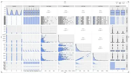
Here is my code and the visual so far:
ERRORCHECK = FALSE

options(warn=0)

library(ggplot2); library(GGally);

for (i in colnames(Values)){   Values[[i]] <- unlist(Values[[i]]) }

p <- ggpairs(Values, mapping = ggplot2::aes(fill = "cornflowerblue", alpha = .5))

for(i in 1:p$nrow) {   for(j in 1:p$ncol){
    p[i,j] <- p[i,j] + scale_fill_manual(values="cornflowerblue")   } }

f <- sapply(Values, is.factor)


middle <- p$ncol/2 middleround <- ceiling(middle) even <- FALSE

if (middle == middleround) {   even <- TRUE }


whereami <- function(i, j, ifprint) {   #TESTING WHERE WE ARE IN THE GRAPH
     axis = FALSE   TOP = FALSE   BOTTOM = FALSE
     if (even==TRUE) {

    if (i==j){

      axis = TRUE

    } else if (j>i) {

      TOP = TRUE


    } else if (i>j) {

      BOTTOM = TRUE

    } else {

      #ERROR
      print("You shoulnd't see this. EVEN = TRUE")

    }
       }  else if (even==FALSE) {

    if (i==j){

      axis = TRUE

    } else if (j>i) {

      TOP = TRUE


    } else if (i>j) {

      BOTTOM = TRUE

    } else {

      #ERROR
      print("You shoulnd't see this. EVEN = FALSE")

    }   } else {

    print("You shuound't see this. Even is neither TRUE not FALSE")
       }
     if (ifprint == TRUE){
    print("----")
    print("axis")
    print(axis)
    print("top")
    print(TOP)
    print("bottom")
    print(BOTTOM)
    print("row")
    print(i)
    print("column")
    print(j)

    rowname <- colnames(Values)[i]
    colname <- colnames(Values)[j]

    print("rowname")
    print(rowname)
    print("colname")
    print(colname)
       }
     returnlist <- list("bottom" = BOTTOM, "top" = TOP, "axis" = axis)
     return(returnlist)    }

for(i in 1:p$nrow) {   for(j in 1:p$ncol){

    wheream <- whereami(i,j, FALSE)

    BOTTOM <- wheream$bottom
    TOP <- wheream$top
    axis <- wheream$axis

    if (i==j) {
      #AXIS

      # DO NOTHING

    } else if (!(f[i])&!(f[j])) {
      #BOTH CONTINUOUS

      # ABOVE AXIS, NO CHANGE. BELOW AXIS, ADD GEOM POINT AND COLOUR MANUAL

      if (BOTTOM == TRUE) {

        p[i,j] <- p[i,j] + geom_point(aes(colour = "cornflowerblue")) +
          scale_colour_manual(values = "cornflowerblue")

      } else if (TOP == TRUE) {

        # DO NOTHING

      } else {

        print("You shouldn't see this. Both are continuous, neither bottom nor top is true")

      }

    } else if ((!(f[i])&(f[j]))) {
      #ROW CONTINUOUS, COLUMN DISCRETE

      if (BOTTOM == TRUE) {

        # DO NOTHING

      } else if (TOP == TRUE) {

        # Discrete-continuous top. Still working on this.

      } else {

        print("You shouldn't see this. Row is continuous, column discrete, neither bottom nor top is true")

      }

    } else if ((f[i])&!(f[j])) {
      #ROW DISCRETE, COLUMN CONTINUOUS

      if (BOTTOM == TRUE) {

        # DO NOTHING

      } else if (TOP == TRUE) {

        # Discrete-continuous top. Still working on this.

      } else {

        print("You shouldn't see this. Row is discrete, column continuous, neither bottom nor top is true")

      }

    } else if ((f[i])&(f[j])) {
      #BOTH DISCRETE

      if (BOTTOM == TRUE) {

        # DO NOTHING

      } else if (TOP == TRUE) {

        # DO NOTHING

      } else {

        print("You shouldn't see this. Both discrete, neither bottom nor top is true")

      }

    }  else {
      #ERROR HANDLING

      print("You shouln't see this message. ")

    }
       } }

errorchecker <- function(nothing){
       #ERROR CHECKER
     print("BEGINNING ERROR CHECKING")
     for(i in 1:p$nrow) {
    for(j in 1:p$ncol){
      tryCatch(
        expr = {
          print(p[i,j])
        },
        error = function(e){
          print("ERROR AT:")
          wheream <- whereami(i,j, TRUE)
        }
      )
    }   }
     print("DONE ERROR CHECKING")    }

if (ERRORCHECK == TRUE){ errorchecker() }


p

