I have a particular structured data set on student performance across classes and into which achievement cohort they fell into. I want to create a sankey diagram that visualizes how students achievement cohorts changed across several classes. My data looks like this:
Course     St_ID    Achievement
Eng101     St_A     Top third
Eng101     St_B     Top third
Eng101     St_C     Middle third
Eng101     St_D     Middle third
Eng101     St_E     Bottom third
Eng101     St_F     Bottom third
Calc101    St_A     Top third
Calc101    St_B     Bottom third
Calc101    St_C     Bottom third
Calc101    St_D     Top third
Calc101    St_E     Middle third
Calc101    St_F     Middle third
Hist101    St_A     Bottom third
Hist101    St_B     Bottom third
Hist101    St_C     Middle third
Hist101    St_D     Top third
Hist101    St_E     Middle third
Hist101    St_F     Top third
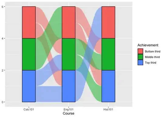
And I want the sankey diagram to look something like this (not drawn to scale) :
:
How can I do that?