3

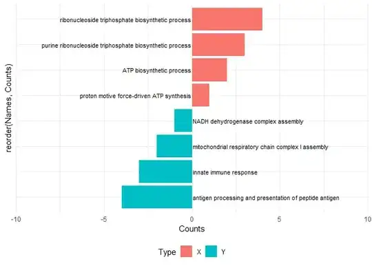
I have a plot with the labels on the y axis (after using coord_flip) Here is a reproducible example

Names <- c("ExampleA","ExampleB","ExampleC","ExampleD", "ExampleE", "ExampleF","ExampleG", "ExampleH")
Counts <- c(4,3,2,1,-1,-2,-3,-4)
Type <- c("X","X","X","X", "Y","Y","Y","Y")
df <-data.frame(Names,Counts, Type)

ggplot(df, aes(x=reorder(Names,Counts), y=Counts, fill=Type))+
  geom_col()+
  coord_flip()+
  theme_minimal()

I want the labels to be written next to the bars. Meaning that "ExampleA/B/C/D" etc. should be written right next to the bars and not listed on the y axis. Or in visuals: What I have

What I have:

What I want What I want: (Credit Li et al. 2021 https://doi.org/10.3389/fimmu.2021.694801)

I tried: ggplot: put axis text inside plot which didn't work.

This

geom_label(label=Names, parse=TRUE)

is close but not really what I want (and also for the real data only works when I type out every single name into a vector which I'd like to avoid if not nescessary). I was hoping that there is something along the lines of

geom_label(label=Names, position="inside")

or

scale_x_discrete(position = "inside")

would be possible, but thus far I could not find anything.

LCD
  • 45
  • 5

3 Answers3

3

Updated to match OP's required output and long names.

Have rearranged x and y subjects from original so that we can avoid coord_flip and read the graph as is, rather than transpose x and y.

Made text positioning more robust using both hjust and nudge_x, the former aligns the text and the later provides the padding between the text and the end of the bar.

As for the long text this is managed by creating extra space either side of the plot using expansion in the call to scale_x_continuous and setting the text size to 3 in the call to geom_text. An alternative would be to edit the text to include a line break but this may be problematic where there are many bars.

library(ggplot2)

Names <- c("ribonucleoside triphosphate biosynthetic process" ,"purine ribonucleoside triphosphate biosynthetic process" ,"ATP biosynthetic process" ,"proton motive force-driven ATP synthesis" ,"NADH dehydrogenase complex assembly" ,"mitochondrial respiratory chain complex I assembly" ,"innate immune response" ,"antigen processing and presentation of peptide antigen")
Counts <- c(4,3,2,1,-1,-2,-3,-4)
Type <- c("X","X","X","X", "Y","Y","Y","Y")

df <-data.frame(Names,Counts, Type)

ggplot(df, aes(Counts, reorder(Names,Counts), fill=Type))+
  geom_col()+
  geom_text(aes(label = Names, x = 0),
            size = 3,
            nudge_x = ifelse(Counts < 0, 0.05, -0.05),
            hjust = ifelse(Counts < 0, 0, 1)) +
  scale_x_continuous(expand = expansion(mult = c(0.75, 0.75)))+
  theme_minimal() +
  theme(axis.text.y = element_blank(),
        legend.position = "bottom")

Created on 2023-06-26 with reprex v2.0.2

Peter
  • 11,500
  • 5
  • 21
  • 31
  • Close, is there a way to write the labels next to the bars on the other side? So that they end/start at 0 – LCD Jun 26 '23 at 13:17
  • 1
    Sorry I missed that, will change the answer! – Peter Jun 26 '23 at 13:22
  • Set `x = 0` explicitly within `geom_text()`, but outside of `aes()` – Captain Hat Jun 26 '23 at 13:24
  • I tried this on my dataset (which has 74 datapoints and not just 8) and for some reason the text is shifted. (I cant add a plot to a comment so Ill try to rectreate it using text with- beeing the bar and . beeing an empty space) some look like this: ------............label, some like: -------label, others: -------.......label. Any idea as to why that is? The only reasoning I have is that its 74 points and not just 8. – LCD Jun 26 '23 at 14:06
  • That's going to be a vey condensed graph! To be honest I'm not really sure I can picture what the problem is. I have removed the `scale_y_continuous` argument from the answer as this is no longer required. Possibly the elements in the `Names` variable need tidying up? Can you include a subset of your actual data that replicates the problem? – Peter Jun 26 '23 at 14:19
  • The problem is the length: Names <- c("ribonucleoside triphosphate biosynthetic process" ,"purine ribonucleoside triphosphate biosynthetic process" ,"ATP biosynthetic process" ,"proton motive force-driven ATP synthesis" ,"NADH dehydrogenase complex assembly" ,"mitochondrial respiratory chain complex I assembly" ,"innate immune response" ,"antigen processing and presentation of peptide antigen") Counts <- c(4,3,2,1,-1,-2,-3,-4) Type <- c("X","X","X","X", "Y","Y","Y","Y") – LCD Jun 26 '23 at 14:34
  • With these names (GOterms) it shows a shifted image for some reason – LCD Jun 26 '23 at 14:34
  • 1
    Thanks for the new name set, see updated answer, which seems to cover it. – Peter Jun 26 '23 at 15:03
  • This now works perfectly. Thank you very much – LCD Jun 27 '23 at 07:25
0

Alternatively, you could create new variables x2 and y2 as below and use them in annotate function to generate the expected plot

df <-data.frame(Names,Counts, Type) %>% arrange(desc(Type), desc(Names), Counts) %>% 
mutate(x2=row_number(),
       y2=ifelse(Type=='X',-0.4,0.4)) %>% 
  arrange(Type,Names,Counts)

ggplot(df, aes(x=reorder(Names,Counts), y=Counts, fill=Type))+
  geom_col()+
  coord_flip()+
  theme_minimal() + annotate(geom = 'text', y=df$y2, x=df$x2, label=df$Names) + 
  theme(axis.text.y = element_blank())

# output

      Names Counts Type x2   y2
1 ExampleA      4    X  8 -0.4
2 ExampleB      3    X  7 -0.4
3 ExampleC      2    X  6 -0.4
4 ExampleD      1    X  5 -0.4
5 ExampleE     -1    Y  4  0.4
6 ExampleF     -2    Y  3  0.4
7 ExampleG     -3    Y  2  0.4
8 ExampleH     -4    Y  1  0.4

enter image description here

jkatam
  • 2,691
  • 1
  • 4
  • 12
  • This also works for the example data. But for the real data (with longer names see coment above) it fails for some reason. There the names are split and partially written inside the coloumns. – LCD Jun 26 '23 at 14:37
0

If the size of the Names is lengthy then we can decrease the size of the labels in annotate() as below

ggplot(df, aes(x=reorder(Names,Counts), y=Counts, fill=Type))+
  geom_col()+
  coord_flip()+
  theme_minimal() + annotate(geom = 'text', y=df$y2, x=df$x2, label=df$Names, size=3) + 
  theme(axis.text.y = element_blank())

enter image description here

jkatam
  • 2,691
  • 1
  • 4
  • 12