I would like to plot likert scale data with percentage on the horizontal axis and Items on the vertical axis. I also want to show the percentages in the middle of each bar.
I have tried the following codes, however the graph is totally blank. It only shows the labels of x-axis and y-axis.
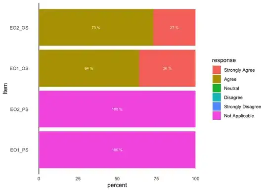
Item <- c("EO1_PS", "EO1_OS", "EO2_PS", "EO2_OS")
SA <- c(0, 36, 0, 27)
A <- c(0, 64, 0, 73)
N <- c(0, 0, 0, 0)
D <- c(0, 0, 0, 0)
SD <- c(0, 0, 0, 0)
NAP <- c(100, 0, 100, 0)

# Creating Data Frame

df <- data.frame(Item, SA, A, N, D, SD, NAP)
print(df)

df <- df %>%
  rename(
    "Strongly Agree" = SA,
    "Agree" = A,
    "Neutral" = N,
    "Disagree" = D,
    "Strongly Disagree" = SD,
    "Not Applicable" = NAP
  )

likert <- df %>%
  gather(response, percent, -Item)
likert

ind_order <- likert %>%
  filter(response == "Not Applicable") %>%
  arrange(desc(percent))

lik <- likert %>%
  mutate(Item = factor(Item, levels = ind_order, ordered = TRUE)) %>%
  mutate(response = factor(response,
    levels = c("Strongly Agree", "Agree", "Neutral", "Disagree", "Strongly Disagree", "Not Applicable"), ordered = TRUE,
    labels = c("Strongly Agree", "Agree", "Neutral", "Disagree", "Strongly Disagree", "Not Applicable")
  )) %>%
  mutate(percent = ifelse(response %in% c("Strongly Agree", "Agree", "Neutral", "Disagree", "Strongly Disagree", "Not Applicable"), percent))

# Plot

gg <- ggplot()
gg <- gg + geom_hline(yintercept = 0)

gg <- gg + geom_text(
  data = filter(lik, percent > 0),
  aes(x = Item, y = percent, group = response, label = paste(percent * 100, "%")),
  position = "stack", hjust = 1, size = 2.5, color = "white"
)

gg <- gg + scale_x_discrete(expand = c(0, .75))
gg <- gg + scale_fill_manual(
  values = c("#4393c3", "#92c5de", "#b2182b", "gray"),
  drop = FALSE
)
gg <- gg + scale_y_continuous(
  expand = c(0, .10),
  breaks = seq(.35, 1, .25),
  limits = c(.35, .95)
)
gg <- gg + coord_flip()
gg <- gg + theme_bw()
gg <- gg + theme(axis.ticks = element_blank())
gg <- gg + theme(panel.border = element_blank())
gg <- gg + theme(panel.grid.major.y = element_blank())
gg <- gg + theme(panel.grid = element_blank())
gg