-1

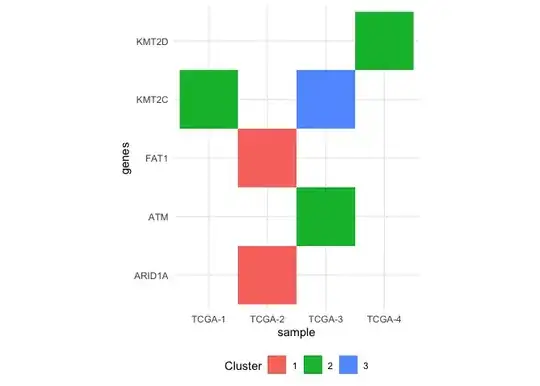
I have a data looks like this.

Genes                  Sample       cluster
1:      ARID1A         TCGA-2 cluster 1
2:        FAT1         TCGA-2 cluster 1
3:       KMT2C         TCGA-1 cluster 2
4:       KMT2C         TCGA-3 cluster 3
5:         ATM         TCGA-3 cluster 2
6:       KMT2D         TCGA-4 cluster 2

I am wondering is there any way to create a heat map of this kind of data in R. I already tried looking into pheatmap package but couldnot find any solution .

Aryh
  • 479
  • 1
  • 4
  • 16
  • How is this heatmap arranged? Rows of genes and columns of samples with the color determined by cluster assignment? Is the dataset complete (all genes assigned a cluster in each sample)? – Seth Jun 08 '23 at 13:50
  • Yes The columns are samples, Rows should be Genes and colors determined by clusters. Perhaps some dendrogram along with heatmap too on above to show cluster assignment clearly. – Aryh Jun 08 '23 at 13:55
  • To generate a dendrogram wouldn't you need the tree from the clustering process and not just the final assignments? Hierarchical clustering results should return data corresponding to when clusters were merged, heights, and ordering. – Seth Jun 08 '23 at 14:06
  • Thats the problem . I donot have clustering results. Anyways what solution do you propose for just heat map? any thing from ggplot? – Aryh Jun 08 '23 at 14:09

1 Answers1

0

Here's a way to create a heatmap with ggplot2 from the data you shared:

library(ggplot2)

ggplot(df, aes(sample, genes, fill = factor(cluster))) +
  geom_raster() +
  coord_equal() +
  theme_minimal() +
  labs(fill = 'Cluster') +
  theme(legend.position = 'bottom')

Created on 2023-06-08 with reprex v2.0.2

Seth
  • 1,659
  • 1
  • 4
  • 11
  • Can we modify in a way that samples having simmilar clusters should be together . Also how to modify the margins? – Aryh Jun 08 '23 at 15:08