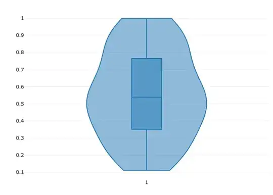
The violin plot im currently trying to create shows tails going into the negative side of the y-axis. Is there anyway to remove the negative tail of these violin plots?
Im using this plotly function to generate the plot:
fig <- plot_ly(data = test_dt, source = 'violin_plot')

fig <- fig %>% add_trace( x = test_dt [[x_col()]], y = test_dt [[y_col()]],  width = .55,

                          showlegend = T,

                          box = list(visible = T),

                          spanmode = "soft",

                          meanline = list(visible = F),

                          color = test_dt[[x_col()]],

                          colors = "Set3",

                          type = "violin")
When I choose span = "hard", both sides (positive and negative) get cut-off. I want to keep the full positive span.
P.s. The number of plots is not fixed. It would be dynamic based on the x-axis variable.