0

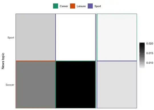
Im trying to make a heatmap, that illustrates how intense a newspaper write about 30 different news topics over a timeperiod. The news topics can be grouped into 6 "meta topics" illustrated by the 6 different colors in the diagram below. However, I would like to fill out the color in each box of the upper legend, so it is easier to see (right now the color is only encircling each of the categories in the legend.) Secondly, I would like to change the location of the upper legend such that it is above the diagram. I have tried to add "theme(legend.position="top") + " to the code, but it doesn't change anything. Current heatmap

My code is:

all.data %>%
  dplyr::mutate(TopicName = fct_reorder(TopicName, metanumber)) %>%
  ggplot(aes(x = date, y = TopicName, color=MetaTopic,fill = rel_impact)) + geom_tile() +
  scale_x_date(date_breaks = "1 year", date_labels = "%Y",expand = c(0,0)) +
  scale_y_discrete(expand=c(0,0)) +
  theme(legend.position="bottom") +
  scale_colour_brewer(palette = "Dark2", name=NULL) +
  scale_fill_gradient(low = "white",high = "black", name=NULL) +
  labs(x=NULL, y="News topic") +
  theme_light(base_size = 11) 

Update: To reproduce the structure of the data, see the following code:

structure(list(SeriesID = c("Topic_1", "Topic_2", "Topic_1", "Topic_2", "Topic_1", "Topic_2"), date = structure(c(14760, 14760,  14790, 14790, 14821, 14821), class = "Date"), TopicName = c("Sport","Soccer", "Sport", "Soccer", "Sport", "Soccer"),MetaTopic = c("Sport", "Sport", "Sport", "Sport", "Sport", "Sport"),abs_impact = c(0.00169196071242834, 0.00237226605899713, 0.00031583852881164, 0.00096867233821691, 0.00020904777100742, 0.00023139444960141), sum = c(0.196227808854163, 0.196227808854163,0.047504294243804, 0.047504294243804,0.0296850112874241, 0.0296850112874241),rel_impact = c(0.00862243084865617,0.01208934693227, 0.00664863111512987,0.0203912583827778, 0.00704219947849513, 0.00779499281172378), metanumber = c(1, 1, 1, 1, 1, 1)), row.names= c(NA, -6L), class = c("tbl_df", "tbl", "data.frame"))

Hope you can help me out.

Sofie
  • 17
  • 4
  • Hi Sofie - To make this a minimal reproducible example, please share a sample of the data itself in place of the screenshot. You can copy the output from `dput(head(all.data))`, and paste it in as an update to your question. – Seth May 02 '23 at 12:58
  • Thanks! I have edited my question, such that it should be possible to reproduce part of the data – Sofie May 02 '23 at 14:29

1 Answers1

0

Edit: Moving legends independently

I arbitrarily changed some of the labels in the MetaTopic variable to make the change to your plot more apparent.

You can override the fill aesthetic used in the color legend, without affecting the other legend and mapping. I made palette to match your color scale, named my_palette in the example. Then I added guide(color = guide_legend(override.aes = list(fill = my_palette))) to your plot, to fill the color legend.

For your plot you'll want to change the number of colors in the palette to match the number of MetaTopics (3 in my example). Also note I increased the linewidth of the geom_tiles just for easy visibility in this example. You can remove that to revert to the default.

Moving legends independently takes a few more steps. First we create the plot with the legend in the default position on the right. Next, the legend is isolated using cowplot::get_legend with the color aesthetic's legend removed (its being added elsewhere). Finally, we assemble the plot in two parts: adding our fill override and position changes to a plot without the fill legend, and adding back the fill legend we extracted in the previous step. rel_widths sets the relative width of each column, with the fill legend being the 2nd column in this case.

library(tidyverse)
library(cowplot)

all.data <- structure(list(SeriesID = c("Topic_1", "Topic_2", "Topic_1", "Topic_2", "Topic_1", "Topic_2"), date = structure(c(14760, 14760,  14790, 14790, 14821, 14821), class = "Date"), TopicName = c("Sport","Soccer", "Sport", "Soccer", "Sport", "Soccer"),MetaTopic = c("Sport", "Leisure", "Sport", "Career", "Career", "Sport"),abs_impact = c(0.00169196071242834, 0.00237226605899713, 0.00031583852881164, 0.00096867233821691, 0.00020904777100742, 0.00023139444960141), sum = c(0.196227808854163, 0.196227808854163,0.047504294243804, 0.047504294243804,0.0296850112874241, 0.0296850112874241),rel_impact = c(0.00862243084865617,0.01208934693227, 0.00664863111512987,0.0203912583827778, 0.00704219947849513, 0.00779499281172378), metanumber = c(1, 1, 1, 1, 1, 1)), row.names= c(NA, -6L), class = c("tbl_df", "tbl", "data.frame"))

my_palette <- RColorBrewer::brewer.pal(3, 'Dark2')

# base plot
p1 <- all.data %>%
  dplyr::mutate(TopicName = fct_reorder(TopicName, metanumber)) %>%
  ggplot(aes(x = date, y = TopicName, color=MetaTopic,fill = rel_impact)) + 
  geom_tile(linewidth = 1) +
  scale_x_date(date_breaks = "1 year", date_labels = "%Y",expand = c(0,0)) +
  scale_y_discrete(expand=c(0,0)) +
  theme(legend.position="bottom") +
  scale_colour_brewer(palette = "Dark2", name=NULL) +
  scale_fill_gradient(low = "white",high = "black", name=NULL) +
  labs(x=NULL, y="News topic") +
  theme_light(base_size = 11)

# grab fill legend
guide_color <- get_legend(p1 + guides(color = 'none'))

# construct plot
plot_grid(p1 +
            guides(fill = 'none',
                   color = guide_legend(
                     override.aes = list(fill = my_palette))) +
            theme(legend.position = 'top'),
          guide_color,
          ncol = 2,
          rel_widths = c(0.9, 0.1)
          )

Created on 2023-05-02 with reprex v2.0.2

Seth
  • 1,659
  • 1
  • 4
  • 11
  • Thanks a lot - it was exactly what I have tried to code up. However, I would still like the upper legend to be placed above the heatmap. Do you have any idea, how I can do this (it does not change if I add "theme(legend.position="top")" to my code) – Sofie May 02 '23 at 15:40
  • 1
    Adding `theme(legend.position="top")` after `theme_light` should work. The order these are added will matter, as `theme_light` will override the legend position if it comes last. Changing `legend.position` is going to move both legends. Were you aiming to move them independently? – Seth May 02 '23 at 16:13
  • 1
    Yes, I only want to move the top one (the one with the colors). The other one should stay to the right – Sofie May 02 '23 at 17:08
  • 1
    Hi @Sofie, `ggplot2` doesn't offer a direct way to do this that I'm aware of. I've edited the answer to show how you can do this using `cowplot`. – Seth May 02 '23 at 17:26