Please, consider the following MWE.
EDIT: Thanks to the very good comments, it became clear that there were not enough data in my very simplified MWE to do the statistical comparisons between the groups. Due to this shortcoming, I've rewritten the MWE:
library(dplyr)
library(ggplot2)
library(tidyr)
# Create random data
set.seed(123456789)
n_participants <- 100
participant_id <- 1:n_participants
group <- sample(c("A", "B"), size = n_participants, replace = TRUE)
gene1 <- sample(0:1, size = n_participants, replace = TRUE)
gene2 <- sample(0:1, size = n_participants, replace = TRUE)
gene3 <- sample(0:1, size = n_participants, replace = TRUE)
gene4 <- sample(0:1, size = n_participants, replace = TRUE)
gene5 <- sample(0:1, size = n_participants, replace = TRUE)
data <- data.frame(participant_id, group, gene1, gene2, gene3, gene4, gene5)
head(data)
#> participant_id group gene1 gene2 gene3 gene4 gene5
#> 1 1 B 1 0 1 0 1
#> 2 2 B 0 0 1 1 0
#> 3 3 A 1 1 0 1 0
#> 4 4 B 0 0 1 1 0
#> 5 5 A 0 1 1 1 0
#> 6 6 B 0 0 1 1 0
# Run chisq.tests to compare the categorical variables gene1:gene5 between groups "A" and "B"
data_long <- data %>%
pivot_longer(cols = gene1:gene5, names_to = "gene", values_to = "value")
test_results <- data_long %>%
group_by(gene) %>%
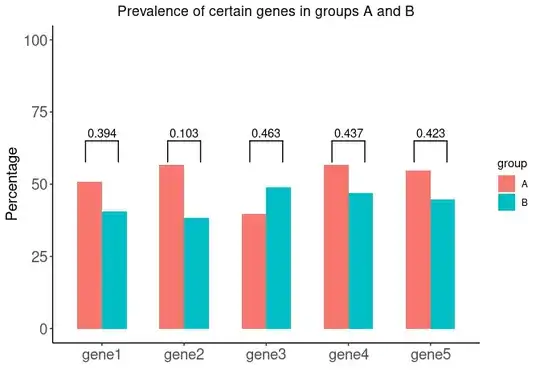
summarize(p_value = chisq.test(table(group, value))$p.value)
test_results
#> # A tibble: 5 × 2
#> gene p_value
#> <chr> <dbl>
#> 1 gene1 0.394
#> 2 gene2 0.103
#> 3 gene3 0.463
#> 4 gene4 0.437
#> 5 gene5 0.423
# For plotting, create probability table
prob_table <- data %>%
group_by(group) %>%
summarise(gene1 = mean(gene1, na.rm = TRUE) * 100,
gene2 = mean(gene2, na.rm = TRUE) * 100,
gene3 = mean(gene3, na.rm = TRUE) * 100,
gene4 = mean(gene4, na.rm = TRUE) * 100,
gene5 = mean(gene5, na.rm = TRUE) * 100)
# Thereafter convert to long form data for ggplot
data_to_ggplot <- pivot_longer(prob_table, gene1:gene5,
names_to = "gene", values_to = "Percentage")
# Plot data
ggplot(data_to_ggplot, aes(fill = group, x = gene, y = Percentage)) +
geom_bar(stat = "identity", position = "dodge", width = 0.6) +
ylim(0, 100) +
labs(x = "", y = "Percentage") +
ggtitle("Prevalence of certain genes in groups A and B") +
theme_classic() +
theme(plot.title = element_text(hjust = 0.5),
axis.text = element_text(size = 14),
axis.title = element_text(size = 14))
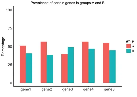
Created on 2023-04-29 with reprex v2.0.2
In order to get the image below, what method do you suggest to add the p-values from the object test_results? Can geom_signif be used in this type of a situation?