0

Due to the nature of my data, I have two age groups that have done two sessions of a test. It's important that I get a way to visualize how the full sample behaves (boxplot) and how each individual changes between sessions (Swarmplot/Lineplot).

When not using hues or groups, it's easy to do it by just using consecutively the three functions, or just skipping lineplot, like here (Swarmplot with connected dots); but as I am using hues to separate between groups, I haven't managed to join the data points of each subject Pre and Post.

So far, I have achieved to plot the lines but they are not alligned with the boxplot, but instead they are alligned to the ticks with the "Pre" and "Post" conditions:

Plot below shows four boxplots (pre_young, pre_old, and post_young, post_old), with the data points aligned to each boxplot, but lines aligned to the ticks of "Pre" and "Post", instead to the actual datapoints or middle of the boxplots.

enter image description here

I got that through this code:

fig, ax = plt.subplots(figsize=(7,5))
sns.boxplot(data=test_data, 
            x="Session", 
            y="Pre_Post", 
            hue="Age", 
            palette="pastel", 
            boxprops=boxprops, 
            ax=ax)

sns.swarmplot(data=test_data, 
              x="Session", 
              y="Pre_Post", 
              hue="Age", 
              dodge=True, 
              palette="dark", 
              ax=ax)
    
sns.lineplot(data=test_data, 
                 x="Session", 
                 y="Pre_Post", 
                 hue="Age", 
                 estimator=None, 
                 units="Subject", 
                 style="Age", 
                 markers=True, 
                 palette="dark", 
                 ax=ax)

plt.title("Test")
plt.xlabel("Session")
plt.ylabel("Score")

# Move the legend outside the plot
plt.legend(bbox_to_anchor=(1.05, 1), loc=2, borderaxespad=0.)

plt.show()

I have also tried to get the coordinates of the points through:

points = ax.collections[0]
offsets = points.get_offsets()
x_coords = offsets[:, 0]
y_coords = offsets[:, 1]

But I couldn't manage to correlate each coordinate to the subject that they are related to.

I am adding a sample of my dataset if it helps you to help me. It is in csv format:

'Session,Subject,Age,Pre_Post\nPre,SY01,young,14.0\nPre,SY02,young,14.0\nPre,SY03,young,13.0\nPre,SY04,young,13.0\nPre,SY05,young,13.0\nPre,SY06,young,15.0\nPre,SY07,young,14.0\nPre,SY08,young,14.0\nPre,SA01,old,5.0\nPre,SA02,old,1.0\nPre,SA03,old,10.0\nPre,SA04,old,3.0\nPre,SA05,old,9.0\nPre,SA06,old,5.0\nPre,SA07,old,13.0\nPre,SA08,old,13.0\nPost,SY01,young,14.0\nPost,SY02,young,13.0\nPost,SY03,young,14.0\nPost,SY04,young,13.0\nPost,SY05,young,15.0\nPost,SY06,young,13.0\nPost,SY07,young,15.0\nPost,SY08,young,14.0\nPost,SA01,old,6.0\nPost,SA02,old,2.0\nPost,SA03,old,10.0\nPost,SA04,old,7.0\nPost,SA05,old,8.0\nPost,SA06,old,11.0\nPost,SA07,old,14.0\nPost,SA08,old,11.0\n'
Trenton McKinney
  • 56,955
  • 33
  • 144
  • 158
Zaida
  • 13
  • 2

2 Answers2

3

This will work:

import pandas as pd
import matplotlib.pyplot as plt
import seaborn as sns

s = 'Session,Subject,Age,Pre_Post\nPre,SY01,young,14.0\nPre,SY02,young,14.0\nPre,SY03,young,13.0\nPre,SY04,young,13.0\nPre,SY05,young,13.0\nPre,SY06,young,15.0\nPre,SY07,young,14.0\nPre,SY08,young,14.0\nPre,SA01,old,5.0\nPre,SA02,old,1.0\nPre,SA03,old,10.0\nPre,SA04,old,3.0\nPre,SA05,old,9.0\nPre,SA06,old,5.0\nPre,SA07,old,13.0\nPre,SA08,old,13.0\nPost,SY01,young,14.0\nPost,SY02,young,13.0\nPost,SY03,young,14.0\nPost,SY04,young,13.0\nPost,SY05,young,15.0\nPost,SY06,young,13.0\nPost,SY07,young,15.0\nPost,SY08,young,14.0\nPost,SA01,old,6.0\nPost,SA02,old,2.0\nPost,SA03,old,10.0\nPost,SA04,old,7.0\nPost,SA05,old,8.0\nPost,SA06,old,11.0\nPost,SA07,old,14.0\nPost,SA08,old,11.0'

a = np.array([r.split(',') for r in s.split('\n')])

test_data = pd.DataFrame(a[1:, :], columns = a[0])
test_data['Pre_Post'] = test_data['Pre_Post'].apply(float)
def encode_session(x):
  if x=='Pre':
    return 0
  else:
    return 1
test_data['Session'] = test_data['Session'].apply(encode_session)

test_data2 = test_data.copy()
def offset_session(row):
  if row['Age']=='young':
    return row['Session']-0.2
  else:
    return row['Session']+0.2
test_data2['Session'] = test_data2.apply(offset_session, axis=1)

fig, ax = plt.subplots(figsize=(7,5))
sns.boxplot(data=test_data, 
            x="Session", 
            y="Pre_Post", 
            hue="Age", 
            palette="pastel", 
            #boxprops=boxprops, 
            ax=ax)

sns.swarmplot(data=test_data, 
              x="Session", 
              y="Pre_Post", 
              hue="Age", 
              dodge=True, 
              palette="dark", 
              ax=ax)
    
sns.lineplot(data=test_data2, 
                 x="Session", 
                 y="Pre_Post", 
                 hue="Age", 
                 estimator=None, 
                 units="Subject", 
                 style="Age", 
                 markers=True, 
                 palette="dark", 
                 ax=ax)

plt.title("Test")
plt.xlabel("Session")
plt.ylabel("Score")

# Move the legend outside the plot
plt.legend(bbox_to_anchor=(1.05, 1), loc=2, borderaxespad=0.)

plt.xticks([0,1],['Pre', 'Post'])

plt.show()

enter image description here

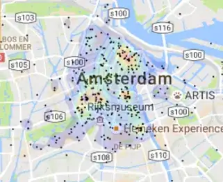
We can debate the merits of this plot. It's definitely cluttered and would probably be better split on two separate axes with less data overlapping each other. I personally do not think a bar plot is better. A before/after lineplot can be a good story teller. For example in the one below that I found on google I would much prefer looking at this over ~40 pairs of bars in a barplot:

enter image description here

Ken Myers
  • 596
  • 4
  • 21
0
  • The point of a visualization is to make it easier to extract meaning from data.
    • It's common to place a swarmplot over a boxplot because it provides additional information about the distribution.
    • You can, but shouldn't place a trendline on a distribution plot. These are two types of plots, which convey different information about the data, and the plot becomes difficult to interpret.
  • Since the point is to show the distribution of the data, and to clearly show the 'Score' change for each 'Subject', a barplot is more appropriate.
    • It is also a cleaner visualization to separate the 'Age' groups.
  • As shown in the other answer:
  • The request is to add a trendline from 'Pre' to 'Post' for each marker for each 'Age', which creates a difficult to read plot, even with a small subset of the data.
    • When there are many markers, the trendlines will only ever go to the center marker, because lineplot doesn't have a way to align with the marker spread from swarmplot.

Imports and Data

import pandas as pd
import seaborn as sns
import matplotlib.pyplot as plt

# data string
s = 'Session,Subject,Age,Pre_Post\nPre,SY01,young,14.0\nPre,SY02,young,14.0\nPre,SY03,young,13.0\nPre,SY04,young,13.0\nPre,SY05,young,13.0\nPre,SY06,young,15.0\nPre,SY07,young,14.0\nPre,SY08,young,14.0\nPre,SA01,old,5.0\nPre,SA02,old,1.0\nPre,SA03,old,10.0\nPre,SA04,old,3.0\nPre,SA05,old,9.0\nPre,SA06,old,5.0\nPre,SA07,old,13.0\nPre,SA08,old,13.0\nPost,SY01,young,14.0\nPost,SY02,young,13.0\nPost,SY03,young,14.0\nPost,SY04,young,13.0\nPost,SY05,young,15.0\nPost,SY06,young,13.0\nPost,SY07,young,15.0\nPost,SY08,young,14.0\nPost,SA01,old,6.0\nPost,SA02,old,2.0\nPost,SA03,old,10.0\nPost,SA04,old,7.0\nPost,SA05,old,8.0\nPost,SA06,old,11.0\nPost,SA07,old,14.0\nPost,SA08,old,11.0'

# split the data into separate components
data = [v.split(',') for v in s.split('\n')]

# load the list of lists into a dataframe
df = pd.DataFrame(data=data[1:], columns=data[0])

# rename the column
df.rename({'Pre_Post': 'Score'}, axis=1, inplace=True)

# convert the column from a string to a float
df['Score'] = df['Score'].apply(float)

# create separate groups of data for the ages
(_, old), (_, young) = df.groupby('Age')

old

   Session Subject  Age  Score
8      Pre    SA01  old    5.0
9      Pre    SA02  old    1.0
10     Pre    SA03  old   10.0
11     Pre    SA04  old    3.0
12     Pre    SA05  old    9.0
13     Pre    SA06  old    5.0
14     Pre    SA07  old   13.0
15     Pre    SA08  old   13.0
24    Post    SA01  old    6.0
25    Post    SA02  old    2.0
26    Post    SA03  old   10.0
27    Post    SA04  old    7.0
28    Post    SA05  old    8.0
29    Post    SA06  old   11.0
30    Post    SA07  old   14.0
31    Post    SA08  old   11.0

young

   Session Subject    Age  Score
0      Pre    SY01  young   14.0
1      Pre    SY02  young   14.0
2      Pre    SY03  young   13.0
3      Pre    SY04  young   13.0
4      Pre    SY05  young   13.0
5      Pre    SY06  young   15.0
6      Pre    SY07  young   14.0
7      Pre    SY08  young   14.0
16    Post    SY01  young   14.0
17    Post    SY02  young   13.0
18    Post    SY03  young   14.0
19    Post    SY04  young   13.0
20    Post    SY05  young   15.0
21    Post    SY06  young   13.0
22    Post    SY07  young   15.0
23    Post    SY08  young   14.0

Plotting

  • The real data likely has more observations, so increase the second number in the figsize tuple to increase the plot length, and adjust the second number in height_ratios to have more of the figure be used by the bar plots.
# create the figure using height_ratios to make the bottom subplots larger than the top subplots
fig, axes = plt.subplots(2, 2, figsize=(11, 11), height_ratios=[1, 2])

# flatten the axes for easy access
axes = axes.flat

# plot the boxplots
sns.boxplot(data=young, x="Session", y="Score", ax=axes[0])
sns.boxplot(data=old, x="Session", y="Score", ax=axes[1])

# plot the swarmplots
sns.swarmplot(data=young, x="Session", y="Score", hue='Session', edgecolor='k', linewidth=1, legend=None, ax=axes[0])
sns.swarmplot(data=old, x="Session", y="Score", hue='Session', edgecolor='k', linewidth=1, legend=None, ax=axes[1])

# add a title
axes[0].set_title('Age: Young', fontsize=15)
axes[1].set_title('Age: Old', fontsize=15)

# add the barplots
sns.barplot(data=young, x='Score', y='Subject', hue='Session', ax=axes[2])
sns.barplot(data=old, x='Score', y='Subject', hue='Session', ax=axes[3])

# extract the axes level legend properties
handles, labels = axes[3].get_legend_handles_labels()

# iterate through the bottom axes
for ax in axes[2:]:
    # removed the axes legend
    ax.legend().remove()
    
    # iterate through the containers
    for c in ax.containers:
        
        # annotate the bars
        ax.bar_label(c, label_type='center')
    
# add a figure level legend
_ = fig.legend(handles, labels, title='Session', loc='outside right center', frameon=False)

Easy to read visulization

enter image description here

Trenton McKinney
  • 56,955
  • 33
  • 144
  • 158