I have example data as follows:
library(dplyr)
library(tidyr)

# example data frame
df <- data.frame(
  col1 = c("A;B;C", "A;B", "B;C", "A;C", "B", "A;B;C;D"),
  col2 = c("X;Y;Z", "X;Y", "Y;Z", "X;Z", "Z", "W;X;Y;Z"),
  col3 = c("1;2", "1", "2;3", "3", "4;5;6", "7"),
  col4 = c(1, 2, 3, 4, 5, 6),
  col5 = c(TRUE, FALSE, TRUE, FALSE, TRUE, FALSE)
)

# select columns to separate
selected_cols <- c("col1", "col2", "col3", "col4", "col5")
I would like to convert the following code (which does a count):
library(ggplot2)
library(tidyr)

lapply(c("col1", "col2"), function(col) {
  separate_rows(df, all_of(col), sep = ";") |>
    ggplot(aes(.data[[col]])) +
    geom_bar(aes(fill = .data[[col]]))
})
To code that does percentages:
lapply(c("col1", "col2"), function(col) {
  separate_rows(df, all_of(col), sep = ";") |>
    ggplot(aes(.data[[col]])) +
    geom_bar(aes(fill = .data[[col]])) +
    stat_count(aes(y = (..count..)/sum(..count..)), position = "identity") +
    scale_y_continuous(labels = scales::percent)
})
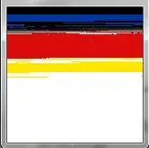
However, that creates some odd graphs, among which is the following one (I just realised it is precisely the same graph where the counts are now percentages in the 100):
What am I doing wrong here?


