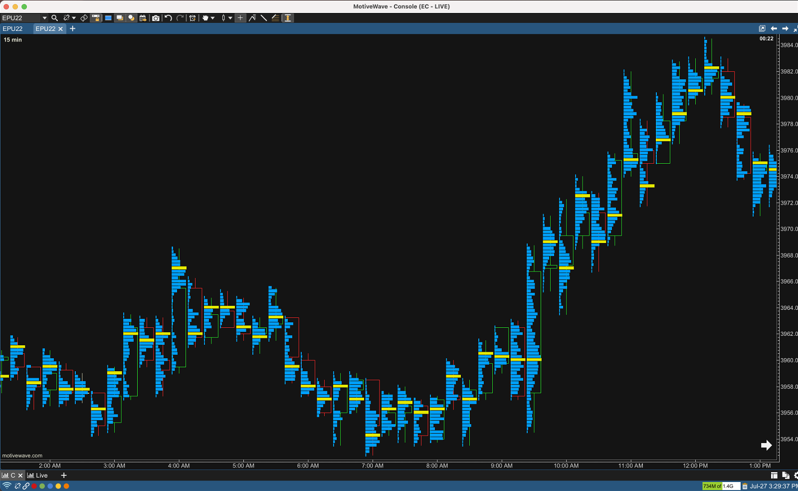
I am trying to create a market profile / volume profile chart like this or this in Bokeh (or anything else - plotly?). Basically, I want to make a plot with horizontal bar charts on it where 'bins' define edges of bars in a bar plot, 'amt' defines height of bars and 'time' is on the x axis.
In practice, I was looking to add around 50-150 of these bar plots to a single figure, and I've got the following example pandas dataframe:
import pandas as pd

data = [
{'time': pd.Timestamp('2023-03-07 23:01:00'), 'bins': pd.Interval(22085.286, 22088.925, closed='right'), 'amt': 8.013, 'buy_amt': 3.05, 'sell_amt': 4.963},
{'time': pd.Timestamp('2023-03-07 23:01:00'), 'bins': pd.Interval(22088.925, 22092.55, closed='right'), 'amt': 11.579, 'buy_amt': 0.106, 'sell_amt': 11.473},
{'time': pd.Timestamp('2023-03-07 23:01:00'), 'bins': pd.Interval(22092.55, 22096.175, closed='right'), 'amt': 0.678, 'buy_amt': 0.002, 'sell_amt': 0.676},
{'time': pd.Timestamp('2023-03-07 23:01:00'), 'bins': pd.Interval(22096.175, 22099.8, closed='right'), 'amt': 5.72300, 'buy_amt': 1.44899, 'sell_amt': 4.274},
{'time': pd.Timestamp('2023-03-07 23:02:00'), 'bins': pd.Interval(22071.686, 22076.3, closed='right'), 'amt': 14.968, 'buy_amt': 3.885, 'sell_amt': 11.08299},
{'time': pd.Timestamp('2023-03-07 23:02:00'), 'bins': pd.Interval(22076.3, 22080.9, closed='right'), 'amt': 0.1440, 'buy_amt': 0.001, 'sell_amt': 0.14300},
{'time': pd.Timestamp('2023-03-07 23:02:00'), 'bins': pd.Interval(22080.9, 22085.5, closed='right'), 'amt': 19.137, 'buy_amt': 4.259, 'sell_amt': 14.878},
{'time': pd.Timestamp('2023-03-07 23:03:00'), 'bins': pd.Interval(22070.691, 22073.8, closed='right'), 'amt': 14.03099, 'buy_amt': 9.532, 'sell_amt': 4.499},
{'time': pd.Timestamp('2023-03-07 23:03:00'), 'bins': pd.Interval(22076.9, 22080.0, closed='right'), 'amt': 5.91, 'buy_amt': 5.91, 'sell_amt': 0.0},
{'time': pd.Timestamp('2023-03-07 23:04:00'), 'bins': pd.Interval(22079.984, 22083.975, closed='right'), 'amt': 0.776, 'buy_amt': 0.68, 'sell_amt': 0.096},
{'time': pd.Timestamp('2023-03-07 23:04:00'), 'bins': pd.Interval(22083.975, 22087.95, closed='right'), 'amt': 6.27199, 'buy_amt': 5.067, 'sell_amt': 1.205},
{'time': pd.Timestamp('2023-03-07 23:04:00'), 'bins': pd.Interval(22087.95, 22091.925, closed='right'), 'amt': 2.156, 'buy_amt': 0.47600, 'sell_amt': 1.6800},
{'time': pd.Timestamp('2023-03-07 23:04:00'), 'bins': pd.Interval(22091.925, 22095.9, closed='right'), 'amt': 7.481, 'buy_amt': 4.755, 'sell_amt': 2.726},
{'time': pd.Timestamp('2023-03-07 23:05:00'), 'bins': pd.Interval(22076.491, 22078.85, closed='right'), 'amt': 26.618, 'buy_amt': 0.3080, 'sell_amt': 26.31},
{'time': pd.Timestamp('2023-03-07 23:05:00'), 'bins': pd.Interval(22081.2, 22083.55, closed='right'), 'amt': 0.196, 'buy_amt': 0.137, 'sell_amt': 0.059},
{'time': pd.Timestamp('2023-03-07 23:05:00'), 'bins': pd.Interval(22083.55, 22085.9, closed='right'), 'amt': 7.582, 'buy_amt': 3.691, 'sell_amt': 3.891}
]
df = pd.DataFrame(data)

df['new_bins'] = df['bins'].apply(lambda x: x.right)
df.set_index(['time', 'new_bins'], inplace=True)
my idea was to add multiple bar plots on a figure for every unique time period on x axis but that was just creating a single bar plot starting on the left hand side, and so the example below doesn't work.
def plot_cluster_graph(df):
    from bokeh.models import Range1d
    from bokeh.plotting import figure, show

    TOOLS = "pan,wheel_zoom,box_zoom,reset,save"

    bin_describe = df['bins'].apply(lambda x: x.right).describe()
    y = (bin_describe.min(), bin_describe.max())
    x = (df.index.get_level_values('time').min(), df.index.get_level_values('time').max())

    p = figure(tools=TOOLS,
               width=1000,
               height=400,
               title="plot",
               x_axis_type="datetime",
               x_range=x,
               y_range=y,
               )
    # get largest amt values per cluster + 1 to act as separator between cluster locations
    max_amts = [df.loc[time]['amt'].max() for time in df.index.get_level_values('time').unique()]
    amt_range = sum(max_amts) + len(max_amts)

    p.extra_x_ranges['vol'] = Range1d(0, amt_range)

    past_amt = 0
    for time in list(df.index.get_level_values('time').unique()):
        left = round(past_amt, 3)
        right = [left+i for i in list(df.loc[time]['amt'])]

        p.hbar(y=list(df.loc[time].index),
               left=left,
               right=right,
               height=0.5)

        past_amt += (df.loc[time]['amt'].max()) + 1

    show(p)
Any suggestions on how I can create this plot in Bokeh or plotly or something similar in python?