There are widget like TextFiled,TextFormFiled can be used to take user input.
Lets split the xml code
android:radius="20dp" it should have 20px(flutter use pixel) for border and TextFormFiled widget can provide different borders based on state.padding android:left="10dp...." having 10px paddingstroke android:width="1dp" means border thickness- and background color
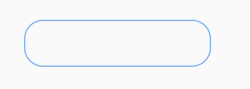
We can use OutlineInputBorder
const border = OutlineInputBorder(
      borderSide: BorderSide(
        color: Color.fromARGB(255, 0, 68, 255),
        width: 1,
      ),
      borderRadius: BorderRadius.all(
        Radius.circular(20),
      ),
    );
The the widget will be
class TestWidget extends StatelessWidget {
  const TestWidget({super.key});

  @override
  Widget build(BuildContext context) {
    const border = OutlineInputBorder(
      borderSide: BorderSide(
        color: Color.fromARGB(255, 0, 68, 255),
        width: 1,
      ),
      borderRadius: BorderRadius.all(
        Radius.circular(20),
      ),
    );
    return TextFormField(
      enabled: false,
      decoration: InputDecoration(
        filled: true,
        fillColor: Colors.grey.shade50,
        contentPadding: EdgeInsets.all(10),
        border: border,
        enabledBorder: border,
        focusedBorder: border,
        errorBorder: border,
        disabledBorder: border,
        focusedErrorBorder: border,
      ),
    );
  }
}
For more, head on flutter.dev/flutter/material/TextFormField-class.html