Below is a sample of the data:
df_1 <- data.frame(total = c(0.9, 0.4, 0.2), white = c(0.6, 0.2, 0.1), black = c(0.3, 0.2, 0.1), immigrant = c(0.7, 0.3, 0.9))

df_2 <- data.frame(total = c(0.8, 0.7, 0.6), white = c(0.4, 0.3, 0.2), black = c(0.4, 0.4, 0.4), immigrant = c(0.9, 0.2, 0.1))

df_3 <- data.frame(total = c(0.6, 0.8, 0.9), white = c(0.4, 0.2, 0.7), black = c(0.2, 0.6, 0.2), immigrant = c(0.6, 0.8, 0.5))
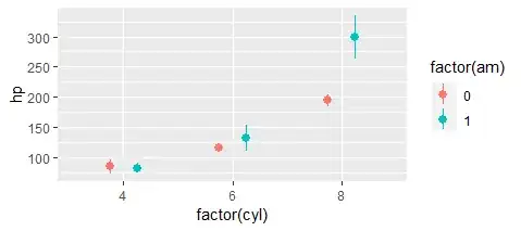
Hi, I am interested in using ggplot2 to graph the dataframes above. In my example, each dataframe represents a different decade as follows: df_1 represents 1930, df_2 represents 1990, and df_3 represents 2020. I am interested in calculating the mean/average of each of the four columns and then graphing the results. I would like the x-axis to represent each year (1930, 1990, and 2020) and the y-axis to represent the calculated means (which should range from 0-1). The columns in all of the dataframes show different demographic groups and would be visualized as a point in the graph. Below is an idea of what I am envisioning. Illustration of the desired graph
I tried grouping the dataframes first but then I am not sure how to categorize each dataframe as a different year. The code below is something I adapted from another graph I made but it didn't work as expected. Note, 'ratio' is meant to represent the calculated means of each column.
Consideration:
- The number of rows in each column may be different throughout the dataframes
list(df_1,
     df_2,
     df_3) %>%
     lapply(function(x) setNames(x, 'ratio')) %>%
     {do.call(bind_rows, c(., .id = 'demographic'))} %>%
     mutate(ratio = mean(ratio)) %>%
     group_by(demographic) %>%
     ggplot(aes(ratio, n, colour = demographic, group = demographic)) +
     labs(x="Mean", y="Year", ))
