I have some data in the following format:
10.0 1 a 2
10.2 2 b 2
10.4 3 a 2
10.6 4 b 2
10.8 4 c 10
11.0 4 c 20
... where the third column basically indicates belonging to a 'separate' dataset; and so I would like to show, say, those samples belonging to 'a' in red, those belonging to 'b' in blue etc (using gnuplot Version 4.4 patchlevel 2).
I managed to somehow get the 'sample' style as a mix between 'impulses' and 'point' styles; and via Choosing line type and color in Gnuplot 4.0, managed to employ individual colors - this is how far I got (basictest.gnuplot):
#!/usr/bin/env gnuplot

print "Generating data..."

# to specify data inline in script:
# only system can work, as it is quoted;
# but still have to escape newlines!

system "cat > ./inline.dat <<EOF\n\
10.0 1 a 2\n\
10.2 2 b 2\n\
10.4 3 a 2\n\
10.6 4 b 2\n\
10.8 4 c 10\n\
11.0 4 c 20\n\
EOF\n"

print "done generating."


# set ranges
set yrange [0:30]
set xrange [0:4]

# define line styles - can call them up later
set style line 1 linetype 1 linewidth 3 pointtype 3 linecolor rgb "red"
set style line 2 linetype 1 linewidth 2 pointtype 3 linecolor rgb "green"
set style line 3 linetype 1 linewidth 2 pointtype 3 linecolor rgb "blue"


# offset the X axis: instead of 1:2, use: ($1-10):2
# to "mix", use "" for last datset - but must also repeat the "using"!
# ... and plot:

plot 'inline.dat' using ($1-10):2 with impulses linestyle 1,\
     "" using ($1-10):2 notitle with points linestyle 1,\
     "" using ($1-10):2 notitle with lines linestyle 2,\
     'inline.dat' using ($1-10):4 with impulses linestyle 3,\
     "" using ($1-10):4 notitle with points linestyle 3

# below just for saving file
#set terminal png
#set output 'basictest.png'
#replot
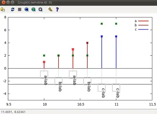
... which looks like this:
In other words, instead of the above - say for ($1-10):2, I'd like to see the 1st and 3rd sample ('a') in blue, 2nd and 4th sample ('b') in red, and the last two ('c') in green (I left the green line there just to see the effect of the style mixing).
I'm aware that this could be achieved by writing a script, that will parse the original data, and generate three tables out of that, as in:
10.0 1 a 2
10.4 3 a 2
---
10.2 2 b 2
10.6 4 b 2
---
10.8 4 c 10
11.0 4 c 20
... which could then be plotted 'separately' - but I was wandering if gnuplot maybe had some internal facility for something like that?
Thanks in advance for any answers,
Cheers!
PS: Some useful links for me:
- gnuplot / intro / style Introduction to gnuplot --- Plot Style
- gnuplot / intro / plotexp (E) Introduction to gnuplot --- Experimental Dat
- Gnuplot: An Interactive Plotting Program
- Gnuplot tricks: Further new features in gnuplot 4.4
EDIT: just wanted to post a link to a script with which I'm getting close to visualizing the data the way I wanted to:
I'm kinda wanting to treat the labels (with the added 'points' as rectagle backgrounds) as nodes in graphviz or in TikZ, and set up those nice connection lines between them - but even this already helps me much :) Note that this is the wxt output - other terminals like png or pdfcairo will have a completely messed up rendering of boxes/labels (and would need to be tuned by hand).