3

Please Consider :

Needs["ErrorBarPlots`"];

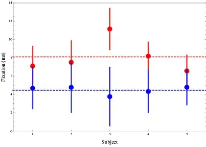
fixNumberF1F6 = {{{7.11`, 7.51`, 11.14`, 8.19`, 6.58`}, 
                  {2.14`, 2.33`,2.25`, 1.53`,1.71`}},               
                  {{4.69`, 4.79`, 3.78,4.34`, 4.8`}, 
                   {2.22`, 2.71`, 3.18`, 2.29`, 1.93`}}}

fixNumberF1F6[[1,1]] refers to the mean fixation number for each subject for condition 1, fixNumberF1F6[[1,2]] the standard Deviation of those means. fixNumberF1F6[[2]] refers to condition 2.

plotOptionsXX[title_, yName_, xName_, colors_: Black] :=

  {Frame -> {{True, False}, {True, False}},
   PlotStyle -> colors,
   PlotLabel -> 
   Style[title, Bold, 14, Opacity[1], FontFamily -> "Helvetica"],
   PlotStyle -> Directive[Black, PointSize[Medium]],
   PlotRangePadding -> 0,
   Frame -> {{True, False}, {True, False}},
   LabelStyle -> Directive[Black, Bold, 12],
   FrameLabel -> {{Style[yName, Opacity[1]], 
   None}, {Style[xName, Opacity[1]], None}},
   FrameStyle -> Opacity[0],
   FrameTicksStyle -> Opacity[1],
   AxesStyle -> Directive[Black, 12],
   ImageSize -> laTaille};

ErrorListPlot[fixNumberF1F6[[#]] // Transpose,
              PlotRange -> {{0, 6}, {0, 15}},
              ImageSize -> 300,
              FrameTicks ->{{Range[1, 13, 2], None},{{1, 2, 3, 4, 5}, None}},
              PlotStyle -> Directive[Black, AbsolutePointSize[10], AbsoluteThickness[2]],
              plotOptionsXX["Mean Fixation number", "Fixation Nuber", "SubNo"]] & /@ Range[2]

enter image description here

The Plot On the Left represent each subject average fixation number along with the standard deviation for condition 1. On the right for condition 2.

How could I plot them both on 1 plot ?

If this :

fixNumberF1F6across = {{8.10, 1.99}, {4.48, 2.46}}

was the mean and SD across subject, How could I show both ?

-How can I show 2 conditions on a similar plot for different subjects -How could I show the group mean and SD on it to.

500
  • 6,509
  • 8
  • 46
  • 80
  • @Yoda, maybe it was the "Need" I forgot. Problem is I would lose the standard deviation if I use BarChart :-( – 500 Sep 21 '11 at 21:34
  • @Yoda. Sorry I don`t understand :-( And if I do have a little idea I would think the bars will overlap ? – 500 Sep 21 '11 at 21:39
  • @500 `BoxWhiskerChart`(new in v. 8) does almost what you want. However you get quartiles (highlighting the 50% around the mean) rather than z-scores (highlighting 68% around the mean). Somehow, I could not get `ErrorListPlot` to run on my machine w/ v. 8, even though I did call `Needs["ErrorBarPlots'"]` – DavidC Sep 21 '11 at 21:42

4 Answers4

5

Edit:

I started from over. Given how the data are simple and clean, it may be easiest to use ListPlot and add the bars via an Epilog.

You can still tweak it a bit--e.g. put a slight space between the blue and red data points and bars, add a legend, etc, but the basic idea is there.

data = {{{7.11`, 7.51`, 11.14`, 8.19`, 6.58`}, {2.14`, 2.33`, 2.25`,   1.53`, 1.71`}}, {{4.69`, 4.79`, 3.78, 4.34`, 4.8`}, {2.22`,  2.71`, 3.18`, 2.29`, 1.93`}}};

ListPlot[{data[[1, 1]], data[[2, 1]]},
   PlotStyle -> {{PointSize[.025], Red}, {PointSize[0.025], Blue}},
   Frame -> True, 
   PlotRange -> {{0.5, 5.5}, {0, 14}},
   FrameTicks -> {{Automatic, Automatic}, {Range[5], None}},
   FrameLabel -> {{"Fixation (ms)", None}, {"Subject", None}},
   Epilog -> {{Red, Thickness[0.003], Dashed, 
      Line[{{0, m1 = Mean@data[[1, 1]]}, {5.5, m1}}],
      Blue, Line[{{0, m1 = Mean@data[[2, 1]]}, {5.5, m1}}]},
      Thickness[0.005], Red, 
      Line[{{#[[1]], #[[2, 1]]}, {#[[1]], #[[2, 2]]}}] & /@ 
      Transpose@{Range[5], ({#[[1]] + #[[2]], #[[1]] - #[[2]]} & /@ 
      Transpose@data[[1]])},
      Thickness[0.005], Blue, 
      Line[{{#[[1]], #[[2, 1]]}, {#[[1]], #[[2, 2]]}}] & /@ 
      Transpose@{Range[5], ({#[[1]] + #[[2]], #[[1]] - #[[2]]} & /@ 
      Transpose@data[[2]])},
      }]

whisker1

The BoxWhiskerChart below is from your data. If this looks vaguely like something you are interested in, it could be modified so that the spread from the 25th percentile to the 75% percentile is altered to reflect the spread of one s.d. above and below the mean.

And, yes, it is easy to overlay the group means (N=5) onto the Chart.

[The reason there isn't perfect symmetry around the mean is that I used your means and standard deviations to generate raw data, assuming a normal distribution. I only used 100 data points per trial, so a little skewing is natural. This would not happen if we were to tweak the chart to reflect standard deviations, which are symmetrical.]

BoxWhiskerChart

DavidC
  • 3,056
  • 1
  • 20
  • 30
5

For any number of series:

plotseries[a_] := 
 Module [{col = ColorData[22, "ColorList"]}, 
  Plot[Evaluate@(Piecewise[{#[[2]], #[[1]] - 1/3 <= x <= #[[1]] + 1/3} & /@ 
           Thread[List[Range@Length@#, #]]] & /@ 
              ({a[[#, 1]] + a[[#, 2]], a[[#, 1]] - a[[#, 2]]}) & /@ 
                (Range@Length@a)), {x, 0, 1 + Length@(a[[1, 1]])}, 
   ClippingStyle -> None,
   PlotStyle -> {None},
   Exclusions -> False,
   Filling -> ({2 # - 1 -> {{2 #}, Directive[col[[#]], Opacity[.2]]}} & /@ 
             Range@Length@a),
   Ticks -> {Range@Length[a[[1, 1]]], Range@#2 &},
   AxesLabel -> {Style["Subject", Medium, Bold], Style["Fixation Time", Medium, Bold]},
   Epilog -> 
    MapIndexed[{Directive[col[[#2[[1]]]], PointSize[.03]], 
       Point@Thread[List[Range@Length[#1[[1]]], #1[[1]]]]} &, a]
   ]
  ]
  b = Table[{Table[j^(i/3) + i, {j, 6}], Table[1, {j, 6}]}, {i, 1, 3}];
  plotseries[b]

enter image description here

Dr. belisarius
  • 60,527
  • 15
  • 115
  • 190
  • Just wondering...why did you treat x as a continuous variable? They are human subjects: 1, 2, 3, 4, 5 are simply labels as I understand it. – DavidC Sep 22 '11 at 02:10
  • @David It is just for visualization purposes. A shadow is easier to see than the error band superposition proposed by Sjoerd. I am well aware of the conceptual twisting I have done :) – Dr. belisarius Sep 22 '11 at 02:24
  • 2
    +1 Now that's really nice. I like your use of transparency. Some minor points: remove the non-integer ticks on x, as well as the number 6. And label the axes. – DavidC Sep 22 '11 at 11:35
  • @David Your desires are orders – Dr. belisarius Sep 22 '11 at 22:30
  • Looks great. I hope I wasn't too insistent. – DavidC Sep 23 '11 at 01:54
  • @David That was just a literal translation of a Spanish teaser. You were right, of course – Dr. belisarius Sep 23 '11 at 02:13
  • @belisarius ¿Did you mean to say ["your wish is my command"](http://en.wiktionary.org/wiki/your_wish_is_my_command)? – abcd Sep 28 '11 at 07:38
  • @Yoda I think so. "Sus deseos son órdenes" was the "correct" way to answer a demand from a king – Dr. belisarius Sep 28 '11 at 10:15
4

I don't work very much with error plots, so this might very well be a non-standard form of displaying the data and hastily put together based on the example in the documentation for ErrorBarFunction.

(*split it up so it's easier to follow*)
meanCond1 = fixNumberF1F6[[1, 1]];
stdCond1 = fixNumberF1F6[[1, 2]];
meanCond2 = fixNumberF1F6[[2, 1]];
stdCond2 = fixNumberF1F6[[2, 2]];

x1 = Transpose@{meanCond1, meanCond2};
x2 = ErrorBar @@@ Transpose@{stdCond1, stdCond2};

Show@(ErrorListPlot[{#1},
     ErrorBarFunction -> 
      Function[{coords, errs}, {Opacity[0.2], EdgeForm[{#2}], 
        Rectangle[coords + {errs[[1, 1]], errs[[2, 1]]}, 
         coords + {errs[[1, 2]], errs[[2, 2]]}]}], PlotStyle -> #2, 
     Axes -> False, Frame -> True, 
     FrameLabel -> {"Condition 1", "Condition 2"}] & @@@ 
   Transpose@{Transpose@{x1, x2}, {Blue, Yellow, Green, Gray, Red}})

enter image description here

Each dot is a different subject. The x coordinate is the mean for condition 1 and the y coordinate is the mean for condition 2. The lengths of the sides of the rectangles are the respective standard deviations. So while it does overlap, if you're prudent in choosing colors (and if there aren't too many subjects), it could perhaps work.

abcd
  • 41,765
  • 7
  • 81
  • 98
  • 1
    An alternative, that might reduce clutter, is to use [`Disk`](http://reference.wolfram.com/mathematica/ref/Disk.html) to create ellipses, plus it's simpler. `Disk[coords, Subtract @@@ errs]` should do in replacing `Rectangle` in the `ErrorBarFunction`. – rcollyer Sep 22 '11 at 04:27
3
ErrorListPlot[Transpose /@ fixNumberF1F6, 
   PlotRange -> {{0, 6}, {0, 15}}, ImageSize -> 300, 
   FrameTicks -> {{Range[1, 13, 2], None}, {{1, 2, 3, 4, 5}, None}}, 
   PlotStyle -> 
       {
        Directive[Opacity[0.6],Black, AbsolutePointSize[10], AbsoluteThickness[2]], 
        Directive[Opacity[0.6],Gray, AbsolutePointSize[10], AbsoluteThickness[2]]
       }, 
   plotOptionsXX["Mean Fixation number", "Fixation Number", "SubNo"]
]

enter image description here

ErrorListPlot[fixNumberF1F6across, PlotRange -> {{0, 3}, {0, 15}}, 
    ImageSize -> 300, 
    FrameTicks -> {{Range[1, 13, 2], None}, {{1, 2}, None}}, 
    PlotStyle -> Directive[Black, AbsolutePointSize[10], AbsoluteThickness[2]], 
    plotOptionsXX["Mean Fixation number", "Fixation Number", "Condition Number"]
]

enter image description here

As to the 3rd. I don't see how you can talk about group means if you want to show the data of the individual subjects. The 4th (5th?) question is totally unclear. I suggest you remove those questions as they don't seem to be specific to Mathematica programming.

Sjoerd C. de Vries
  • 16,122
  • 3
  • 42
  • 94
  • Thank You Sjoerd. I removed the last question. I thought it was important to show both to see how subjects are located against the mean for the group. I just thought I could have an horizontal line for that ? If you don`t think it is relevant, I will rely on your judgement, since you are an expert. Many thanks for your attention. – 500 Sep 21 '11 at 22:18
  • @500 There is no reason to eliminate the group means. You are trying to show a difference in two experimental conditions, after all. – DavidC Sep 21 '11 at 22:26
  • So here what we are looking at really is : in a free-viwewing 3seconds task how many fixations did subjects do if we consider them all (bond 1 here) or 6cm at least away from the center (condition 2 here) i use that in the intro to show that with a task, and viewing simple abstract pattern, subjects did explore. I am sorry this goes outside pure programming question, however, now i feel math-stat-code-display are so linked in Mathematica. – 500 Sep 21 '11 at 22:37
  • @500 If you're looking into further insight as to how best to represent your data (from a non-programming, but statistical viewpoint), I suggest visiting [stats.se], which is another site on the SE network. As always, be sure to read their faq and familiarize yourself with what not to ask :) – abcd Sep 21 '11 at 22:43
  • @Yoda, thank you, I am lucky to work with staticians, but none using Mathematica :-). – 500 Sep 21 '11 at 23:34
  • @500 If you show the statisticians the kinds of things they can do with mma, they may get interested. The distributions that come with mma 8 seem to offer many possibilities. – DavidC Sep 22 '11 at 11:50
  • @David, I am trying hard. The 2 new students are convinced and just await for me to give an overview of it. I might have sold 10 copies of Mathematica already :-) – 500 Sep 22 '11 at 12:31
  • @500 If you get a commission for those sales, please remember we all helped – Dr. belisarius Sep 23 '11 at 02:16