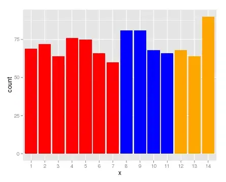
I was working on a task where I'm required to find if there is increase in price while increase in number of rooms. I've used ggplot2 and geom_point.
But I'm unable to understand is there any increment. Could any one help to make me understand this graph please. Or is there any other way to draw graph so that I can understand easily.
The following line is my code.
ggplot(df, aes(x = rooms, y = price)) + geom_point()
