I need to put some text over an image in a specific position. I want the text to stay in place & reduce its font-size when the viewport shrinks. Like this:
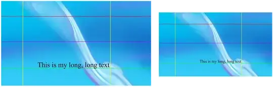
Text MUST be just above the horizontal green line, and it MUST touch the yellow line on the right.
This is my code:
    <style>
        #hero img {
            width: 100%;
        }

        #motto {
            position: absolute;
            bottom: 272px;
            right: 360px;
            font-size: 59px;
        }
    </style>

    <div id="hero">
        <img src="image.jpg">
        <div id="motto">This is my long, long text</div>
    </div>
The text is correctly positioned iniitally, but then it goes banana when I shrink the viewport

I also tried with font-size: 5vw. The font size seems to shrink, but it doesn't stay in place.
I would like to preserve the <img> and NOT using a background-image, if possible. Anything else would work for me.
Thanks
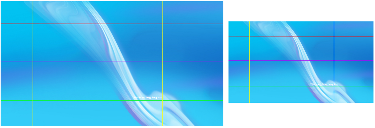
Someone suggested to take a look at Text over image - responsive . I did (I already did before posting, actually), and it doesn't work the way I need it to (the font-size is fixed, and it doesn't shrink, which is the main problem here). For context: the (adapted) code of that answer is
    <style>
        img {
    display: block;
    width: 100%;
}

.thumbnail {
    position: relative;
    display: inline-block;
}

.caption {
    position: absolute;
    top: 77%;
    left: 66%;
    transform: translate( -50%, -50% );
    text-align: center;
    color: white;
    font-weight: bold;
}
    </style>

    <div id="box-search">
        <div class="thumbnail">
            <img src="image.jpg" alt="">
            <div class="caption">
                <p>This is my long, long text</p>
            </div>
        </div>
    </div>
The result is this: