2

i wanted to recreate the following style

enter image description here

I came up with the following

enter image description here

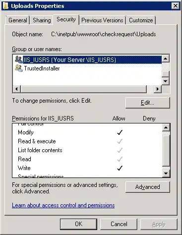
The problem is that the cut does not effect the blur filter and i have no idea how to solve it. This is my HTML code:

.glass {
    width: 40%;
    height: 100%;
    position: absolute;
    background: rgba(255, 255, 255, 0.1);
    backdrop-filter: blur(50px);
    z-index: 0;
    mix-blend-mode: screen;
    margin-left: auto;
    margin-right: auto;
}

.afri {
    position: absolute;
    top: 410px;
    left: 54%;
}
<div className="glass">
    <div className="trips">
        <h3>AMAZING TRIPS</h3>
    </div>
    <div className="afri">
        <h1>AFRI</h1>
    </div>
</div>

I tried a backdrop-filter and mix-blend-mode: screen. I expected a full cut

Goethe
  • 41
  • 1
  • 10
encoded
  • 25
  • 3

1 Answers1

4

You can use mask to achieve this but only available on chrome right now:

.box {
  /* this will do the trick */
  -webkit-mask:
    linear-gradient(#000 0 0),
    linear-gradient(#000 0 0);
  -webkit-mask-clip: text, padding-box;
  -webkit-mask-composite: xor;
          mask-composite: exclude;
  /**/
  backdrop-filter: blur(8px);
  text-transform: uppercase;
  font-size: 80px;
  font-weight: bold;
  background: rgb(0 0 0/50%);
  padding: 20px;
}

body {
  background:url(https://picsum.photos/id/1016/800/300) center/cover;
  padding: 50px 0;
}

html {
  background: #fff;
}
<div class="box">Text</div>
Temani Afif
  • 245,468
  • 26
  • 309
  • 415